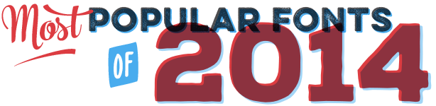
Best wishes for 2015 from the MyFonts team! As usual, we hold off publishing our Most Popular Fonts of the Year list until the first full week of January. It’s based on the sales data of the entire year which, as few list makers seem to realize, did not end until December 31. To qualify, font families must have seen their first MyFonts release after December 1, 2013. That’s because fonts released in December seldom have a chance to make it big that same year. The list is based on sales revenue (not the number of copies sold); we kept the number of families from the same foundry to a maximum of two, and made sure popular genres are fairly represented. There you go: a type chart like no other, based on sales, just like the pop music hit parades of old (the fair ones). And thanks to everyone who bought a new font. You have helped us put this list together. |
|
|
At MyFonts are often surprised by the trends that our customers set, or help perpetuate. More than two decades after “rough” and “weathered” fonts first hit our desktops, that trend is as strong as ever. Type designers follow suit, and produce textured versions of their most popular families. Some do it better than others, of course. Brandon Printed by Hannes von Döhren, one of the year’s absolute bestsellers, is a smart variation on his successful Brandon Grotesque and adds a booming new voice to the family. It convincingly mimics how Brandon’s capitals would look in nonchalant letterpress printing or when turned into rubber stamps. The series has several varieties, including a shadow font that can be used in a second color. Its funkiest asset is a witty set of Extras (dingbats, arrows and ornaments), allowing users to create leaflets, posters and titles with a look that’s equal parts 1880s poster, 1920s Deco and 1970s punk, all done with 21st-century technology! |
|
|
Popular typefaces in 2014 seemed to come from two opposite directions. They were either clean and simple, or informal and festive, with a hand-made touch. Some of our most successful foundries catered to both camps. Bulgaria’s Fontfabric had two megasellers: one smooth and clear, the other rough and nonchalant (see below). The former is the typeface shown here — Glober, an economic sans serif with friendly shapes. Designer Ivan Petrov made an attractive hybrid: a cool corporate face softened by humanized proportions and rounded stroke endings. With nine weights plus matching italics, Glober is very versatile, and can be used to set headlines that shout or headlines that whisper. Its middle weights also work well in longer text blocks, and make for excellent legibility on the web. |
|
|
Surprisingly, the informal handwriting trend that was dominant over the past eight years seems to be waning a little. Which is not to say that users have stopped liking these fonts: when offering something special, casual scripts can still be wildly popular. As was Quickpen by Laura Conduris of Trial by Cupcakes. It’s a likable script that successfully emulates quickly-jotted, carefree handwriting with a felt-tip pen or brush. When used in an OpenType-savvy application, ligatures and contextual alternates for lowercase letters enhance the natural hand-written look, while swashes lend a bit more finesse. Quickpen is the perfect script for a design that doesn’t take itself too seriously. |
|
|
Campton is a prime example of a genre that has become amazingly popular the past couple of years: geometrically constructed sans serifs with distinct Modernist overtones — inspired, that is, by modern classics from the 1920s and 1930s. Designed by Berlin’s René Bieder, Campton aspires to what was once a major obsession to functionalist designers: neutrality. While there are already many faces focusing on similar principles, Campton found its niche by combining simplicity with friendliness. Neutral without being cold or characterless, it offers a typographic color that is subtly different from existing font families, for projects ranging from editorial and corporate design via web and interaction design to products. |
|
|
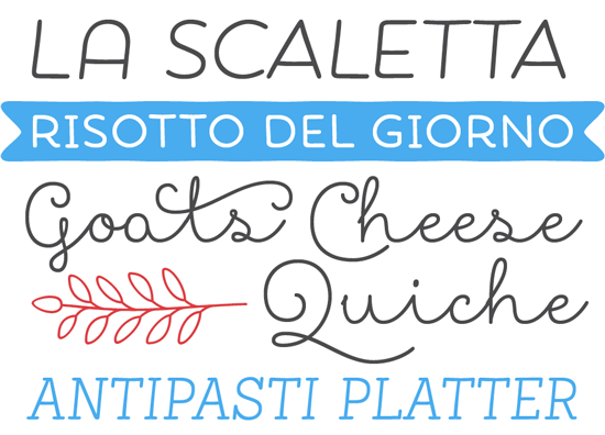
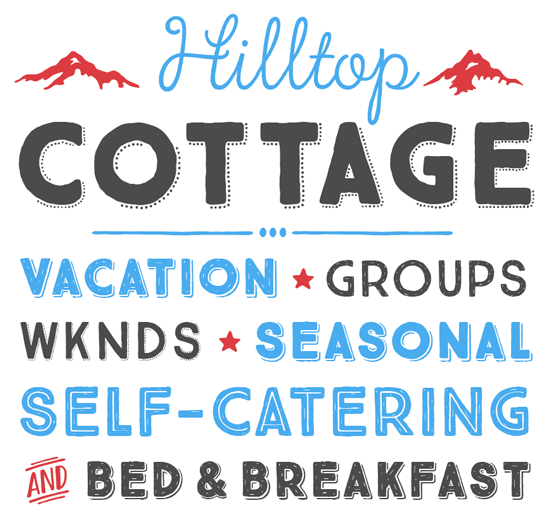
Adorn from Laura Worthington was the year’s most successful example of what we propose to call “Shabby-Chic Lettering Suite”. The concept was pioneered by Worthington herself with her Charcuterie series. It is not exactly a genre, but rather a novel way of grouping fonts into toolkits made up of typefaces from miscellaneous display categories, designed to work well together. It works like a breeze if the suite is designed with sensibility and care. Adorn is brilliantly done, so users can trust all the fonts contained in the package will work together harmoniously in spite of their diversity. The suite’s scope is impressive, offering seven display fonts, four lovely scripts, monograms, ornaments, illustrations, banners, frames, and catchwords. All with a hand-drawn feel, all striking a sensible balance between the immediate attraction of spontaneous lettering, and smart usability. |
|
|
You probably don’t need reminding that besides fonts-of-the year, we also have words-of-the-year. In 2013, the word “Selfie” was just that, according to the editors of the Oxford Dictionary. With a sense of irony, Maximiliano Sproviero of Lián Types named his most successful typeface of 2014 after this phenomenon. Just like the selfie itself, the typeface is a perfectly eclectic product of its time. It combines geometric construction with neon tube lines, with pen-stroke connections and abundant swashes thrown in to enhance the fun. Based on vintage signage scripts as seen in Buenos Aires’ Galerías, Selfie combines vintage charm with digital versatility. The rugged Printed version offers variety with a rugged letterpress look; the attractive Selfie Flags font is a flexible set of banners and English catchwords. |
|
|
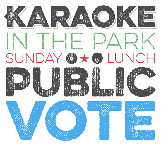
As mentioned above, one of last year’s major trends is the prolonged popularity of battered retro fonts. We already met Brandon Printed; this list of the year’s bestsellers contains other families in a similar vein. Microbrew from Albatross shares its worn and weathered all-caps look with Brandon Printed, but it takes a distinctly different approach. Rather than Art Deco lettering, Microbrew references generic industrial lettershapes. With its touch of authenticity, it offers some extra “oomph” that sets it apart from its countless competitors. It comes with a set of retro ornaments and catchwords and offers stackable varieties to create multi-colored layouts. As the name indicates, Microbrew is great for pub signage and beer posters, but can also be effective when used for branding, magazines, menu, music or food packaging. |
|
|
Here is another successful variety in the realm of miscellaneous display suites. Showcase from Latinotype is not exactly shabby-chic. Its appearance is subtly irregular and suggestive of hand-made origins, but its lines are clean, its curves smooth. Designers Daniel Hernández and Paula Nazal Selaive have created a mixed bunch of styles: a script, a sans-serif, a slab, a sans mini (think small caps) and finally a set of ornaments and dingbats. Designed to mix well and work together in perfect harmony, they speak the same visual language but with very different nuances. The result is a versatile and easy-to-use family, ideal for informal yet lucid menus, labels, showcards and brochure titles. |
|
|
René Bieder is one of the foundries who deserved a double mention in this list of the year’s bestsellers. Less than four months after his sans-serif Campton Bieder released another extended family — Choplin, a sturdy slab serif. Designed on Campton’s skeleton, it shares the same principles: geometry, simplicity and neutrality. While the families work very well together (we can imagine designing a powerful magazine layout combining these two), Choplin is not simply Campton-with-serifs-snapped-on. Many details were changed during the process in order to sharpen the slab serif character. While the middle weights work well in longer texts, the lightest and boldest weights make headlines look loud and strong. |
|
|
Nexa Rust is the year’s second megaseller from FontFabric. In order to produce this huge family — yes, another Shabby-Chic Lettering Suite — principal Svetoslav Simov set up a collaboration involving three other designers. Based on the popular Nexa and Nexa Slab families, Nexa Rust brings an attractive texture to these typefaces’ shapes, adding matching Script and Handmade fonts. This brings the total to five sub-families, each containing various styles — different weights or widths, with or without shadows, etc. The Sans, Slab, and Script sets come in a range of variations, showing increasing degrees of roughness. The Extra series offers a series of useful icons and catchwords, plus swashes and ornaments to spice up the Nexa Rust Scripts. |
|
|
One of the most-admired lettering styles today is the flowing style brush scripts that expert lettering artists created in the 1940s and 1950s for magazine headlines and advertising. Emil Karl Bertel from Fenotype is among the designers of digital type inspired by this style, and has developed admirable flair in translating it into flexible fonts. Of his most popular 2014 releases we selected The Carpenter, consistently successful since its release a year ago. It’s loosely based on Bertel’s 2012 release Mercury Script — but it’s more exuberant and offers a wealth of self-assured swashes and alternates. Like many fonts of its kind, it is best used in combination with an OpenType-enabled design application. The Carpenter comes in three weights, with a series of lovely ornaments, patterns and pictograms, making it a versatile and easy-to-use script font for creating ambitious headlines, logos and posters. |
|
|
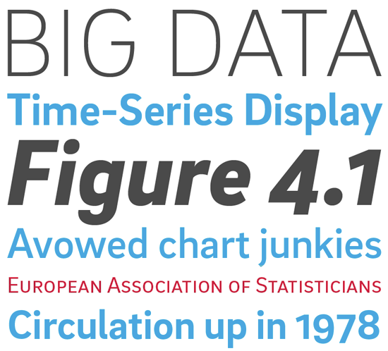
Texta is the most recent typeface on this list; it was featured as a Rising Star in last month’s newsletter, and has continued to do very well. It is also the second family from Latinotype that made the list — another phenomenally successful year for the trio from Chile. “A sans for all” is how they have labeled this cool, clean font family for text and display. Their approach was historical. They studied twentieth-century classics of the humanist sans genre, from Edward Johnston to Adrian Frutiger, as well as the simplified Gothics made by signpainters (the kind that Johnston called “block-letter”). The result is a rational and transparent sans-serif family that could almost be called “timeless”. It comes with a separate Alt version that replaces lower case letters like a-g-y with more geometric constructions, a subtle way of achieving a somewhat more modernist look. |
|
|
The parade of shabby-chic suites continues with True North from Cultivated Mind. It is one of the more elegant and successful of its kind. Offering sixteen nostalgic styles — all-caps fonts, a monoline Script, Labels, Extras and a free set of banners — True North is a useful toolkit for creating layouts with character, best suited to evoke the great outdoors and rugged lifestyles. Extras include wild animals, catchwords, numbers, symbols, tools, maple leaves and trees. The Script is pretty sophisticated: equipped with a wealth of ligatures and alternates, it automatically creates the feel of hand-lettering — provided it is used in a fully functioning OpenType environment. |
|
|
Brix Slab from HVD Fonts was on our list of Most Popular Fonts of 2012 — one of the most robust and readable of recent slab serif families. It’s a great typographic tool for demanding editorial design work, and the one thing it needed to be even more versatile was a sans-serif companion. Two years after Brix Slab, designers Hannes von Döhren and Livius Dietzel presented Brix Sans, a sans with style. It is much more than just the Slab with its serifs chopped off: the sans-serif follows the visual logic of its genre, resulting in a sturdy yet supple grotesque that has repeated the success of its older sibling. Together, the two families are ideal for solving complex typographical challenges. |
|
|
Ryan Martinson of Yellow Design Studio is a master of textures. Earlier typefaces such as Veneer and Thirsty Rough had the random wear of roughly printed letterpress. His most successful 2014 release Eveleth, is more sophisticated and specific. It features three different sub-families, each with its own printed texture, each offering six distress textures per letter, allowing incredible customization. You can sense the surface of the paper, or the abrasion of a battered old cardboard box. Additional features include funky icons, shapes and emblems, as well as clean versions. As the high-resolution wear and tear involves complex outlines, the fonts do not load very fast in some applications — so for web use, either use the clean versions… or experiment with subsets of just a handful of letters. |
|
|
|
|
|
Comments?
We’d love to hear from you! Please send any questions or comments about this newsletter to [email protected]
|
|
|
|
|
|
MyFonts Inc. 500 Unicorn Park Drive, Woburn, MA 01801, USA
MyFonts and MyFonts.com are registered service marks of MyFonts Inc. Other technologies, font names, and brand names are used for information only and remain trademarks or registered trademarks of their respective holders.
© 2015 MyFonts Inc
|
|
|
|