Select this license type when you are developing an app for iOS, Android, or Windows Phone, and you will be embedding the font file in your mobile application's code.
Remora Sans
by G-Type
- Aa Glyphs
-
Best ValueFamily Packages
- Individual Styles
- Tech Specs
- Licensing
Remora Sans W5 Roman & Italic Pack
14 fontsPer Style:
$13.92 USD
Pack of 14 styles:
$195.00 USD
Remora Sans W4 Roman & Italic Pack
14 fontsPer Style:
$13.92 USD
Pack of 14 styles:
$195.00 USD
Remora Sans W3 Roman & Italic Pack
14 fontsPer Style:
$13.92 USD
Pack of 14 styles:
$195.00 USD
Remora Sans W2 Roman & Italic Pack
14 fontsPer Style:
$13.92 USD
Pack of 14 styles:
$195.00 USD
Remora Sans W1 Roman & Italic Pack
14 fontsPer Style:
$13.92 USD
Pack of 14 styles:
$195.00 USD
About Remora Sans Font Family
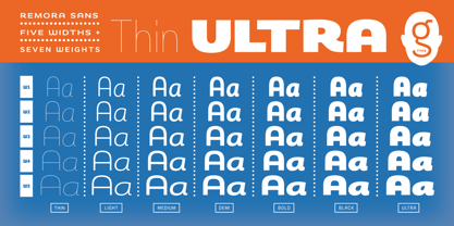
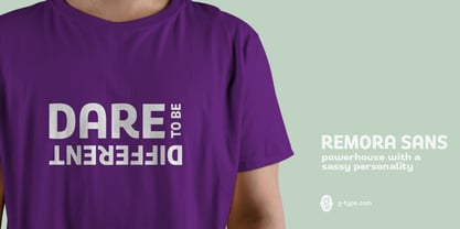
Remora is an extensive new humanist sans serif which comes in 2 style variations, the effervescent Remora Sans and its corporate business partner
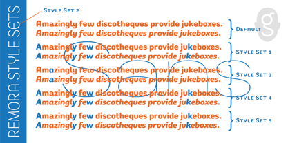
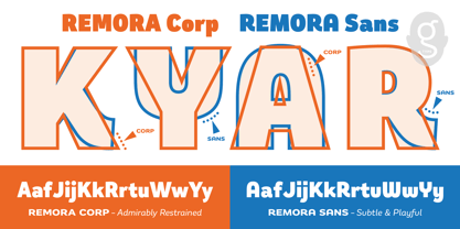
. Both styles include 5 individual width sets ranging from the condensed W1 to the extra-wide W5. Furthermore, with an impressive 7 weights (Thin to Ultra) and true matching italics in each pack Remora is an ultra versatile super family comprising 140 individual fonts, perfect for any typographic assignment or design brief. Remora was designed by G-Type founder Nick Cooke. Both the Sans and Corp families share the same proportions, with the exception of certain key characters that change the overall appearance. Remora Sans is an exuberant and characterful typeface while Remora Corp, as its name suggests, is a businesslike typeface more suited to corporate typography. Quite early on in the design process Nick decided to give Remora Corp equal billing instead of incorporating these glyphs as alternates or a stylistic set that may get overlooked. “I created two separate families after learning a valuable lesson with one of my earlier typefaces, Houschka”, says Nick. “Houschka contained distinctive rounded A’s W’s and w’s, with ‘straight’ styles as character alternates. Even though style sets and alternates are easy to activate they are rarely used, so after many requests for customised versions of the fonts with the straight characters as defaults it was decided to create the separate ‘Alt’ family. So I cut straight to the chase with the two Remora variants and created two complementary families.” Both sets contain many shared letterforms, but it is the alternate characters that significantly alter the appearance of each font. Remora has been carefully designed for optimum legibility at large and very small sizes. Although fairly monolinear in appearance, especially in the lighter weights, particular attention has been paid to optical correction like the overshoots of the curved characters. Open counters and painstaking attention to detail (e.g. weight contrast between horizontal and vertical strokes, junctions of shoulders and stems etc) all boost readability and make Remora a great choice across all media. Remora Sans and Corp are ‘humanist’ rather than ‘geometric’ in style, meaning they’re not strictly based on rectangles and circles, resulting in a warm and friendlier feel. The slightly ’super-elliptical’ rounded forms create generously attractive curves. Remora has very distinctive italics in that they are only inclined by 8 degrees, but are not just based on slanted uprights. The italic styles are very alluring when used for display at large sizes and the good news is they come bundled free with their respective uprights. Each family also contains many OpenType features including proportional and tabular numbers, small caps, discretionary ligatures, plus five stylistic sets for ultra versatile typography.
Designers: Nick Cooke
Publisher: G-Type
Foundry: G-Type
Design Owner: G-Type
MyFonts debut: Jan 30, 2018

About G-Type
G-Type is a digital font foundry and experienced type design studio founded by Nick Cooke in 1999. G-Type excels at designing logos and custom fonts for leading brands and organisations around the world. Companies and publications as diverse as Vauxhall, Sun Life Financial, Walmart and The Mail On Sunday have had well received typographic makeovers courtesy of G-Type and many more, including NBC Television, SKF, and TATA Consulting use G-Type commercial fonts as the cornerstone of their corporate brand styling.Cooke’s Chevin typeface brands the Royal Mail with distinction and is highly visible at every Post Office throughout the UK. The G-Type retail library is a wonderfully varied and versatile collection of high quality original fonts, invariably containing feature-rich ‘Pro’ character sets brimming with alternates, ligatures, multiple figure options and extensive language coverage. Popular fonts like Houschka Pro, Chevin, Rollerscript and Olicana offer expansive glyph palettes and multiple stylistic sets, enabling your work to adopt various personas without the need to change fonts.
Read more
Read less
- Choosing a selection results in a full page refresh.