Select this license type when you are developing an app for iOS, Android, or Windows Phone, and you will be embedding the font file in your mobile application's code.
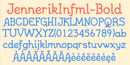
JennerikInformal™
by Ingrimayne Type
Individual Styles from $9.95
Complete family of 6 fonts: $14.95

JennerikInformal Font Family was
designed by
Robert Schenk and
published by
Ingrimayne Type. JennerikInformal contains
6
styles and family package options.
More about this family
- Aa Glyphs
-
Best ValueFamily Packages
- Individual Styles
- Tech Specs
- Licensing
Per style:
$2.49
Pack of 6 styles:
$14.95
About JennerikInformal Font Family
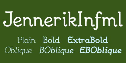
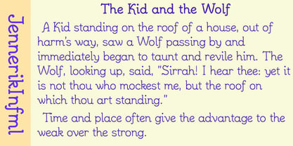
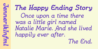
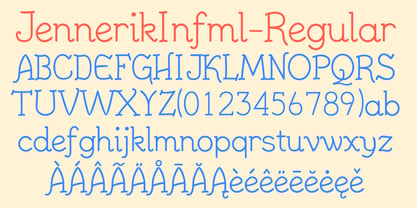
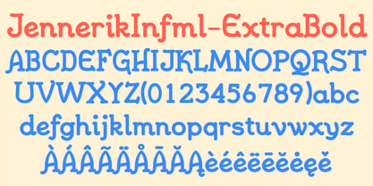
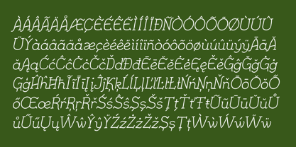
JennerikInfml is a friendly, casual typeface family that has the appearance of neat hand printing. It began as the italics to Jennerik, but I ended up separating it and giving it a different set of upper-case letters. Although its lower-case letters were designed as italics, it was originally published in 1992 with three weights as upright letters without a slant or skew. The revision of 2020 added the oblique or slanted styles.
Designers: Robert Schenk
Publisher: Ingrimayne Type
Foundry: Ingrimayne Type
Original Foundry: unknown
Design Owner: Ingrimayne Type
MyFonts debut: Nov 6, 2002
JennerikInformal™
is a trademark of Ingrimayne Type.

About Ingrimayne Type
IngrimayneType distributes digital typefaces designed by Robert Schenk. Robert became fascinated with type design in the late 1980s and began designing type in 1988 with an early version of Fontographer. He has designed a wide variety of typefaces, from standard text fonts to bizarre decorative faces. Many of these faces were designed to meet specific needs but others were experimental, designed as a challenge to form letters that met a narrowly-defined criteria. Areas of special strength in the IngrimayneType library include novelty fonts, picture fonts including tessellations, and fonts with alternating character sets.
Read more
Read less
- Choosing a selection results in a full page refresh.