Skip to content
Skip to main content

Freude

by Typejockeys
Individual Styles from $25.00 USD
The Freude Font Family was designed by Thomas Gabriel and published by Typejockeys. Freude contains 1 styles. More about this family

About the family


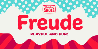
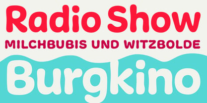
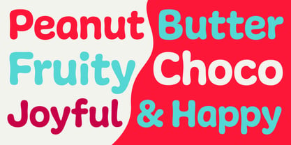
Freude was originally developed for the album artwork of the Austrian musician Tombeck. The word Freude means “joy” in German. Supplemented by the addition of lowercase letters and refined by various OpenType features, the Freude typeface is charmingly playful. Created for everything fun, its design is relaxed and amiable – perfect for mama’s boys, chocolate freaks and pranksters alike. Thanks to its balanced letterforms, Freude is equally entertaining in both large and small sizes.

Designers: Thomas Gabriel

Foundry: Typejockeys

MyFonts debut: Feb 23, 2014

Freude

About Typejockeys

Typejockeys is a renowned type foundry and graphic design company located in Vienna, Austria, founded in 2008 by Anna Fahrmaier, Thomas Gabriel, and Michael Hochleitner. The team engages in a diverse range of activities, including graphic design, lettering, and type design. As they expressed in their 2014 Creative Characters interview, "With Typejockeys, it was never our plan solely to produce typefaces, since our interest in typography extends in a lot of other directions as well." Their expertise spans various disciplines, such as corporate design, packaging, editorial, environmental, and digital media, alongside retail and custom type design, with lettering serving as a bridge between these fields. Their typeface library showcases spirited originality and technical precision, heavily inspired by the vibrant culture of Vienna. For instance, the design of their typeface, Henriette, draws from the street signs of their hometown. "Since we are serious type nerds, we keep looking at letters everywhere we are. Luckily, Vienna had some very talented sign makers, who over the years produced a fair amount of great shop sign letterings around the city." Typejockeys' passion for typography is evident in their work: "We love letters, we think about them and work with them with all our hearts. This is the meaning of the ‘serifed heart’ that you can find in all our fonts!" Their commitment to quality and creativity sets them apart in the design industry, making them a go-to choice for clients in various sectors, including editorial, technology, and retail.

Read more

Read less