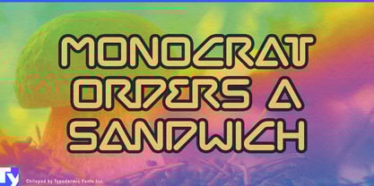
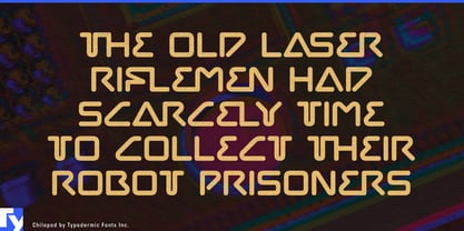
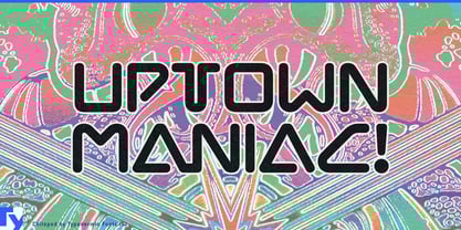
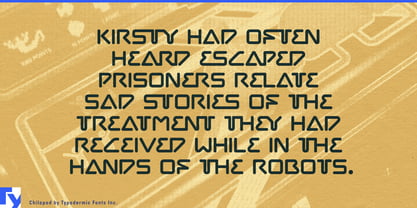
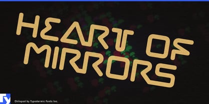
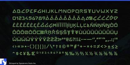
Chilopod turns connection into part of the letterform. Its rounded strokes can join across selected character combinations, allowing words to behave less like separate symbols and more like continuous paths. Depending on the context, those paths can suggest cable, pipe, roadway, circulation, or relationships between people.
That makes Chilopod especially well suited to connectivity infrastructure. Fibre networks, broadband providers, telecom equipment, subsea cables, data-centre interconnects, and network-peering services all exist to move information between points. In corporate identities, service-family names, expansion campaigns, trade-show environments, and large website headlines, Chilopod can make the typography participate in that idea rather than placing another node-and-line diagram beside the name.
Connected utilities offer a physical version of the same concept. Hydrogen distribution, water infrastructure, district heating and cooling, industrial gases, pipeline technology, and thermal-management systems all depend on continuous routes carrying something through a network. Chilopod’s tubular construction can echo pipes, conduits, and flow paths without becoming a literal diagram.
Transport and logistics add movement to the connection. Rail infrastructure, toll-road networks, airport transit, parcel routing, fleet systems, and automated distribution all link destinations through paths. Chilopod can support network-expansion campaigns, mobility-technology launches, logistics branding, and large environmental graphics where routes are part of the story.
The same logic works with closed loops. Recycling systems, reusable packaging networks, material-recovery programs, circular manufacturing, and industrial take-back schemes depend on keeping materials in motion rather than allowing them to reach a dead end. Chilopod can suggest continuity and return without relying on familiar recycling arrows.
Not every connection is physical. Telecommunications, collaboration platforms, professional networks, research consortia, and membership organizations all exist to connect people, institutions, or information. Chilopod gives that otherwise abstract promise a concrete visual device. Technology clusters, innovation districts, university-industry programs, and other multi-organization initiatives can use the same idea to show separate participants forming a larger system.
Chilopod is most useful when connection is the subject: wires linking equipment, pipes carrying resources, routes joining places, materials circulating through a closed loop, or people and organizations forming a network. Instead of adding connection as an illustration around the typography, Chilopod can build it into the word itself.