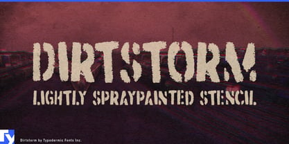
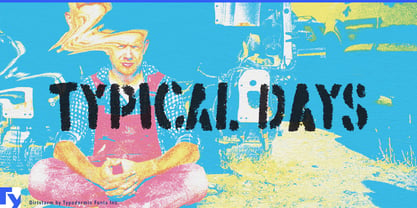
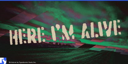
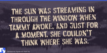
Dirtstorm gives professionally produced advocacy graphics the directness of a sign sprayed through a hand-cut cardboard stencil. It suits union campaigns, political organizations, environmental fundraisers, and public-interest advertising; the same lettering can move from paid social graphics and web headlines to rally signs, event backdrops, and campaign merchandise without losing its connection to public action.
Its alphabet began with a scammer. One of those too-good-to-be-true internet hustlers was persuaded to make a stencil sign, then unknowingly kept supplying more letters. By the time the exchange ended, enough existed to piece together most of an alphabet. The forms were traced and the missing characters drawn to complete Dirtstorm.
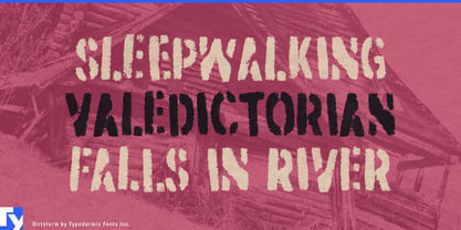
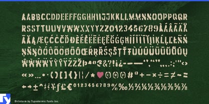
That unusual production method remains visible in the uneven cuts, ragged edges, rough fill gaps, and inconsistent stencil bridges. Letter-pair substitutions introduce alternate shapes automatically, reducing the repetition that often gives away a digital stencil. Doubled letters can resemble two separate passes through the same battered piece of cardboard instead of one form copied twice. The result belongs to public walls and improvised signs rather than military depots.
At the more art-directed end of skateboarding and street fashion, Dirtstorm’s compressed capitals fit naturally across skate decks, garment panels, footwear packaging, and narrow shop displays. The rough texture works over photography, halftones, recycled stock, and hard blocks of colour, making it useful for capsule collections, hangtags, lookbooks, and pop-up installations.
Colour and context can also give Dirtstorm a constructive role. With plant photography, recycled paper, plywood, canvas, or a bright ecological palette, it suits solarpunk publishing, urban-agriculture campaigns, seed packaging, and community-garden identities. The same marks that look confrontational on a protest placard can resemble working labels sprayed onto seed crates, compost bins, and tool sheds.
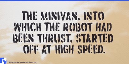
Dirtstorm is an all-capital display face for short, forceful messages. Use it for campaign slogans, collection names, product titles, and section headings; pair it with a straightforward sans serif for schedules, donation instructions, and product details.