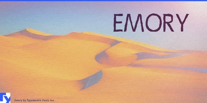
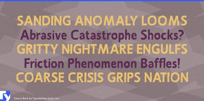
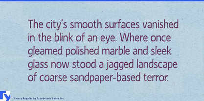
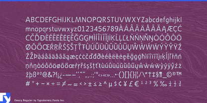
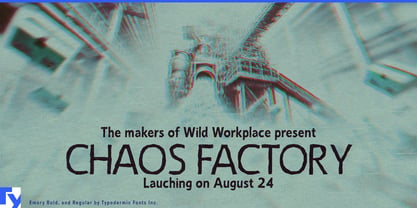
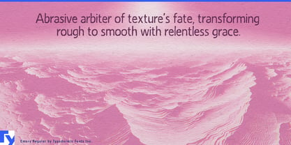
Crunchy food packaging has to promise texture before anyone opens the bag. A cookie name should feel crumbly; a chip brand ought to suggest snap and seasoning from across the aisle. Emory gives typography that physical quality. Its narrow sans-serif shapes have warped, rubbed contours that make each word look baked, scraped, or imperfectly printed.
The roughness is built into the silhouettes. Straight sections bend slightly, curves tighten unexpectedly, and repeated shapes never feel clinically manufactured. Underneath that distortion is a clear geometric structure that keeps Emory recognizable and surprisingly readable. Its condensed proportions also leave room for long product names, flavor combinations, and emphatic package callouts.
Emory is particularly well suited to oat cookies, ginger snaps, shortbread, sandwich biscuits, crackers, pretzels, tortilla chips, popcorn, granola clusters, and crunchy cereals. On bags, cartons, and multipacks, its irregular contours can suggest crumbs, salt, toasted grains, cracked surfaces, or an uneven coating without drawing any of them literally. Product names, flavor bands, ingredient stories, and short pieces of package copy can all share the same tactile voice.
The effect becomes drier and more adult around products shaped by fermentation and natural processes. Natural wine, cider, kombucha, specialty vinegar, sourdough, and cultured foods can use Emory for bottle labels, batch names, tasting cards, taproom boards, and release posters. It gives them an independently made appearance without relying on rustic script or nostalgic engraving.
Publishing and screen graphics reveal a stranger side. The distorted outlines introduce low-level unease without conventional horror lettering, making Emory useful for weird fiction, folk horror, ecological suspense, absurdist comedy, mock instructional films, and fictional community television. Geology, archaeology, erosion, and material-science exhibits can connect the same unstable contours with stone, sediment, weathering, and imperfect surfaces.
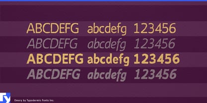
When common letters repeat, built-in substitutions introduce alternate shapes and reduce mechanical repetition. Emory provides repeatable imperfection that can extend across an entire package line, exhibition, publication series, or screen campaign.