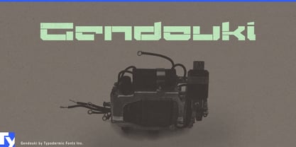
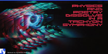
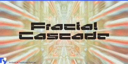
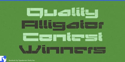
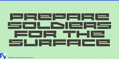
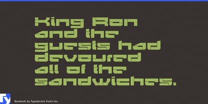
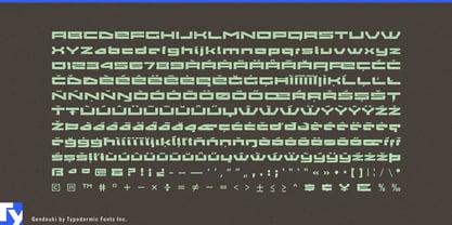
Gendouki turns letters into fabricated assemblies. Thin cuts divide its strokes into plates and sections, giving the alphabet the appearance of something built from modular components rather than drawn as continuous forms. The original inspiration came from spacecraft access panels, but the same construction translates naturally into contemporary architecture, building systems, machinery, and other places where surfaces are assembled from engineered parts.
That makes modular construction an especially good fit. Prefabricated buildings, façade systems, architectural cladding, building-envelope products, structural components, and advanced construction technologies already communicate through panels, joints, seams, and repeated modules. On an architecture trade-show wall, a modular-building company identity, a façade product launch, or the name of a new construction system, Gendouki can look almost as though the lettering was fabricated alongside the product.
The effect becomes particularly strong at architectural scale. Large words on exhibition stands, construction hoardings, showroom walls, demonstration spaces, and architectural-product displays give the narrow interruptions enough room to become structural details of their own. Gendouki behaves less like ordinary headline typography in these settings and more like another element of the built environment.
Industrial machinery offers a related territory. Automation equipment, robotics, motion systems, specialist manufacturing hardware, and engineered product families can use Gendouki for company names, machine series, model names, and launch graphics. Its segmented strokes suggest joints between panels, housings, covers, and mechanical assemblies without copying the markings of any particular machine.
There is also a natural place for Gendouki in constructed visions of the future. Rather than relying on glowing screens and digital interference, its forms suggest the physical infrastructure behind the technology: spacecraft interiors, access hatches, industrial corridors, vehicle bodies, research facilities, and modular habitats. For science-fiction film, game, and entertainment production, it can give facilities, vehicles, organizations, and manufactured objects a visual language that feels physically assembled rather than merely computerized.
Gendouki is intentionally specialized. Its abstraction pushes some forms toward the edge of immediate recognition, so it is better suited to short names and prominent display typography than explanatory text. That limitation becomes useful when the job is to make a product family, building system, machine series, or enormous environmental word feel proprietary. The unusual shapes resist the anonymous quality of generic techno lettering.
The panel cuts are not decoration added to an otherwise conventional alphabet; they are the organizing principle that gives Gendouki its identity.