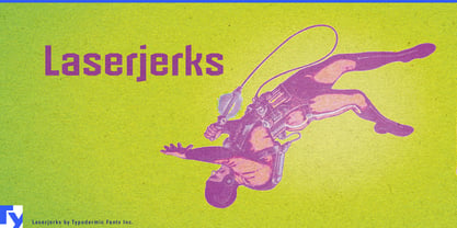
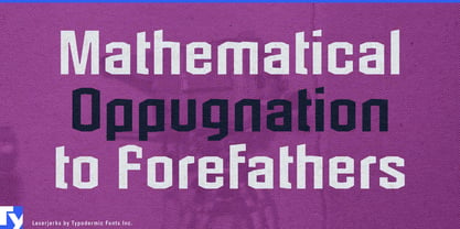
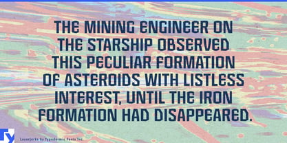
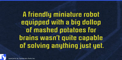
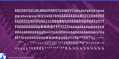
Laserjerks began with a digital blending experiment, but the result feels surprisingly physical. Its letters are built from angular cuts, polygonal strokes, shifting waistlines, and joints that refuse to line up quite where you expect. Familiar sans-serif structures remain underneath, so words stay recognizable even as the components seem to have been cut apart and reassembled. The effect is less computer than machine: fabricated plates, mismatched modules, structural pieces, and mechanisms assembled according to some engineering logic you almost understand.
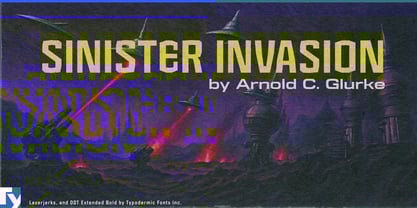
That makes Laserjerks particularly comfortable in science fiction where the future still has weight. Think asteroid-mining equipment, robot factories, planetary survey gear, improvised spacecraft, alien machinery, and enormous devices whose purpose becomes clear only after something has gone badly wrong. It suits science-fiction paperback titles and anthology covers, as well as chapter headings, fictional reports, equipment labels, planetary maps, and other pieces of world-building. Rather than the smooth language of screens and cyberspace, its geometry suggests technology that has to be manufactured, transported, repaired, and occasionally hit with a wrench.
The same qualities carry naturally into robotics and experimental engineering. Robot competitions, hardware demonstrations, engineering exhibitions, mechanical prototypes, and science-centre displays can use Laserjerks to introduce machinery without falling back on conventional industrial lettering. It doesn’t pretend to be a font for technical drawings or operating instructions; its job is to establish the subject at display size, then let a quieter companion handle the specifications.
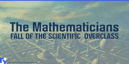
There is also a stranger scientific territory available. Its irregular construction can give recreational mathematics, speculative physics, invented disciplines, laboratory fiction, and science-festival graphics an appropriately uncertain authority. A heading can look systematic without looking entirely trustworthy; useful territory for anything between rigorous engineering and a diagram of a machine that may open a portal.
Laserjerks includes lowercase, giving it more range than a one-line futuristic alphabet. It can sustain several lines of large copy while preserving the same chopped, assembled texture found in its capitals. Book-cover subtitles, exhibition headings, section openers, and short fictional documents can therefore stay inside the same visual system. For longer reading, pair it with a straightforward sans or serif and let Laserjerks handle the machinery.