Skip to content
Skip to main content

Lineavec

by Typodermic
Individual Styles from $69.95 USD
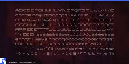
The Lineavec Font Family was designed by Ray Larabie and published by Typodermic. Lineavec contains 1 styles. More about this family

About the family


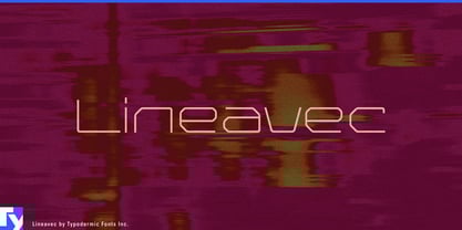
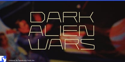
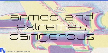
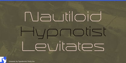
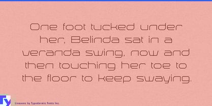
Thin futuristic lettering can easily become decorative. Lineavec has a more specific logic: its broad monoline forms behave like paths. Strokes turn corners, cross wide spans and connect through the alphabet like routed signals rather than filled shapes.

That makes photonics an unusually natural fit. Silicon-photonics systems, optical interconnects, photonic processors and high-speed transceivers can use Lineavec for product-family names, chip-series identities, conference graphics and trade-show displays, where the thin strokes can suggest waveguides without becoming literal circuit diagrams.

LiDAR and reality capture extend the same idea into measurement. Terrestrial laser scanners, surveying systems, point-cloud platforms and digital-twin services can use Lineavec for scanner model names, campaign titles and large exhibition graphics, letting the letterforms share the visual language of scan lines, plotted paths and measured geometry.

The construction becomes especially effective when the typography itself is rendered as light. Edge-lit acrylic, laser-engraved panels, etched glass and illuminated environmental graphics can turn Lineavec’s strokes into glowing routes. Photonics-company lobbies, science-museum installations, architectural-lighting showrooms and technology exhibitions all give the design enough scale for its delicate structure to remain visible.

Laser projection, optical installations and light-art systems offer a related territory, while developer-board graphics and large schematic-inspired displays can preserve the circuit-trace ancestry at display scale.

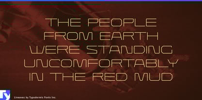
Lineavec works best where its thin paths have room to breathe: product names, conference titles, installation graphics and large environmental lettering rather than small operational text. Inspired by lasers, vector graphics and circuit traces, it has found a contemporary home in systems where information really does travel along lines of light.

Designers: Ray Larabie

Foundry: Typodermic

MyFonts debut: Jul 13, 2006

Lineavec

About Typodermic

Welcome to Typodermic Fonts, a spirited type foundry rooted in Nagoya, Japan, started by the Canadian typeface designer, Raymond Larabie in 2001. Our library brims with 500+ diverse typefaces to fuel creativity in graphic design, advertising, web, and app development. As digital type pioneers, we adopted web fonts and app licensing early, consistently pushing the design envelope. With Canadian heart and Japanese precision, we're your global partners in extraordinary typography. Explore Typodermic Fonts—where creativity meets character.

Read more

Read less
