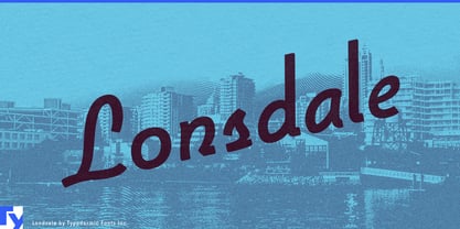
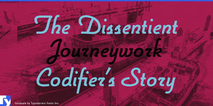
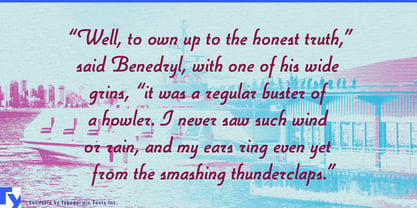
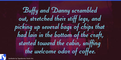
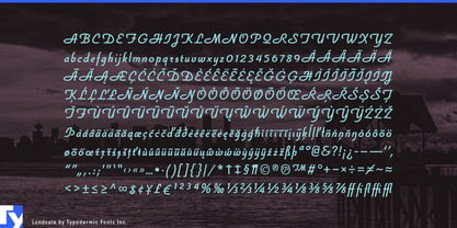
Lonsdale began with a practical contradiction. It was developed during work on the Cinecav closed-caption family, where the goal was to create a script that could coexist with a technical typographic system. The experiment proved too expressive for captioning: the lowercase was unconventional for accessibility-critical reading, while the wide, decorative capitals demanded more space and attention than the job allowed. Those same qualities became the reason to keep it.
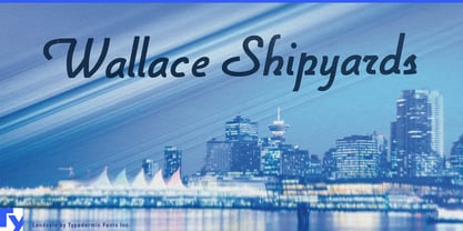
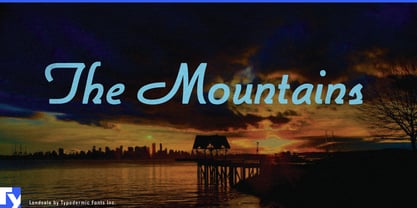
The result is a script that behaves more like designed lettering than handwriting. Its letters remain disconnected, the curves are controlled, and the capitals can dominate short names without making the rest of the word feel casual or improvised. That gives Lonsdale a useful role inside contemporary identity systems: it can provide the signature element while a more neutral companion face handles navigation, specifications, addresses, and supporting copy.
Place branding is a particularly natural fit. Mixed-use developments, waterfront districts, premium residential projects, destination hotels, marinas, and resort properties often need a memorable name that can sit comfortably beside modern architecture. Lonsdale can appear on entrance monuments, building façades, leasing campaigns, development hoardings, lobby graphics, and property brochures without forcing the entire identity into a script style.
The same principle works for hospitality sub-brands. A hotel restaurant, rooftop bar, lounge, spa, or private club may need an identity of its own while remaining related to the larger property. Lonsdale can distinguish the named experience on signage, menus, glass graphics, amenities, and campaign material while the surrounding system remains restrained.
Product and vehicle naming offer another strong use. Yacht models, motorcycles, e-bikes, recreational vehicles, limited product series, and other premium transport products often need a name that feels more individual than a model code but less sentimental than conventional handwriting. Lonsdale can turn that name into a badge, decal, embossed mark, launch graphic, or display headline while technical information remains in a more systematic face.
Passenger transport and destination services can use the same distinction. Ferry operators, scenic rail services, cruise brands, and premium mobility companies frequently have expressive route names, vessel names, lounges, or onboard venues within otherwise highly functional identities. Lonsdale can supply that named layer without being asked to handle timetables, wayfinding, or dense operational information.
Lonsdale works best as a designed signature: the name of a place, vehicle, property, venue, or experience that needs to feel distinctive while remaining compatible with the architecture, products, and systems around it.