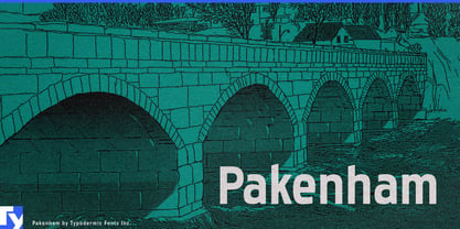
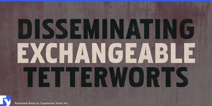
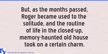
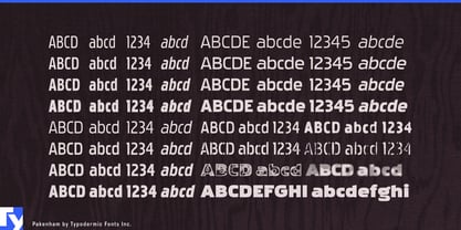
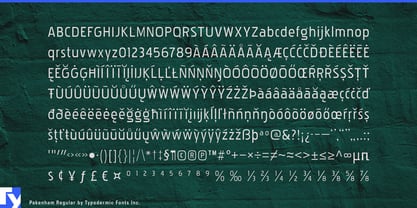
Pakenham has the practical awkwardness of lettering made for a real place. Its squarish, superelliptical curves, modest lowercase, and angled ascenders resist the smooth regularity of a conventional workhorse sans. The forms are competent but idiosyncratic, suggesting commercial lettering worked out by a local sign painter rather than handed down as part of a corporate identity system.
That puts Pakenham naturally around campgrounds, cottage country, fishing lodges, canoe rentals, marinas, summer camps, roadside motels, bait shops, and outdoor recreation businesses. It can handle the entrance sign, but the more characteristic uses are the ordinary signs that accumulate around a place: CABINS 1–8, CANOE RENTALS, FIREWOOD, BOAT LAUNCH, CAMP STORE, SHOWERS, ICE, or CAMPSITES AVAILABLE. Nothing needs to look antique; Pakenham simply gives those words the character of lettering made locally for a specific job.
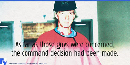
Its condensed styles are particularly useful in that world. Sign painters rarely get to choose the dimensions of the board, and long names still have to fit between the posts. Pakenham can squeeze trail names, rental information, activity listings, directions, and programme headings into narrow spaces without turning into an anonymous compressed grotesque.
The same character works beyond the campground. Regional attractions, garden centres, farm stands, hardware shops, community arenas, small museums, local festivals, and independent roadside businesses can use Pakenham when polished corporate typography would feel imported from somewhere else. It suits maps, schedules, admission boards, menus, brochures, window lettering, directional signs, and the everyday graphic infrastructure that makes a place feel like itself.
Pakenham is not a historical sign-painter revival, and it does not need artificial distress to suggest hand-made commercial lettering. Its character comes from the shapes themselves; square shoulders, restrained curves, and occasional awkward turns give clean digital type some of the specificity that local signage acquires naturally.
With condensed, regular, and expanded proportions across the family, Pakenham can move from information packed onto a narrow notice to broad lettering stretched across an entrance sign. It stays readable without disappearing into the background like a common workhorse sans; there is always just enough evidence that somebody, somewhere, had to make the sign fit.