Skip to content
Home / Fonts / Volcano Type / Bikini
Bikini

Bikini

by Volcano Type
Individual Styles from $19.00
Bikini Font Family was designed by Felix Braden and published by Volcano Type. Bikini contains 1 styles.

More about this family
FREE 30-DAY TRIAL of Monotype Fonts to get over 150,000 fonts from more than 1,400 type foundries. Start free trial
Start free trial

About Bikini Font Family


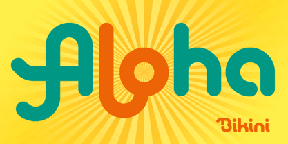
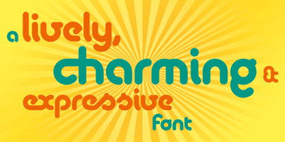
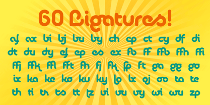
Bikini is a display-font that offers designers a variety of opportunities to create a lively and sophisticated typography. The font contains swash-capitals and roman capitals as well as two different forms of lowercase letters for endless combinations. Furthermore, a set of more than 60 ligatures is included. Bikini gets its charm by mixing up constructivist and handmade origination concepts. Although the letters show partially very expressive and overhanging details, the creation is strictly based on a matrix of circles and arcs (see drawing). In spite of its static and geometric basic elements Bikini seems to come to life and to break the rules of the grid, thus it looks somewhat psychedelic.

Designers: Felix Braden

Publisher: Volcano Type

Foundry: Volcano Type

Design Owner: Volcano Type

MyFonts debut: Apr 21, 2010

Bikini

About Volcano Type

Volcano Type is a independent font foundry based in Karlsruhe, Germany. The first course: a fast food youthfulness that was served for the first time in 1996. An earthy dish, created by chance, with thirteen organic fonts. Quickly whisked up and devoured. It rarely took more than a few days from sketch to use/digestion by the project. Uncouth forms, erupted from the bowels of the earth. Shattered letters, branded, stressed, humiliated. In order to produce arrogant fonts, far too expressive to last on a page of copy text. Quite indisputably from nature. Still roughly hewn. Raw. Imperfect. The second course formed a strong contrast: tight concept, linear work, disciplined preparation. In most cases the font was formed by a matrix. Digital cool, sober, reduced. Plenty of free scope, like chess: the board is always the same, the moves always different. Classic openings are followed by unfamiliar variants. Competitive games. Finely nuanced movements. Carefully thought out, one masterminded brainchild after another. Dessert: mathematical severity is rounded off and smoothed down. Fonts between digital and analogue. Straightened rivers - the surfaces of our times.

Read more

Read less