Select this license type when you are developing an app for iOS, Android, or Windows Phone, and you will be embedding the font file in your mobile application's code.
Eveningnews
by Wiescher Design
Individual Styles from $39.50
Complete family of 2 fonts: $49.50


Eveningnews Font Family was
designed by
Gert Wiescher and
published by
Wiescher Design. Eveningnews contains
2
styles and family package options.
More about this family
- Aa Glyphs
-
Best ValueFamily Packages
- Individual Styles
- Tech Specs
- Licensing
Per style:
$24.75
Pack of 2 styles:
$49.50
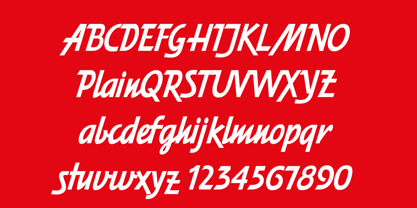
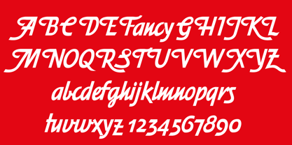
About Eveningnews Font Family
Since many years I live in Munich and read the daily newspaper Abendzeitung. One morning they had redesigned the paper, using Eric Gill's Joanna for the body copy and a tweaked version of Franklin Gothic for the headlines. Since both typefaces are my all-time favorites, I was very pleased. The old hand-lettered title lettering designed by in-house designer Ernst Friedrich Adler around 1947 or 48 was untouched as it always was. Adler had worked for the newspaper an incredible 47 years! Ernst Friedrich Adler celebrated his 100th birthday in the summer of 2007 looking very healthy. But someone had adapted his title lettering for use in the chapter headings, and I did not like the way that was done. Every morning I saw those letters and thought "one day I have to clean that up". About 15 years later I finally did it! Being at it, I designed the whole typeface and added a second fancy cut. And, what do you know, the people at the Abendzeitung called me up and said they liked what I did and started using it. So since that day in 2005 I can read my morning paper without having to wonder about the chapter headings. Well maybe one day they will do another redesign and maybe they will use another one of my fonts. Your editorial typeface designer, Gert
Designers: Gert Wiescher
Publisher: Wiescher Design
Foundry: Wiescher Design
Design Owner: Wiescher Design
MyFonts debut: Mar 15, 2005
Eveningnews
About Wiescher Design
The Munich studio of graphic designer and type designer Gert Wiescher. Check his Person page for more info!
Read more
Read less
- Choosing a selection results in a full page refresh.