


Ambroise™ Std
von Typofonderie

- Aa Glyphen
-
Bestes AngebotFamilienpakete
- Einzelschnitte
- Technische Daten
- Lizenzierung
Über die Familie
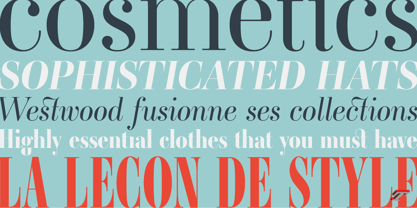
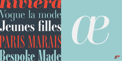
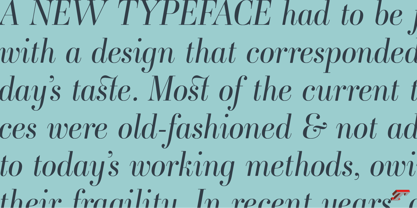
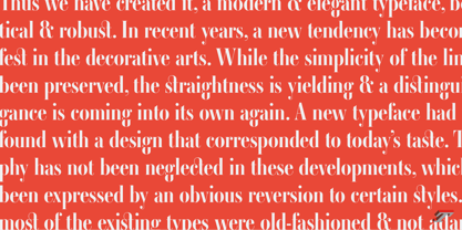
An exquisite Didot font in 18 series Ambroise is a contemporary interpretation of various typefaces belonging to Didot’s late style, conceived circa 1830, including the original forms of g, y, &; and to a lesser extent, k. These unique glyphs are found in Gras Vibert, cut by Michel Vibert. Vibert was the appointed punchcutter of the Didot family during this period. It is the Heavy, whom sources were surest that Jean François Porchez has been used as the basis for the design of the typeface family. In the second half of the 19th century, it was usual to find fat Didots in several widths in the catalogs of French type foundries. These same typefaces continued to be offered until the demise of the big French foundries in the 1960s.
Ambroise attempts to reproduce more of what we see printed on paper in the 19th century; a more accurate representation of Didot punches. So, the unbracketed serifs are not truly square straight-line forms but use tiny transitional curves instead. The result on the page appears softer and less straight, particularly in larger sizes.
The illustrious Didot family of type founders and printers
Every variation of the typeface carries a name in homage to a member of the illustrious Didot family of type founders and printers. The condensed variant is called Ambroise Firmin. The extra-condensed is called Ambroise François.
Ambroise Pro brought back to life: fifteen years in the making!
Club des directeurs artistiques, 48e palmarès
Bukva:raz 2001
Designer: Jean François Porchez
Herausgeber: Typofonderie
Foundry: Typofonderie
Eigentümer des Designs: Typofonderie
MyFonts Debüt: Jun 17, 2009
Über Typofonderie
Founded in 1994 by Jean-François Porchez, Typofonderie is an independent digital type foundry in France, designing, manufacturing and distributing a selection of high quality typefaces for adventurous digital typographers. This is the first place in the world to buy our digital fonts. Based in Clamart (France) from the end of 2008, Typofonderie as foundry, is dedicated to the distribution of a selection of high quality typeface designs, while ZeCraft focuses on the bespoke typefaces and lettering projects. Many of the Typofonderie typefaces have won prizes in international competitions.
Mehr lesen
Weniger lesen
- Wenn du dich für eine Auswahl entscheidest, wird die Seite komplett aktualisiert.