Direkt zum Inhalt
Zum Hauptinhalt springen

Aqum Two

von Slava Antipov
Einzelschnitte ab $29.00 USD $20.30 USD
30% Off
Komplette Familie mit 4 Fonts: $59.00 USD $41.30 USD
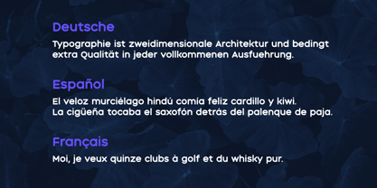
Die Schriftfamilie Aqum Two wurde von Slava Antipov entworfen und von Slava Antipov veröffentlicht. Aqum Two enthält 4 Stile und Familienpaketoptionen. Mehr über diese Familie

pro Font:

$27.50 USD $19.25 USD

Paket mit 2 Fonts:

$55.00 USD $38.50 USD

pro Font:

$27.50 USD $19.25 USD

Paket mit 2 Fonts:

$55.00 USD $38.50 USD

pro Font:

$22.50 USD $15.75 USD

Paket mit 2 Fonts:

$45.00 USD $31.50 USD

Über die Familie


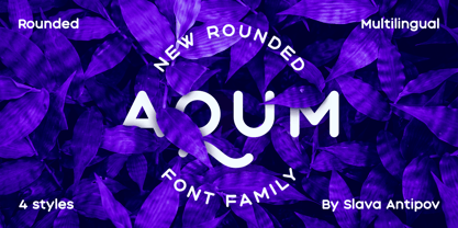
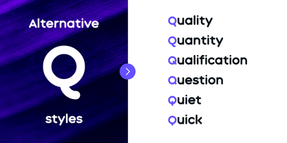
Aqum Two is a rounded geometric sans serif family built around soft corners, rounded terminals, and four distinct styles. Its friendly construction gives the family a playful and approachable character while keeping the underlying forms simple and geometric.

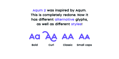
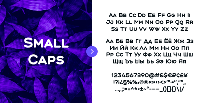
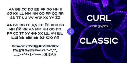
The family includes Bold, Small Caps, Classic, and Curl.

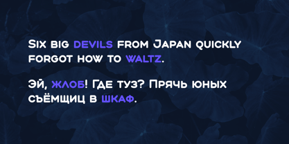
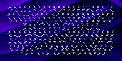
Aqum Two Bold combines uppercase and lowercase forms for a stronger contemporary display style. Small Caps uses compact uppercase forms for an alternative typographic texture. Classic returns to the all-capital character of the original Aqum design, while Curl transforms the family into its most expressive form with around 290 alternate glyphs.

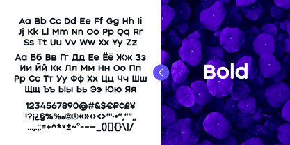
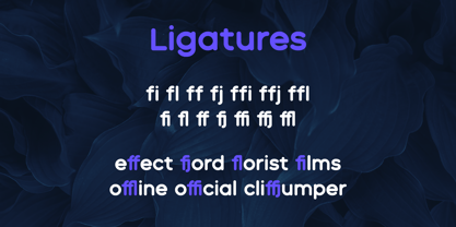
The styles contain between 274 and 564 glyphs, depending on the design. Bold includes standard ligatures in addition to kerning, while Curl provides its large set of alternate glyphs.

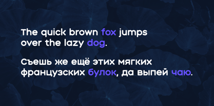
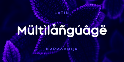
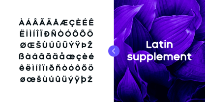
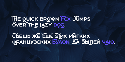
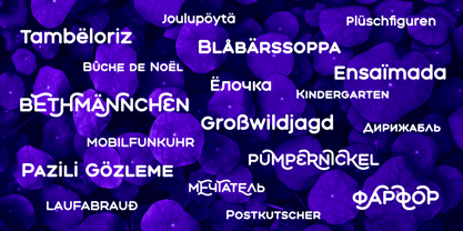
Aqum Two supports Latin and Cyrillic scripts and is particularly well suited to logos, packaging, posters, headlines, social media graphics, merchandise, and other display-oriented projects.

The combination of rounded geometric forms, multiple capitalization styles, and the highly expressive Curl style makes Aqum Two suitable for projects looking for a friendly, playful, and distinctive typographic character.

Designer: Slava Antipov

Foundry: Slava Antipov

MyFonts Debüt: Jun 4, 2021

Aqum Two

Über Slava Antipov

Slava Antipov is an independent typeface designer focused on contemporary type families, with a particular interest in grotesques and sans serifs. His work explores the balance between functional typography and distinctive visual character, combining geometric construction, expressive details, varied proportions, and flexible typographic systems. Slava creates typefaces for a wide range of contemporary design applications, from branding and visual identities to editorial design, packaging, posters, digital products, and display typography. His families often explore multiple weights, widths, styles, and advanced typographic features, with an emphasis on creating useful and versatile systems rather than isolated typefaces. Multilingual typography is an important part of his work. Latin and Cyrillic have been the foundation of his typefaces from the beginning, while newer projects increasingly expand into Greek and Vietnamese and explore additional writing systems. He is particularly interested in developing high-quality typefaces that make contemporary typography more accessible to designers working across different languages and writing systems. While contemporary grotesques remain the main focus of his work, Slava continues to explore new typographic directions, visual approaches, and writing systems as his type library grows.

Mehr lesen

Weniger lesen