Special dicsount on my website koplexs com.
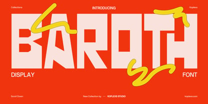
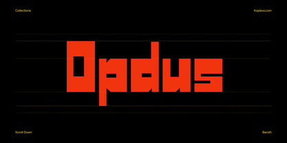
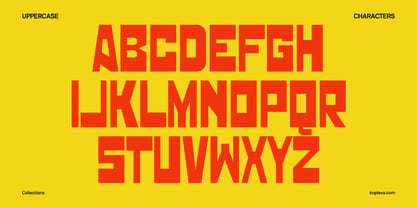
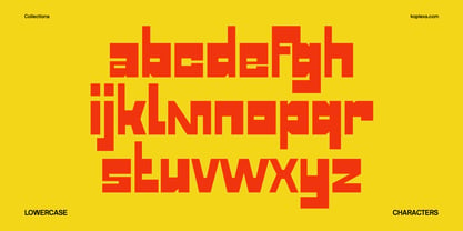
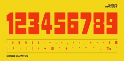
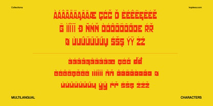
Baroth is a bold display typeface built for strong visual impact. Its heavy, condensed letterforms and solid geometric construction give every word a confident, modern presence, making it especially effective when typography needs to become the main focus of a design.
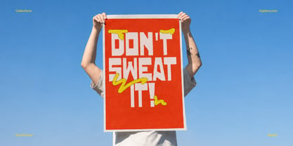
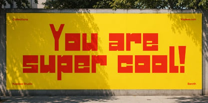
Designed for large-scale use, Baroth works beautifully across posters, headlines, branding, packaging, advertising, editorial layouts, album covers, merchandise, streetwear graphics, social media campaigns, and website hero sections. Its compact proportions help create powerful compositions while keeping the overall layout visually controlled and direct.
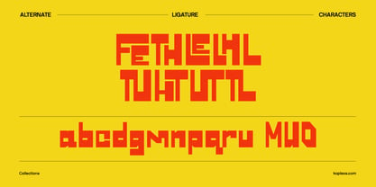
What gives Baroth its personality is the balance between bold structure and expressive character. The letterforms feel strong and graphic without becoming overly complicated, giving designers plenty of room to build energetic layouts around the type. It can feel contemporary, urban, playful, or slightly brutalist depending on how it is used.
Baroth is especially suited to projects that need attention-grabbing typography, such as fashion branding, creative studios, music artwork, event promotion, product packaging, sports graphics, and modern lifestyle identities.
For contrast, Baroth pairs well with clean sans serif typefaces for body copy and minimal layouts. It can also work alongside a refined serif typeface when you want to create a stronger contrast between expressive headlines and more elegant supporting text.
Baroth was created for designers who want their typography to feel bold, memorable, and full of personality. Whether used as a large headline, logo treatment, campaign title, or statement graphic, it helps turn simple words into a strong visual element.
Choose Baroth when your design needs bold display typography that speaks clearly, confidently, and with impact.