





Direkt zum Inhalt
Zum Hauptinhalt springen

Bibliopola Pro LCG

von Jovica Veljovic
Einzelschnitte ab $75.00 USD
Komplette Familie mit 10 Fonts: $535.00 USD
Die Schriftfamilie Bibliopola Pro LCG wurde von Jovica Veljovic entworfen und von Jovica Veljovic veröffentlicht. Bibliopola Pro LCG enthält 8 Stile und Familienpaketoptionen. Mehr über diese Familie

Über die Familie


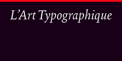
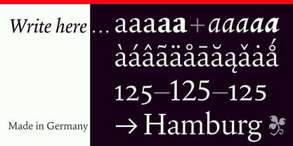
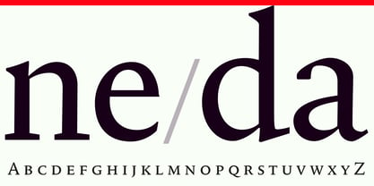
For years, Veljović has worked to blend the beauty and elegance of Renaissance typefaces with the modern form of classic serif typefaces, catering to the simplicity and demands of contemporary typography for both print and screen. At first glance, Bibliopola radiates a refined yet understated aura, with all glyphs harmoniously arranged to ensure that no letter appears out of rhythm. The color, tone, and sound are preserved, all subordinated to high legibility and reading comfort. While the text presents a calm and even appearance—Veljović's primary goal—closer inspection reveals a subtle calligraphic character in the main strokes, which are slightly thinner at the top than at the bottom. This is particularly evident in the capital letters B, D, H, I, P, R, as well as in the lowercase letters b, h, k, m, n, l. Veljović's calligraphic sensibility shines through, especially in the italic version, where the capital letters maintain a subtle understatement while the controlled calligraphic elements are more pronounced in italic glyphs such as a, e, h, n, m, and z. Bibliopola boasts a consistent overall tone and well-balanced stroke weights, making it highly space-efficient with moderate contrast. This typeface is perfect for reading longer texts, even at small sizes, both on screen and in print. Similar to Agmena, Bibliopola features subtle color variations between the regular and medium weights to meet different printing requirements across various paper textures. It is available in Light, Regular, Medium, Semibold, and Bold weights, along with corresponding italic styles and extended character sets in Cyrillic and Greek. Additionally, old-style figures and small caps are offered for both roman and italic designs across all weights.

Designer: Jovica Veljovic

Foundry: Jovica Veljovic

MyFonts Debüt: Jul 13, 2026

Bibliopola Pro LCG

Über Jovica Veljovic

Jovica Veljović is independent type foundry that is passionate about type design and production. Quality is the highest priority and primary goal in his type designs. With decades of experience in type design, calligraphy, typography and art, Jovica Veljović has developed a keen sense for the requirements of good, functional typefaces. For almost 30 years, he has been a professor of type design and typography and shared his knowledge with students at the Hamburg University of Applied Sciences (HAW). Whenever possible, Veljović strives to integrate extended OpenType features into his typefaces, alongside Latin, Cyrillic, and Greek glyph sets. He is convinced that combining the tradition and history of typography with today's technologies can pave the way for a promising future in type design and typography. His frustration with the production work he had with the mayor companies in the field led him to believe that the budget and time for production work should be unlimited.

Mehr lesen

Weniger lesen