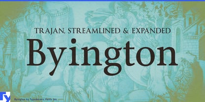
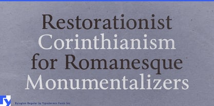
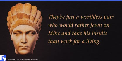
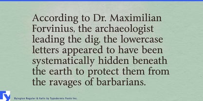
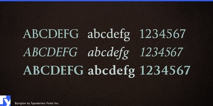
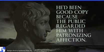
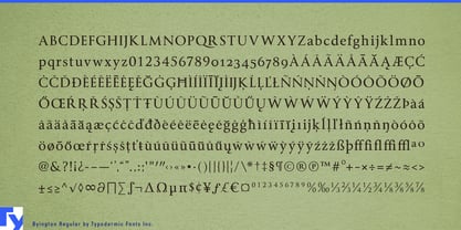
Trajan is one of typography’s clearest shortcuts to monumentality, right up until the client asks for lowercase. Then the designer has a practical problem: keep the Roman inscriptional capitals and bolt on something unrelated, abandon the direction, or find a family that can carry the same authority beyond a single line. Byington was built for that situation. Its capitals draw on the monumental Roman tradition associated with Trajan, while its lowercase extends that character into mixed-case names, headings, sub-brands, and supporting display typography.
Byington is also tougher than the usual inscriptional model. It originated in a screen project where fine serifs and delicate transitions had to survive low-resolution video, so the forms were strengthened rather than treated as an archaeological reconstruction. That gives the family a more substantial presence on signs, menus, plaques, packaging, displays, and other applications where a fragile classical serif can feel too refined.
Premium hospitality is one of the clearest uses. Heritage hotels, destination resorts, private clubs, golf resorts, steakhouses, and formal restaurant groups often want Roman authority for the main name but need far more than a logo. Byington can continue into restaurant names, room categories, facility names, menu headings, event titles, guest materials, and environmental graphics without changing typographic language every time lowercase appears.
Museums, universities, foundations, performing-arts organizations, and historical institutions face the same problem. A monumental title may establish the right tone for an institution, exhibition, building, or commemorative program, but real systems also need gallery names, lecture series, donor recognition, annual-report headings, event titles, and directional graphics.
Prestige film, television, documentary, and narrative games provide another natural territory. A Trajan-like title can establish historical scale or institutional gravity, but a franchise soon needs episode cards, chapter names, character introductions, locations, factions, expansions, menus, and promotional headings. Byington keeps that Roman-derived atmosphere working after the title sequence ends.
Its sturdier construction also suits dimensional lettering, donor walls, engraved plaques, etched glass, stone or metal signage, building names, and formal wayfinding. The same quality carries into premium products where heritage and physical substance matter, including wine estates, distilleries, leather goods, luggage, and classic-vehicle specialists.
Byington keeps monumental Roman lettering useful after the first line. The capitals establish the grand gesture; the lowercase and sturdier construction let the same voice continue into the practical parts of an identity.