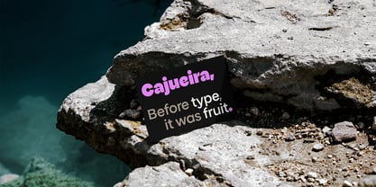
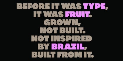
Before it was type, it was growth.
Cajueira is a geometric sans-serif inspired by the logic of cultivation. Rather than drawing from the visual appearance of the Brazilian cashew tree, the project translates processes of growth, expansion, and maturation into a typographic system.
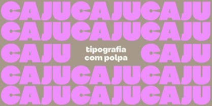
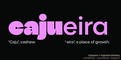
Its name defines its essence: “caju,” the fruit, and “-eira,” a place of becoming. Cajueira is conceived not as a static object but as a living system that develops across its weight range.
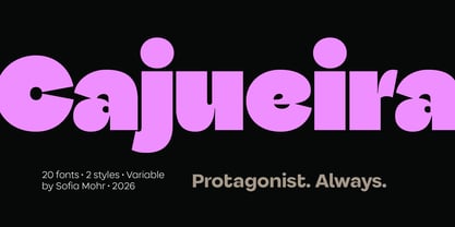
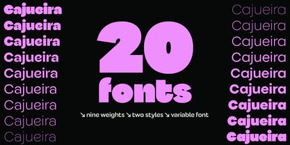
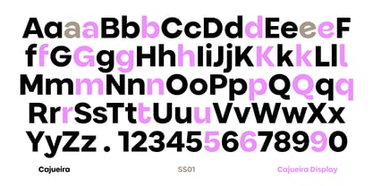
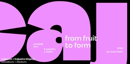
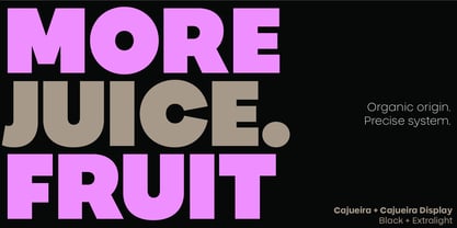
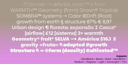
The family includes 18 styles, from Thin to UltraBlack, across Normal and Display versions, as well as two variable fonts: Cajueira Variable and Cajueira Display Variable. Throughout this progression, the typeface undergoes a gradual transformation. What begins as a light, open, and restrained structure becomes increasingly dense, compact, and assertive. Each weight represents a stage in a process of maturation rather than simply an increase in thickness.
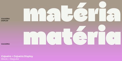
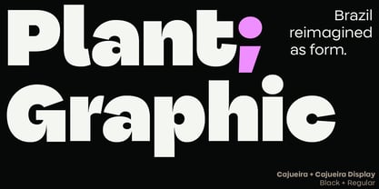
The family is structured around two complementary voices. The Normal version balances personality and readability for editorial, branding, packaging, and digital applications. The Display version embraces greater formal freedom, amplifying the expressive potential of the design and its visual impact at larger sizes.
Built on a precise geometric foundation, Cajueira explores the tension between narrow vertical structures and expansive curved forms. As the weights grow heavier, counters tighten, curves expand, and the typeface gains presence, moving from clarity toward expression. In its heaviest styles, characters draw closer together, generating dense fields of black where reading becomes inseparable from visual perception. Text is experienced not only as language, but also as texture, rhythm, and atmosphere.
Rooted in a contemporary Latin American perspective, Cajueira challenges the neutrality often associated with geometric typefaces. Its identity emerges not from ornament but from transformation—from the idea that typography, like nature, can evolve, mature, and acquire character over time. This approach earned Cajueira a place in the 10th Bienal Tipos Latinos, one of the most important showcases of contemporary Latin American typography.
Cajueira is not merely designed.
It is cultivated.