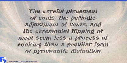
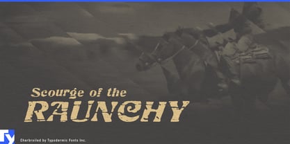
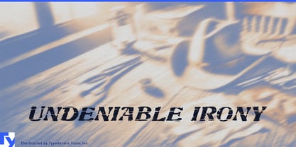
Live-fire food has a typography problem. Clean modern lettering can feel too polished for smoke, char and wood; conventional Western type can turn a serious restaurant or product into a costume. Charbroiled occupies the useful space between them: an old American italic display face with the wear already built into the strokes.
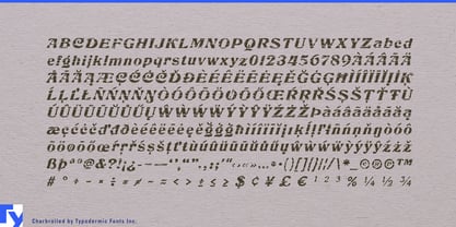
The design began with American Italic, a 1902 typeface by Hermann Ihlenburg, and was reconstructed from scans of an old metal-type catalog. Its narrow, forward-leaning forms retain the brisk commercial energy of the original, while a texture derived from photographs of weathered barn boards gives the letters a scorched, handled surface.
Smokehouses, charcoal-grill restaurants, open-fire kitchens, steakhouses and wood-fired dining concepts can use Charbroiled for names, menu section headings, signature-dish titles, takeaway packaging and campaign graphics that suggest heat and age without resorting to cartoon flames or saloon lettering. As a distinctive single display style, it works naturally beside a cleaner companion face for descriptions, prices and service information.
Barbecue sauces, dry rubs, smoked salts, jerky, smoked nuts and other fire-oriented pantry goods present the same problem on a smaller surface. Charbroiled’s condensed width helps long flavor names and product variants stay prominent on bottles, tins and narrow front panels, while mixed case gives it more flexibility than an all-caps novelty face.
Smokers, charcoal grills, fire-pit cooking systems, lump charcoal, smoking wood and pellet fuels extend the same language into outdoor cooking. Model names, fuel varieties, cartons, dealer displays and launch graphics gain a weathered character with a direct material connection to heat, smoke and wood.
Bourbon, rye, barrel selections and smoked-cocktail programs offer a related territory for series names, tasting-event graphics and menu headings. The turn-of-the-century American structure and worn surface provide age and atmosphere without relying on frontier clichés.
Charbroiled gives brands built around smoke, wood and heat an aged American display voice without forcing them into cowboy typography or decorative fire effects.