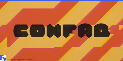
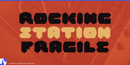
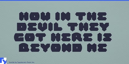
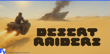
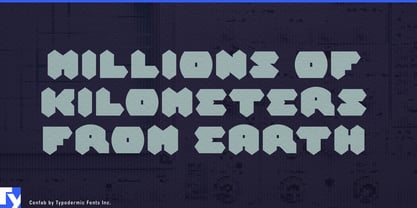
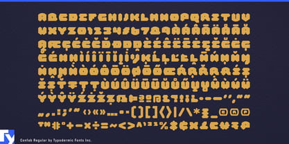
A lot of rugged-product typography communicates toughness by simply getting heavier. Confab takes a different route. Its wedges, protrusions, abrupt cuts and interlocking shapes suggest objects designed to bite, grip, cut or lock together. The letters look constructed from parts rather than drawn around a conventional skeleton, giving short words a physical quality without resorting to distressed surfaces or generic industrial boldness.
That makes traction products an especially strong fit. Trail-running shoes, hiking boots, winter footwear and aggressive outsole systems use geometry to communicate grip long before the customer reads a specification. Confab can handle shoe model names, traction-technology names, launch graphics and retail displays where the typography appears beside molded lugs, faceted soles and close-up tread photography. Its angularity suggests performance through shape rather than the familiar slanted language of speed.
Winter and off-road tires push the same idea harder. Tread blocks, grooves and biting edges are designed around contact with difficult surfaces, and Confab’s protruding forms can feel almost tread-like themselves. Tire model names, snow-traction campaigns, dealer displays and technology headings can use the face as the distinctive display layer while a conventional sans handles dimensions, ratings and technical information.
Cutting tools offer another interpretation of the same geometry. Circular saws, reciprocating-saw blades, cutting discs, router bits and demolition tools already speak through teeth, edges and repeated angular forms. Confab can name a blade series, identify a cutting technology or dominate tool packaging and workshop displays without relying on stencil lettering or simulated metal textures. Power tools, tool storage, clamps, work lights and rugged cases can extend that visual language across a workshop product range.
Architectural products open the idea beyond obvious rugged equipment. Façade panels, folded-metal cladding, perforated screens and louver systems are built from repeated components, joints and negative spaces that can echo Confab’s assembled construction. Architectural hardware such as brackets, hinges, mounting systems and structural connectors makes an even more literal match: products whose purpose is to engage with another part.
Grip becomes architectural too. Stair nosings, anti-slip treads, grated walkways, entrance systems and non-slip decking use serrations, grooves and raised surfaces to create traction underfoot. Confab can bring that same sense of engagement into product-family names, catalog covers, trade-show graphics and specification headings. Modular acoustic panels, ceiling baffles and partition systems offer a quieter variation, using the font’s geometry to echo repeated pieces fitted together in space.
Ruggedized outdoor and jobsite equipment can draw on the same vocabulary. Protective cases, recovery gear, hard-shell accessories and impact-resistant products benefit from typography that looks physically engaged with the object rather than merely labeled as tough. Confab is particularly effective for product names and short technology terms where its unusual silhouettes have room to register.
Puzzles provide a completely different market for the same construction. Spatial logic games, puzzle boxes, abstract strategy games, construction toys and escape-room identities can make Confab’s interlocking forms feel like pieces waiting to rotate, slide or fit together. Here the strange cuts and projections suggest problem solving rather than aggression, giving the font a playful use that has little to do with conventional science-fiction graphics.
Confab works best where a product, system or game needs a name that feels physically constructed: something designed to grip a trail, bite into ice, cut through material, fasten a façade or click into place with the next piece.