Direkt zum Inhalt
Zum Hauptinhalt springen

Cuelas Varoe

von Maikohatta
Einzelschnitte ab $8.00 USD
Komplette Familie mit 2 Fonts: $15.00 USD
Die Schriftfamilie Cuelas Varoe wurde von Gilang Ternadho entworfen und von Maikohatta veröffentlicht. Cuelas Varoe enthält 2 Stile und Familienpaketoptionen. Mehr über diese Familie

Über die Familie


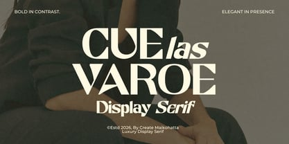
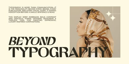
Introducing our new product Cuelas Varoe – Luxury Display Serif

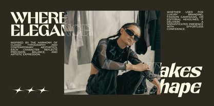
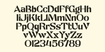
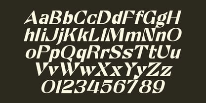
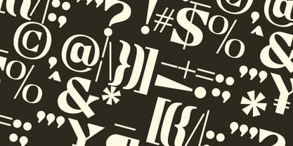
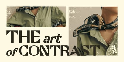
Cuelas Varoe – Luxury Display Serif is a bold and elegant display serif typeface designed to make a lasting impression. Featuring dramatic high-contrast strokes, refined curves, and stylish letterforms, Cuelas blends timeless sophistication with a contemporary editorial aesthetic. Its distinctive character makes it perfect for luxury branding, fashion campaigns, premium packaging, magazine headlines, beauty products, logos, and upscale marketing materials.

Created to stand out in large sizes, Cuelas delivers exceptional readability while adding a sense of exclusivity and confidence to every design. Whether you're crafting a modern fashion identity or an elegant editorial layout, this typeface brings refined luxury and visual impact to your creative projects.

Designer: Gilang Ternadho

Foundry: Maikohatta

MyFonts Debüt: Aug 7, 2026

Cuelas Varoe

Über Maikohatta

Embark on a typography exploration guided by Maikohatta, a seasoned authority in the intricate realm of visual communication. With a steadfast commitment to precision and meticulousness, Maikohatta's expertise shines through.In Maikohatta's interpretation, typography transcends the mere arrangement of letters; it metamorphoses into a harmonious fusion of visual artistry and practicality. Each typeface, whether thoughtfully selected or uniquely crafted, contributes as a distinctive stroke in the broader narrative canvas. Typography, in my view, extends beyond mere legibility, it is a means of evoking emotional connections that linger in the observer's memory.My forte lies in versatility. Whether blending refined serifs for enduring elegance, exploring avant-garde sans-serifs for contemporary appeal, or fashioning bespoke scripts for a personal touch, I navigate the expansive typographic domain with finesse.Beyond fonts and letterforms, I excel in constructing typographic systems that establish hierarchy, rhythm, and visual coherence. The outcome is a seamless fusion of aesthetics and utility, where each typographic decision serves a deliberate role in the grand orchestration of design.

Mehr lesen

Weniger lesen