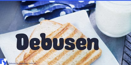
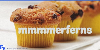
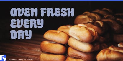
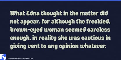
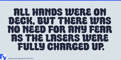
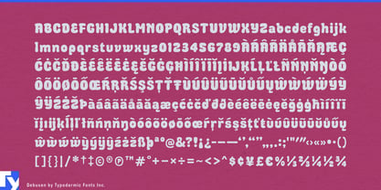
Soft foods have a hard packaging problem. Before anyone can squeeze the loaf, pull apart the roll, or bite into the gummy, the package has to communicate tenderness, chew, and spring. An ordinary rounded sans may look friendly, but it still looks manufactured. Debusen makes words appear as though they have risen, expanded, and pressed against their own outlines.
Heavy strokes bulge around narrow counters, while terminals spread into soft knobs and flattened cushions. The letters resemble dough pushed through a shaped opening, foam settling into a mold, or fabric packed with stuffing. That physical exaggeration gives Debusen a bouncy, slightly ungainly rhythm with more substance than conventional bubble lettering.
Milk bread, brioche, cinnamon rolls, muffins, doughnuts, soft cookies, mochi, marshmallows, gummy candy, chewy cereal bars, and filled pancakes all provide natural territory. Debusen can carry product names, flavour launches, multipack cartons, freezer displays, menu boards, delivery boxes, and seasonal promotions. Its forms suggest fluffiness, stretch, filling, air pockets, and a soft centre without drawing any of them literally.
Products made through rising, culturing, and fermentation reveal another side of the same idea. Sourdough starters, yogurt, kefir, whipped desserts, fermented dough, and probiotic snacks can connect Debusen’s swollen forms with bubbles, yeast, expansion, and microbial activity.
Beyond food, Debusen belongs wherever products invite squeezing, stretching, molding, or hugging. Squishy toys, modeling compounds, slime kits, foam craft sets, plush collectibles, inflatable play equipment, and bath products can use it on packaging, retail displays, and animated campaigns. Soft-sculpture exhibitions, textile shows, tactile museum programs, comedy series, children’s animation, and exuberant variety-show graphics offer further room for cheerful excess.
Debusen works best as the physical voice of a design. Let it handle product names, campaign headlines, flavour callouts, exhibition titles, and short bursts of oversized copy; a quieter companion can take care of ingredients, schedules, instructions, and dense text. The contrast gives softness room to expand.