Diese Einstiegs-Lizenz ermöglicht die persönliche und gewerbliche Nutzung für traditionelle Grafikdesign-Arbeiten.
Mit der Desktop-Lizenz können Sie flache, nicht editierbare Designs erstellen, drucken und teilen, wie zum Beispiel:
Markenidentität
Fonts einsetzen, um eine starke und einheitliche Markenidentität zu schaffen.
Videos
Fonts in Titeln, im Abspann und als On-Screen-Text verwenden.
PDFs
Berichte, Broschüren und digitale Dokumente gestalten und formatieren.
Grußkarten
Einzigartige, personalisierte Karten für jeden Anlass gestalten.
Logos
Einprägsame, professionelle Logo-Typografie entwickeln.
Beschilderung (Wegweiser & Plakate)
Klare, auffällige Beschilderung für den Innen- oder Außenbereich erstellen.
Flyer
Lesbare, attraktive Überschriften und Layouts setzen.
Verpackung
Produktverpackungen mit stilvollem Text aufwerten.
Album-Cover
Gedruckte individuelle Textdesigns auf T-Shirts, Hoodies und mehr.
Plakate
Mutige, auffällige Plakat-Layouts.
Einladungen
Stilvolle, personalisierte Einladungen für Veranstaltungen erstellen.
Social-Media-Beiträge
Grafiken und Untertitel mit einzigartigen Fonts aufwerten.
Visitenkarten
Professionelle, einprägsame Visitenkarten-Designs gestalten.
Schulprojekte
Projekte mit kreativem Text hervorheben.
Wortmarken
Starke, wiedererkennbare Marken-Wortmarken entwickeln.
Geschäftspapiere
Elegante Briefköpfe, Umschläge und Notizen gestalten.
Diese Lizenz unterstützt Folgendes nicht:
Kommerzielle Druckumgebungen
Nicht für großflächige Druckgeschäfte.
E-Mails
Fonts sind in E-Mail-Vorlagen nicht gestattet.
Mehr erfahren
Weitergabe des Fonts
Fonts dürfen nicht an andere weitergegeben werden.
Andere zur Nutzung des Fonts berechtigen
Lizenz gilt nur für Sie.
Zusammenarbeit
Fonts dürfen nicht in Teams geteilt werden.
Mehr erfahren
Modifizieren
Fonts dürfen nicht verändert oder bearbeitet werden.Mehr erfahren
Installation auf einem Server
Fonts dürfen nicht auf einem Server installiert werden.
DAMs
Fonts dürfen nicht als herunterladbare Assets auf DAMs gehostet werden.
Desktop-Lizenzen richten sich nach der Anzahl der Nutzer der Fonts, d.h. der Anzahl der Computer, auf denen
der Font installiert wird. Sie können die Anzahl der Nutzer ändern, indem Sie die Option für die Mengenauswahl auf
den Seiten „Kaufoptionen“ oder „Warenkorb“ auswählen.
Bitte stellen Sie sicher, dass Sie die
Desktop-Lizenzvereinbarung der listenden
Foundry überprüfen, da einige Einschränkungen gelten können – wie die Nutzung in Logos/Markenzeichen,
geografische Einschränkungen (Anzahl der Standorte) und Produkte, die verkauft werden.
Spätere Hinzufügung von Nutzern:
Desktop-Lizenzen sind kumulativ. Wenn Sie eine Desktop-Lizenz benötigen, die zusätzliche Nutzer abdeckt,
geben Sie einfach eine neue Bestellung für dasselbe Desktop-Paket mit der Anzahl der zusätzlichen Nutzer auf.
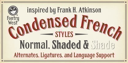
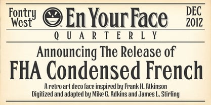
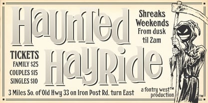
FHA Condensed French
Desktop
Wählen Sie eine Company Desktop-Lizenz, wenn Fonts dort verfügbar sein sollen, wo Ihr Team tatsächlich arbeitet: auf den Arbeitsplätzen Ihrer Mitarbeitenden, in Design-Tools, Office-Anwendungen, Marken-Workflows und den täglichen Kreativprozessen. Entwickelt für Teams, die eng zusammenarbeiten, für anspruchsvollere Workflows und für Marken, deren Fonts unternehmensweit souverän zum Einsatz kommen sollen.
Mit dieser Lizenz können Ihre Mitarbeitenden Materialien erstellen, bearbeiten, ansehen, drucken und verteilen, sofern die Font-Software selbst nicht in diese Assets eingebettet wird. Sie eignet sich gut für interne Markenprojekte, Präsentationen, Verpackungslayouts, statische Grafiken, Marketingmaterialien und andere im Unternehmen erstellte Assets.
Company Desktop unterstützt außerdem die praktische Zusammenarbeit an Dokumenten. Lizenzierte Nutzer dürfen nicht-kommerzielle, nicht bearbeitbare PDFs mit eingebetteten Fonts erstellen und teilen. Die Company Desktop-Lizenz ist zudem nach Unternehmensgröße gestaffelt, sodass Ihre Mitarbeitenden Fonts gemeinsam und in internen DAM-Systemen nutzen können. Für kommerzielle eBooks, eMagazines oder andere kostenpflichtige elektronische Dokumente ist eine separate Commercial Electronic Document-Lizenz erforderlich.
Diese Lizenz richtet sich nach der Anzahl Ihrer Mitarbeitenden. Sie müssen eine Lizenzstufe erwerben, die für Ihre gesamte Unternehmensgröße ausreicht, und die lizenzierten Nutzer müssen Ihre Mitarbeitenden sein. Ein Austausch der Nutzer während der Lizenzlaufzeit ist nicht zulässig (non-concurrent).
FHA Condensed French
Company Desktop
Webfonts: für Ihre Webseite
Webfonts ermöglichen die Einbettung von Font in eine Webseite unter Verwendung der @Font-face-Regel, so dass Absätze und Überschriften
von Text als Webfont gestaltet werden können. Sie stellen das Webfont-Kit für Ihre eigene Website bereit und verlinken
es im CSS.
Webfonts auf einer einzigen Domäne verwendet werden können. Agenturen, die für mehrere Webseiten verantwortlich sind, z. B. Web
Design-Agenturen oder Hosting-Anbieter, dürfen eine einzelne Webfont-Lizenz nicht für mehrere Webseiten verwenden.
Wenn die Datei Font selbst nicht in Webseite eingebettet wird (z. B. wenn die Datei Font in einer statischen Grafik wie einem Logo verwendet wird)
Grafik wie z. B. einem Logo verwendet wird), sollten Sie stattdessen eine Desktop Lizenz erwerben.
Die meisten Foundrys auf MyFonts bieten ihre webfonts mit dem Jahreslizenzmodell an. Klicken Sie hier für
Mehr erfahren.
FHA Condensed French
WebFont