Direkt zum Inhalt
Zum Hauptinhalt springen

FHA Tuscan Roman

von Fontry West
Einzelschnitte ab $20.00 USD
Komplette Familie mit 4 Fonts: $25.00 USD
Die Schriftfamilie FHA Tuscan Roman wurde von Michael Gene Adkins, James L. Stirling entworfen und von Fontry West veröffentlicht. FHA Tuscan Roman enthält 4 Stile und Familienpaketoptionen. Mehr über diese Familie

Über die Familie


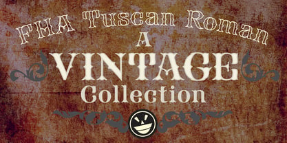
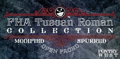
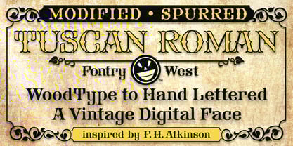
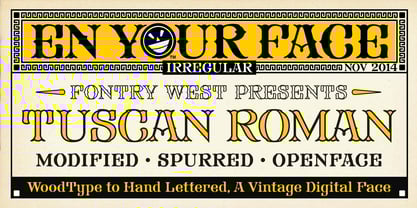
The first Tuscan lettering was penned in the mid-fourth century by the calligrapher Furius Dionysius Filocalus. The style was still in common usage as calligraphy when Vincent Figgins designed the first Antique Tuscan for print in 1817. Antique and Gothic Tuscan woodtype fonts appeared in the 1830’s. By the 1850’s, Tuscan fonts had become popular in America. These styles continued in print use into the twentieth century. Tuscan Antique and Gothic styles, borrowed from print and calligraphy, were perfect for signs, posters, handbills and other large format advertising. Sign painter, Frank Atkinson demonstrated several Tuscan forms in his book Sign Painting, A Complete Manual. Modified & Spurred Tuscan Romans were inspired by this and other works of the same period.

Designer: Michael Gene Adkins, James L. Stirling

Foundry: Fontry West

MyFonts Debüt: Oct 8, 2014

FHA Tuscan Roman

Über Fontry West

Before the internet went big, when access was still dial-up, Mike Adkins and James Stirling sat in a room with the song of a vinyl cutter singing in the background. It was summer in Oklahoma, hot and humid, even at night. It was late or early, depending on which direction you were coming from. On the side of a manila envelope was scribbled a word: "Fontry." It was a made-up word to identify the contents. Inside the tattered folder were thoughts and ideas on scraps of paper—sketches of letterforms. Between the two men, who were hanging on to wakefulness with caffeine and stubbornness, there was a discussion, a discourse concerning the future. Pages were pulled from the envelope and spread out to share an idea. Did they have any background in fonts or typography? No. What they had was a feel for letterforms and whatever their instructors at the local university had been able to drum into their heads. That was enough to start. There have been many starts and a lifetime of learning. Not every product has been a success, but a few have found their way into type history. The work of the two men has surfaced in every aspect of human graphic endeavor. There is no medium that has not felt the momentary touch of their creativity. Together, with the manic smile of their mascot, they are The Fontry®.

Mehr lesen

Weniger lesen