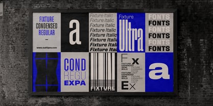
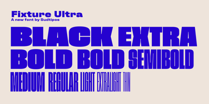
Fixture Ultra Thin
Fixture Ultra Italic Thin
Fixture Ultra Extra Light
Fixture Ultra Italic Extra Light
Fixture Ultra Light
Fixture Ultra Italic Light
Fixture Ultra Regular
Fixture Ultra Italic Regular
Fixture Ultra Medium
Fixture Ultra Italic Medium
Fixture Ultra Semi Bold
Fixture Ultra Italic Semi Bold
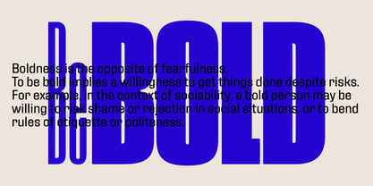
Fixture Ultra Bold
Fixture Ultra Italic Bold
Fixture Ultra Extra Bold
Fixture Ultra Italic Extra Bold
Fixture Ultra Black
Fixture Ultra Italic Black
Fixture Condensed Thin
Fixture Italic Condensed Thin
Fixture Condensed Extra Light
Fixture Italic Condensed Extra Light
Fixture Condensed Light
Fixture Italic Condensed Light
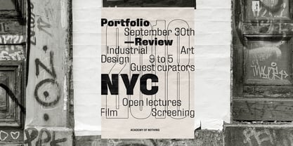
Fixture Condensed Regular
Fixture Italic Condensed Regular
Fixture Condensed Medium
Fixture Italic Condensed Medium
Fixture Condensed Semi Bold
Fixture Italic Condensed Semi Bold
Fixture Condensed Bold
Fixture Italic Condensed Bold
Fixture Condensed Extra Bold
Fixture Italic Condensed Extra Bold
Fixture Condensed Black
Fixture Italic Condensed Black
Fixture Thin
Fixture Italic Thin
Fixture Extra Light
Fixture Italic Extra Light
Fixture Light
Fixture Italic Light
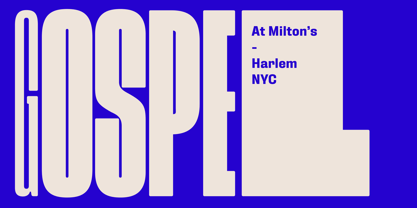
Fixture Regular
Fixture Italic Regular
Fixture Medium
Fixture Italic Medium
Fixture Semi Bold
Fixture Italic Semi Bold
Fixture Bold
Fixture Italic Bold
Fixture Extra Bold
Fixture Italic Extra Bold
Fixture Black
Fixture Italic Black
Fixture Expanded Thin
Fixture Italic Expanded Thin
Fixture Expanded Extra Light
Fixture Italic Expanded Extra Light
Fixture Expanded Light
Fixture Italic Expanded Light
Fixture Expanded Regular
Fixture Italic Expanded Regular
Fixture Expanded Medium
Fixture Italic Expanded Medium
Fixture Expanded Semi Bold
Fixture Italic Expanded Semi Bold
Fixture Expanded Bold
Fixture Italic Expanded Bold
Fixture Expanded Extra Bold
Fixture Italic Expanded Extra Bold
Fixture Expanded Black
Fixture Italic Expanded Black
Fixture Variable
Fixture Ultra Variable