




Direkt zum Inhalt
Zum Hauptinhalt springen

Gildabeth

von Typodermic
Einzelschnitte ab $69.95 USD
Komplette Familie mit 14 Fonts: $169.95 USD
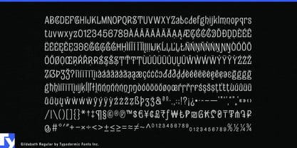
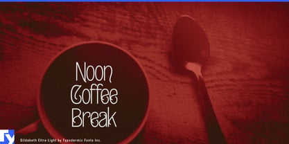
Die Schriftfamilie Gildabeth wurde von Ray Larabie entworfen und von Typodermic veröffentlicht. Gildabeth enthält 14 Stile und Familienpaketoptionen. Mehr über diese Familie

Über die Familie


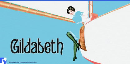
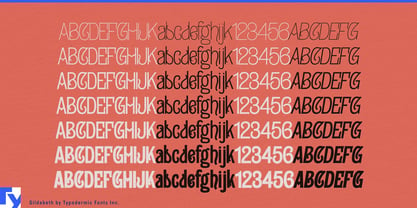
Decorative display typefaces often come with one setting: loud. That may be enough for a logo, but beauty, fashion and hospitality brands usually need more range. A salon might want a delicate service heading, a stronger product name and a huge seasonal window graphic without changing its visual language each time. Gildabeth solves that problem with seven weights whose eccentric construction can shift from wiry and decorative to dense and exuberant.

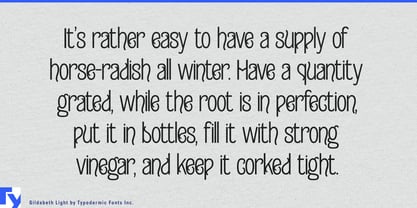
Its narrow proportions, high contrast and peculiar curves give the lighter weights a romantic quality without turning them into conventional scripts or luxury Didones. That makes Gildabeth particularly useful for boutique salons and haircare brands. Shampoo, conditioner, treatment masks, styling products and fragrance lines can move from fine product names and scent variants to stronger campaign headlines, gift sets and retail displays. Salon identities can carry the same language through service menus, appointment cards and window lettering.

Bath-and-body products and decorative giftware extend that territory naturally. Hand creams, soaps, bath salts, scented candles, fragrance collections, cosmetic bags, tea tins and seasonal gift boxes often live among floral illustration, pattern and ornament. Thin and Light can sit delicately beside botanical imagery, while heavier weights provide enough presence for packaging fronts, collection names and shop displays.

Fashion brings out a sharper side. Mod-inspired clothing, patterned dresses, eyewear, accessories and colorful boutique collections suit Gildabeth’s combination of narrow geometry and exaggerated detail. Lighter styles bring elongated elegance to lookbooks and garment tags; heavier weights give collection names, shop windows and campaign typography considerably more graphic force.

Food and hospitality reveal its playful end. Ice-cream parlors, cake shops, dessert cafés, afternoon-tea rooms and whimsical bakeries can use Gildabeth for menu headings, flavor names, packaging and signs. In the heavier weights, those same unusual shapes become chunky enough for retro burger shops, milkshake menus, fry cartons and colorful diner graphics.

That change of temperament is one of Gildabeth’s most useful qualities. Many eccentric display faces give designers one spectacular voice; Gildabeth lets the same odd proportions whisper, speak or shout. A hand-cream label, salon menu, mod-fashion lookbook and burger-shop window can all draw from the same family without requiring the same degree of visual intensity.

Seven weights with matching italics let designers control the eccentricity rather than switch it off: delicate enough for a serum bottle, assertive enough for a salon window, sharp enough for a mod-fashion campaign and loud enough to shout over a basket of fries.

Designer: Ray Larabie

Foundry: Typodermic

MyFonts Debüt: Apr 15, 2024

Gildabeth

Über Typodermic

Welcome to Typodermic Fonts, a spirited type foundry rooted in Nagoya, Japan, started by the Canadian typeface designer, Raymond Larabie in 2001. Our library brims with 500+ diverse typefaces to fuel creativity in graphic design, advertising, web, and app development. As digital type pioneers, we adopted web fonts and app licensing early, consistently pushing the design envelope. With Canadian heart and Japanese precision, we're your global partners in extraordinary typography. Explore Typodermic Fonts—where creativity meets character.

Mehr lesen

Weniger lesen
