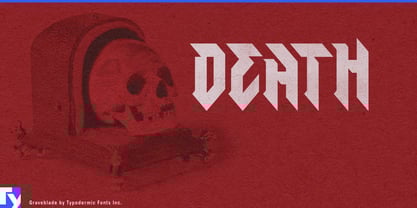
Aggressive display lettering often forces a choice. Traditional blackletter can provide darkness and historical weight, but it may pull a project toward medieval associations. Extreme-metal lettering can look genuinely hostile, but sometimes at the cost of immediate recognition. Cleaner angular fonts stay readable, yet often lose the sense of danger that made the designer reach for something sharper in the first place.
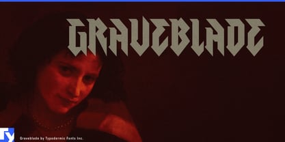
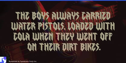
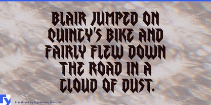
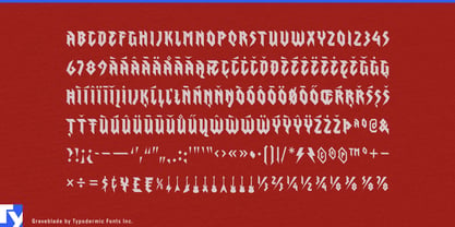
Graveblade is built for the space between those extremes. Its condensed forms retain some of the rhythm and compression of blackletter, but the strokes are simplified into blades, lightning-like diagonals, sharp terminals, and hard directional changes. The result can look menacing without turning every word into a deciphering exercise.
Combat sports are a particularly strong setting. MMA cards, boxing events, professional wrestling, fight-week merchandise, championship graphics, and athlete identities all need typography that can project hostility at arena scale while remaining legible on broadcasts, posters, apparel, and social graphics. Graveblade can handle event names, fighter nicknames, faction identities, walkout-shirt graphics, weigh-in backdrops, promotional screens, and limited merchandise collections.
Year-round horror attractions provide another natural territory. Haunted experiences, dark rides, scare zones, immersive horror venues, and permanent horror destinations need attraction names that can signal danger without automatically falling into Victorian gothic, dripping-blood lettering, or distressed wood. Graveblade suits entrance marquees, attraction titles, chapter names, queue graphics, event merchandise, and large promotional screens.
Dark fantasy and action entertainment use the same balance of menace and clarity. Horror-action games, demon-hunting worlds, brutal action RPGs, and other dark franchises need expansion titles, faction names, season graphics, collector-edition lettering, convention displays, key art, and merchandise that can feel dangerous without becoming unreadable.
Heavy music remains an obvious home, but Graveblade does not have to replace a band’s existing logo to be useful. Arena tours, metal festivals, anniversary editions, deluxe box sets, merchandise capsules, stage graphics, tour titles, and apparel slogans all need secondary display lettering that belongs beside more extreme custom logos.
Hard enduro, motocross, downhill racing, and off-road equipment culture provide a physical counterpart. Race names, helmet and goggle collections, protective-gear series, rider merchandise, team apparel, course-section names, launch graphics, and event screens can use Graveblade’s condensed aggression without drifting into military or generic techno styling.
Graveblade is most useful when a project needs typography that looks genuinely dangerous but cannot afford to become illegible.