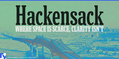
Places have long names, and public projects have even longer ones. Hospital networks, transit extensions, river programs and regional investigations must fit specific language into mobile cards, report columns, construction graphics and title frames designed for something shorter. A condensed sans may solve the width problem while making every institution sound like the same software portal; an overtly historical slab can turn current work into civic reenactment. Hackensack compresses the language without stripping away its editorial and institutional character.
Its narrow proportions and tight spacing make room for difficult names, while firm bracketed slabs give them enough substance to remain prominent. Rounded terminals and a single-storey g soften the texture without making it decorative. Hackensack carries a trace of Clarendon character, but it does not require distressed printing, period layouts or heritage styling.
Regional journalism gives that balance a practical role. Local reporting is crowded with neighborhood names, government agencies, hospital departments, legal terminology and public programs that cannot always be rewritten into tidy headlines. The same story may need to survive a newsletter banner, mobile card, print column, investigation page, vertical-video title and social quotation graphic. Hackensack keeps those headlines large while giving the publication a recognizable serif voice; a quieter text face can handle full articles, data and navigation.
Infrastructure and climate-adaptation projects create a similar problem. Bridge renewals, flood-resilience programs, river restoration, transit construction, water systems and grid upgrades require project identities, public dashboards, construction-hoarding graphics, environmental summaries and community presentations. Hackensack gives that public-facing layer civic weight without making it look bureaucratically neutral or historically themed.
Large institutions also accumulate language faster than layouts expand. Hospital campuses, university research centers, library programs, transit agencies and public utilities often need to accommodate long facility names, sponsored departments and multipart initiatives. Hackensack can carry campus names, program headings, report titles and public-service campaigns while a standards-oriented sans handles instructions, schedules and accessibility-critical information.
Place-based documentaries, investigative podcasts, urban-history projects and infrastructure exhibitions offer another useful setting. Episode titles, location cards, archive headings and witness quotations can feel rooted in a real city without being locked to a particular decade.
Hackensack is a compact slab serif for information that arrives with a place attached. It gives long names, public projects, regional reporting and institutional identities enough room to fit without losing their voice.