


HG Soei Kakupoptai
von RICOH
Einzelschnitte ab
$199.00 USD
Komplette Familie mit 3 Fonts: $597.00 USD

Die Schriftfamilie HG Soei Kakupoptai
wurde von
entworfen und von
RICOH veröffentlicht. HG Soei Kakupoptai enthält
3
Stile und Familienpaketoptionen.
Mehr über diese Familie
- Aa Glyphen
-
Bestes AngebotFamilienpakete
- Einzelschnitte
- Technische Daten
- Lizenzierung
pro Font:
$199.00 USD
Paket mit 3 Fonts:
$597.00 USD
Über die Familie
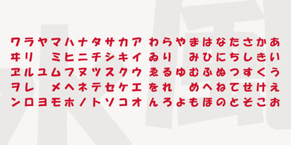
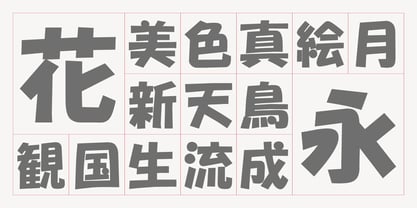
HG創英角ポップ体は、水本恵子氏がデザインした「創英ポップ体1」を字母とする書体です。店頭広告用文字のスタイルを模して作られた書体で、楽しく、軽快な書体です。極太角ゴシックのイメージをベースに作られていますが、それをやや崩し、柔らかさも取り入れ、フリーハンドで書いたイメージを残しています。見やすくするため、ふところは可能な限り大きくなっています。店頭のPOP、チラシ、看板などに最適の書体です。
HG Soei Kakupoptai is a typeface with a "fresh pop" designed by Mr. Mizumoto Keiko. It is a typeface made by mimicing the style of letters for party-style, fun and light typefaces. It is made on the basis of the image of thickSoei Kakugothic, but it breaks it open, and incorporates softness, leaving the font looking freehand. To make it easy to see, the boldness has become as thick as possible. It is a typeface best suited for store-front fun, leaflets, signboards and so on.
HG Soei Kakupoptai
- Wenn du dich für eine Auswahl entscheidest, wird die Seite komplett aktualisiert.