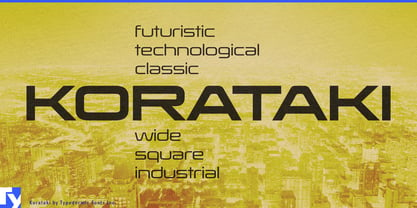
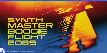
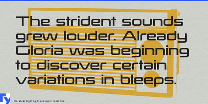
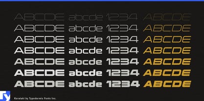
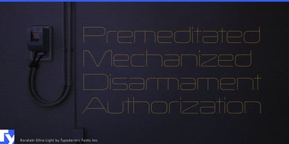
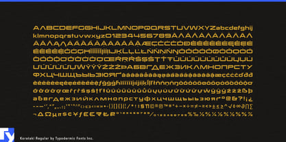
Wide type has a practical advantage on long, shallow surfaces. Korataki’s expanded proportions let a name stretch across a frame tube, pipe, rod, rail, cabinet, or machine housing while keeping the letters comparatively low. Its squared curves and monolinear construction give those markings an engineered structure without falling into the usual narrow, aggressive vocabulary of technical display type.
Commercial delivery bikes and urban logistics equipment are especially good territory. Model names can run along down tubes, frame rails, battery enclosures, chain guards, and cargo modules; the same identity can extend to chargers, docking stations, fleet graphics, dealer displays, specification sheets, and launch campaigns. A manufacturer building two-wheel couriers, long-tail cargo bikes, heavy three-wheel carriers, and modular delivery systems can use Korataki to give the whole range a consistent visual architecture.
The same geometry suits tubular industrial products and linear machinery. Structural tubing, district-heating pipe, geothermal systems, industrial conduit, robotic arms, gantries, automated warehouse vehicles, and extrusion equipment all provide long surfaces where prominent product names and series designations can become part of the object itself rather than a small applied label.
Energy infrastructure gives Korataki room to operate at a larger scale. Grid-storage batteries, commercial EV chargers, solar inverters, heat-pump units, hydrogen-system enclosures, and modular power equipment can use broad product names and system identifiers across cabinets, housings, and installation walls, with the same visual language carrying into trade-show graphics, launch materials, facility signage, and technical presentations.
Performance equipment offers a more compact version of the same problem. Fishing rods, trekking poles, ski poles, paddle shafts, bicycle components, and other long sporting products provide plenty of length but little height; Korataki lets model names and series designations occupy that space with presence.
Korataki is built for projects where technology is physical: bikes, pipes, rods, robots, chargers, batteries, rails, and structural systems. Its width is more than a stylistic gesture; it gives designers a way to make lettering occupy long hardware with the same deliberate scale as the object carrying it.