Direkt zum Inhalt
Zum Hauptinhalt springen

Lemota

von Marvadesign
Einzelschnitte ab $20.00 USD
Die Schriftfamilie Lemota wurde von Febrie Setiawan entworfen und von Marvadesign veröffentlicht. Lemota enthält 1 Stile. Mehr über diese Familie

Über die Familie


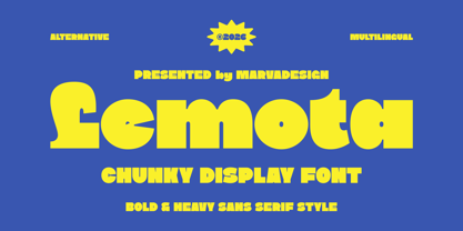
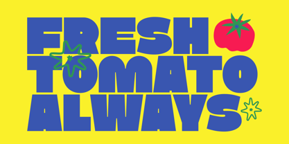
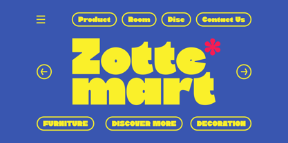
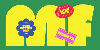
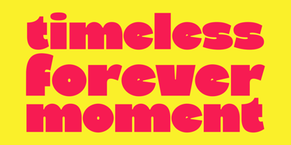
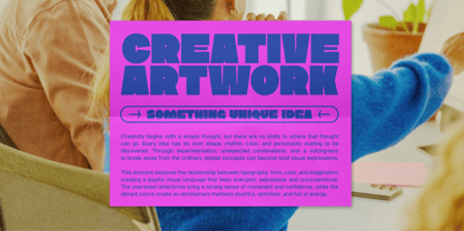
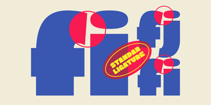
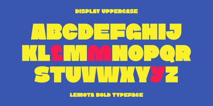
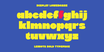
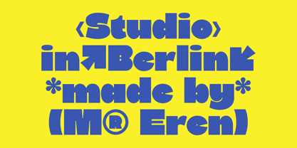
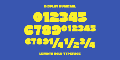
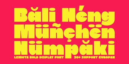
Lemota is a bold and highly expressive display typeface designed to bring a playful, energetic, and unconventional personality to typography. Its oversized letterforms feature chunky proportions, heavy strokes, compact spacing, and distinctive geometric cuts that create a strong visual impact while maintaining a fun and approachable character. The rounded forms are combined with sharp notches, unusual terminals, asymmetric details, and playful counters, giving each letter its own recognizable personality. These unexpected shapes make Lemota feel dynamic and slightly experimental rather than following the conventional structure of a traditional sans serif.

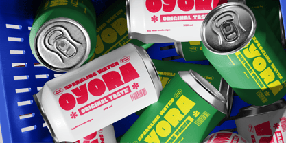
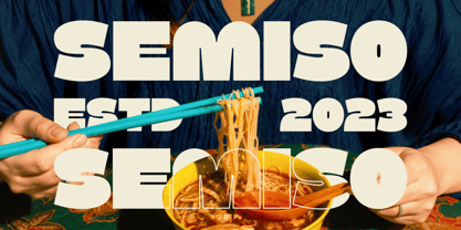
One of Lemota most distinctive qualities is its retro-inspired yet contemporary display aesthetic. The exaggerated width, soft curves, bold weight, and irregular construction evoke the visual language of vintage posters, 60s–70s graphic design, playful branding, and modern pop culture. Its alternate characters add another layer of personality, allowing designers to create more spontaneous and varied typographic compositions. The uppercase and lowercase sets have a particularly strong contrast in scale and shape, while the numerals and punctuation maintain the same bold, quirky visual language.

Designer: Febrie Setiawan

Foundry: Marvadesign

MyFonts Debüt: Aug 20, 2026

Lemota

Über Marvadesign

Enter the world of expertly created letterforms with Marvadesign. Their dedication to innovation and attention to detail is evident in every design. The core of Our portfolio is a collection of bespoke typefaces that go beyond the ordinary. Each glyph is a testament to his meticulous design process, where proportions, curves and spacing were carefully researched to achieve a harmonious visual balance. The flexibility of their typeface design repertoire is a defining feature. From elegant serifs that exude classic sophistication to modern sans-serifs that embody a contemporary aesthetic, and custom scripts that add a touch of personality, each typeface is an intentional exploration of form and function. As a typographic designer, we navigate the intersection of tradition and innovation, honoring typographic heritage while pushing the boundaries of what is possible. The result is a portfolio that reflects a deep understanding of the craft and a passion for shaping the future of visual communications.

Mehr lesen

Weniger lesen