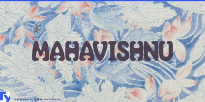
Organic display lettering can be difficult to use in premium branding. Push the curves too far and fashion starts looking psychedelic; loosen the drawing and a yoga studio can drift toward hippie culture; add too much handmade texture and an expensive spa can suddenly feel rustic. Mahavishnu occupies a narrower space. Its swollen, flowing forms are expressive and sensuous, but controlled enough for settings where casual bohemian lettering would send the wrong signal.
That makes Mahavishnu especially useful for fashion, fragrance, jewelry, beauty, resort wear, designer swimwear, eyewear, handbags, and footwear. Use it for collection names, campaign headlines, runway-show titles, fashion-film credits, lookbook covers, invitations, hangtags, shopping bags, fragrance boxes, boutique displays, and retail-window graphics. Paired with quieter typography for product information and supporting copy, Mahavishnu becomes the distinctive display layer of a more restrained identity.
The same quality solves a related problem in premium wellness. High-end yoga and Pilates studios often want warmth, movement, and a connection to the body without looking like budget retreats. Resort spas, urban day spas, massage studios, bodywork programs, thermal bathing facilities, and integrated wellness clubs need relaxation without drifting toward either medical sterility or incense-and-tie-dye informality. Mahavishnu can carry studio names, signature classes, treatment collections, ritual names, apparel, amenity packaging, wall graphics, and campaign headlines while a neutral companion face handles schedules, prices, descriptions, and booking information.
Mahavishnu grew out of the atmosphere of 1970s jazz fusion and psychedelic lettering, but its forms were drawn with a quieter rhythm. The letters swell, taper, pinch, and interact with their neighbors in ways that feel shaped rather than rough or spontaneous. That ancestry is still visible, especially when color and imagery encourage it, but it does not dictate the result.
Context changes Mahavishnu dramatically. Surround it with saturated color and swirling graphics and its psychedelic side comes forward. Give it generous space, restrained color, fashion photography, foil, embossing, or polished packaging and the same curves become sculptural. That flexibility makes Mahavishnu useful when a premium brand needs organic display typography without the usual hippie baggage.