


Manus Smooth
von JOEBOB graphics
Einzelschnitte ab
$25.00 USD

Die Schriftfamilie Manus Smooth
wurde von
Geert Dijkers
entworfen und von
JOEBOB graphics veröffentlicht. Manus Smooth enthält
1
Stile.
Mehr über diese Familie
Über die Familie
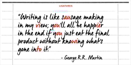
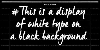
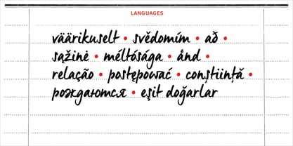
The Manus font family is extended with a new relative: Manus Smooth. Some major and minor adjustments were made, but it still has the look & feel of the original.
Manus Smooth

Über JOEBOB graphics
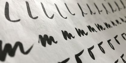
At JOEBOB graphics we like to write. And we like to keep it real.We create our handwritten fonts in such a way that they end up looking like handwriting, not like polished scripts. We do so because we think it’s a good idea to establish a natural feel to our fonts and aim for character and intention over perfection. Little flaws we make while writing are welcomed and left in on purpose because we think it contributes to the idea of being human in an increasingly digital world.Foundry of Jeroen “Joebob” van der Ham.
Mehr lesen
Weniger lesen
- Wenn du dich für eine Auswahl entscheidest, wird die Seite komplett aktualisiert.