Direkt zum Inhalt
Zum Hauptinhalt springen

Not My Type

von It's me Simon
Einzelschnitte ab $25.00 USD
Die Schriftfamilie Not My Type wurde von Simon Stratford entworfen und von It's me Simon veröffentlicht. Not My Type enthält 1 Stile. Mehr über diese Familie

Über die Familie


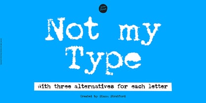
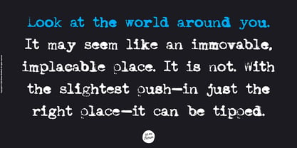
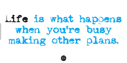
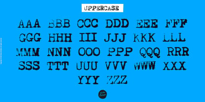
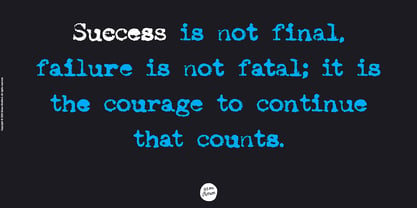
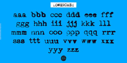
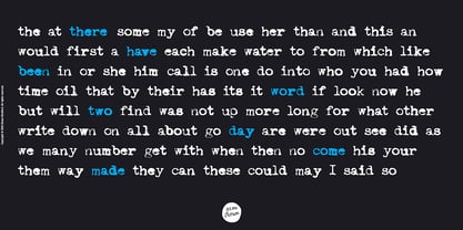
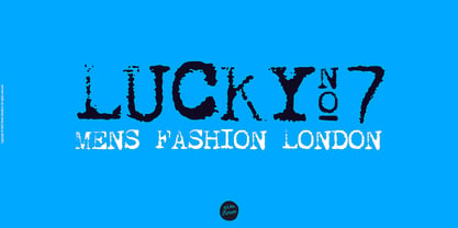
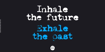
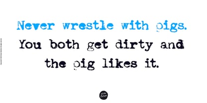
If you want your design to have that nostalgic typewriter effect, Not my Type would be perfect. It's old-fashioned and retro—letters are worn and grungy like it needs a new ink ribbon. Some of the letters are misaligned—just like a real old typewriter.


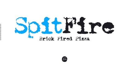
It is best used at smaller sizes, perfect for logos, headlines, covers and any design where you want that vintage look and feel.


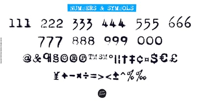
Each letter has two alternatives, making three in total. Using the alternative letters, you can make your type layouts look more random, like a real typewriter.


You can manually set the alternatives via the glyphs panel in your design software or you can enable them automatically. If you enable contextual alternatives in your design application, the letters will change automatically as you type.

Designer: Simon Stratford

Foundry: It's me Simon

MyFonts Debüt: Nov 9, 2022

Not My Type

Über It's me Simon

Hello, I’m Simon Stratford, an independent type designer based in London. After spending more than 20 years in the design industry—including time at London branding and film agencies—I left the rat race to work for myself. For nearly a decade, I’ve been creating characterful retail fonts and bespoke typefaces for branding, advertising, packaging and entertainment. My work has been used by Reebok, ITV, Three, King and creative teams around the world. I’m drawn to lettering with personality: bold, distinctive type that refuses to disappear politely into the background. When I’m not designing fonts, you’ll usually find me painting, taking photographs, hunting for trainers, walking dogs or searching for a proper cup of coffee.

Mehr lesen

Weniger lesen