

Direkt zum Inhalt
Zum Hauptinhalt springen

Prixma Caps

von deFharo
Einzelschnitte ab $10.00 USD
Komplette Familie mit 6 Fonts: $48.00 USD
Die Schriftfamilie Prixma Caps wurde von Fernando Haro entworfen und von deFharo veröffentlicht. Prixma Caps enthält 6 Stile und Familienpaketoptionen. Mehr über diese Familie

Über die Familie


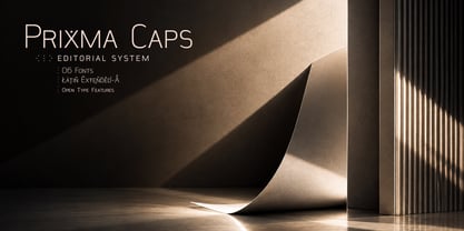
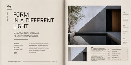
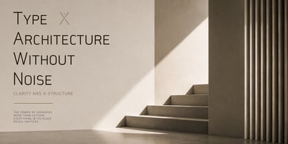
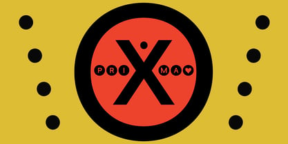
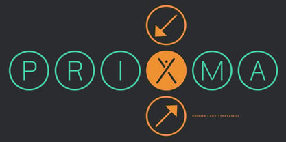
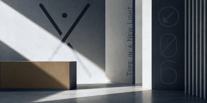
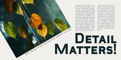
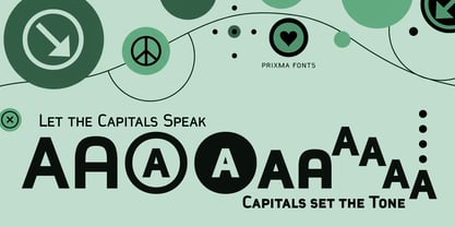
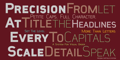
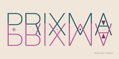
Prixma Caps is the extension of Prixma Sans designed for use with uppercase letters, hierarchies, and typographic layouts. It retains the geometric, precise, and airy character of Prixma Sans but takes its visual language into more graphic and expressive territory—making it particularly well-suited for headlines, visual identity, editorial design, and branding.

Prixma began as a sans-serif family with a contemporary rhythm, designed to work effectively in both small-scale text and large-scale compositions. Prixma Caps shares that same DNA but develops it from a different perspective, offering greater structure, enhanced scale contrast, and expanded layout possibilities.

It is not simply a matter of using Prixma Sans’s uppercase characters at a larger size; Prixma Caps is built as a standalone system capable of establishing distinct levels of information within a single composition.

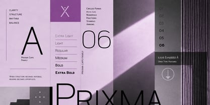
The family’s six weights—Extra Light, Light, Regular, Medium, Bold, and Extra Bold—cover a broad spectrum, ranging from extremely delicate layouts to commanding, high-impact headlines.

Designer: Fernando Haro

Foundry: deFharo

MyFonts Debüt: Sep 21, 2026

Prixma Caps

Über deFharo

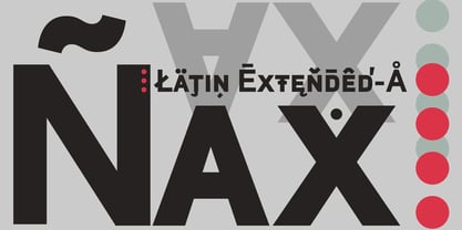
deFharo is the independent type foundry of Spanish graphic and type designer Fernando Haro. With more than 30 years of experience in graphic and advertising design and over a decade devoted to typeface design, Fernando Haro has developed an eclectic body of work that ranges from editorial and corporate typefaces to expressive display, geometric, technological, retro and experimental designs. His approach combines visual character with typographic functionality. Every typeface begins with drawing, proportion and a clear visual idea, and evolves through meticulous work on spacing, metrics, kerning, optical corrections and OpenType features. Rather than following a single recognizable style, deFharo explores different typographic territories according to the personality and purpose of each project. Some families are designed for long-form reading and editorial systems; others are built for branding, headlines, packaging, signage or highly expressive graphic compositions. A strong interest in vector drawing, typographic systems and functional design runs throughout the collection. Alternative characters, small caps, Petite Caps, fractions, numerals, ligatures, symbols and extended language support are frequently developed as integral parts of the typeface rather than as afterthoughts. The result is a growing collection of typefaces designed to be both distinctive and useful — fonts with personality, but also with the technical precision required for professional graphic and editorial work. deFharo typefaces are designed by Fernando Haro and published independently from Spain.

Mehr lesen

Weniger lesen