


Direkt zum Inhalt
Zum Hauptinhalt springen

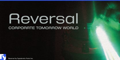
Reversal

von Typodermic
Einzelschnitte ab $69.95 USD
Komplette Familie mit 14 Fonts: $169.95 USD
Die Schriftfamilie Reversal wurde von Ray Larabie entworfen und von Typodermic veröffentlicht. Reversal enthält 14 Stile und Familienpaketoptionen. Mehr über diese Familie

Über die Familie


Compact products need compact typography, but narrow type often brings a harsher personality than the product itself. Condensed sans serifs can feel urgent or industrial; rounded faces are often too broad for tight physical and digital spaces. Reversal occupies the useful territory between them: space-efficient proportions with the softened geometry of contemporary consumer products.

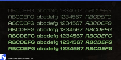
Its condensed forms avoid the rigid pressure of many narrow grotesks. Squashed circular shapes and smooth construction give Reversal a streamlined, manufactured quality without relying on blades, cuts or overtly futuristic details. Seven weights from Hairline through Extra-Bold, each with an italic, let the family move from light technical headings to substantial product names while preserving the same compact structure.

Urban mobility is a natural setting. Compact EVs, e-bikes, electric scooters and autonomous shuttles all have limited space for model names, service graphics and interface headings, yet their identities extend into apps, charging points and rental systems. Reversal can keep those physical and digital touchpoints related without making approachable mobility products look like heavy machinery.

Service robotics presents a similar problem. Delivery robots, cleaning robots, hospitality machines and autonomous logistics equipment need to look technologically capable without becoming militarized or toy-like. Reversal can handle product-family names, fleet identifiers, launch graphics and short interface headings while a quieter companion face carries dense instructions and operational data.

Wearable monitors, home diagnostic devices, rehabilitation products and other personal health technology can use the same balance. Reversal moves comfortably between device names, packaging, companion apps and campaign graphics where space is limited but the visual language still needs to feel considered and approachable.

Reversal is useful because it saves horizontal space without making the design feel severe. For compact mobility, service robotics and personal devices that need to look engineered without looking aggressive, that balance gives the family its role.

Designer: Ray Larabie

Foundry: Typodermic

Original Foundry: Typodermic

MyFonts Debüt: Mar 10, 2010

Reversal

Über Typodermic

Welcome to Typodermic Fonts, a spirited type foundry rooted in Nagoya, Japan, started by the Canadian typeface designer, Raymond Larabie in 2001. Our library brims with 500+ diverse typefaces to fuel creativity in graphic design, advertising, web, and app development. As digital type pioneers, we adopted web fonts and app licensing early, consistently pushing the design envelope. With Canadian heart and Japanese precision, we're your global partners in extraordinary typography. Explore Typodermic Fonts—where creativity meets character.

Mehr lesen

Weniger lesen
