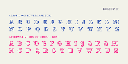
Direkt zum Inhalt
Zum Hauptinhalt springen

Roijer

von PeGGO Fonts
Einzelschnitte ab $18.00 USD
Komplette Familie mit 4 Fonts: $102.00 USD
Die Schriftfamilie Roijer wurde von Pedro Gonzalez Jorquera entworfen und von PeGGO Fonts veröffentlicht. Roijer enthält 4 Stile und Familienpaketoptionen.

Mehr über diese Familie

Roijer Family

4 Fonts

Bestes Angebot!

pro Font:

$25.50 USD

Paket mit 4 Fonts:

$102.00 USD

Über die Familie


“Röijer” was born from a branding exercise done with “high care”, graphically developed thanks to the valuable help of designers Marcela Aguilera & Pedro Gonzalez, each letterform and every type design process was worked as a typographic jewel, as a strong bond between classical and fresh concepts (with a Lombardic and Art Nouveau touch). Röijer puts a dual capital model in your hands; a classic Roman and a fresh contemporary alternative, on each letter: the first located in a lowercase box looks formal and sober, while the uppercase box shows a glamorous and more daring look, ideal to being use at specific moments only. Röijer combine elegance and audacity in a very magistral way. It has 2 variants with 541 glyphs each one; a normal and a volumetric one, all with an ornaments set and a decorative objects set. Ideas that be useful not only for branding design but also for titling, headline composition, label design, fashion and luxury stuff.

Designer: Pedro Gonzalez Jorquera

Herausgeber: PeGGO Fonts

Foundry: PeGGO Fonts

Eigentümer des Designs: PeGGO Fonts

MyFonts Debüt: Jan 24, 2017

Roijer

Über PeGGO Fonts

“Peggo Fonts” is a Chilean based foundry, founded in 2002 by Pedro González, with more than 20 years doing fonts for you and more than 14 years on the market, on early stages Peggo Fonts started as a calligraphy design studio, so, we still love doing (and teaching) “real calligraphy” that we take as inspiration, we still love doing lettering and do technical type drawings as detailed and deep reference for our type design, always through a critical and fresh scope, analyzing and solving our constant global needs for design.We put all our energy on fine tunning a balance between function and aesthetics for the sake of better design and a more pleasant reading experience. We work on do optical adjustments, on programing useful opentype features and finding innovative design concepts.

Mehr lesen

Weniger lesen