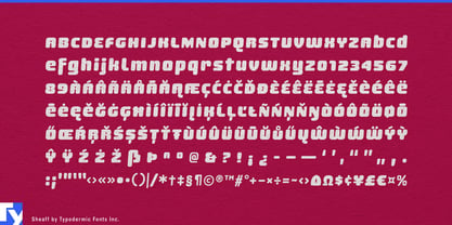
Sheaff comes from the softer side of Y2K: glossy consumer pop, rounded plastic forms, bright packaging, and short names designed to become graphics in their own right. Its construction mixes that millennium vocabulary with interlocking display lettering, so letters can tuck together, extend, and underline themselves instead of simply sitting in a row.
That makes Sheaff particularly useful when the name is the main graphic. Product names, flavor names, collection names, toy-line names, and model names can become compact wordmark-like shapes without requiring bespoke lettering for every variation. The effect is strongest in short display text, where the connections and extensions are easy to see.
Confectionery is a natural setting. Chewing gum, gummies, fruit chews, taffy, marshmallow products, and other soft candy already share Sheaff’s inflated, brightly colored visual world. A master brand can dominate a pouch or carton, while flavor names, seasonal editions, and collaborations use the same interlocking vocabulary across wrappers, resealable bags, sharing packs, shelf displays, vending graphics, and launch campaigns.
Beauty and personal care offer a similar opportunity. Lip gloss, lip oil, tinted balm, nail collections, body mist, bath products, temporary hair color, and pop-oriented styling products often depend on short names, glossy packaging, translucent materials, and frequent color or scent variations. Sheaff can carry a product name across a tube or carton, become the title of a seasonal collection, or anchor retail displays and campaign graphics.
Toys and play equipment give the same shapes an even more literal physical context. Doll lines, collectible figures, slime and sensory toys, playsets, balance bikes, tricycles, scooters, ride-on cars, plastic slides, playhouses, water tables, and splash toys all inhabit a world of molded plastic, inflated forms, bright color, and invented product names. Sheaff can move from packaging onto frame decals, molded badges, stickers, wheel covers, and graphics applied directly to the product.
Sheaff arrived when the soft-plastic side of Y2K design was already slipping out of fashion. Seen from the late 2020s, that timing has become part of its usefulness: it carries the bubblegum-pop consumer aesthetic of the period without defaulting to cyber nostalgia, while its interlocking construction gives that reference a practical job.