Direkt zum Inhalt
Zum Hauptinhalt springen

Stalve

von Peachfont
Einzelschnitte ab $20.00 USD
Komplette Familie mit 2 Fonts: $37.00 USD
Die Schriftfamilie Stalve entworfen und von Peachfont veröffentlicht. Stalve enthält 2 Stile und Familienpaketoptionen. Mehr über diese Familie

Stalve Complete Family

2 Fonts

Bestes Angebot!

pro Font:

$18.50 USD

Paket mit 2 Fonts:

$37.00 USD

Über die Familie


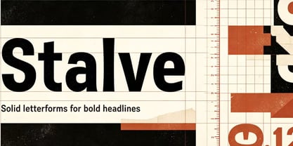
Stalve is a bold geometric sans-serif display font crafted for strong, modern visual impact. Built on clean, blocky letterforms, it features solid strokes and balanced proportions, free of unnecessary ornamentation. Each glyph is carefully adjusted for consistent weight and harmonious spacing, keeping the design stable and unified at large sizes.

It shines for logotypes, brand marks, poster headlines, packaging, apparel graphics, social media visuals, album art and event titles. It also works well for web hero text and short editorial pull quotes. Though made for display, it maintains good legibility at medium-large sizes.

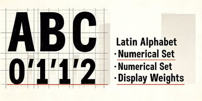
The design favours restraint and punch: controlled curves, crisp corners and consistent symmetry. The family includes Regular and Bold weights to create clear visual hierarchy. Suited for modern branding, streetwear, creative studios and youthful minimalist work. With no flashy details, it relies on solid form — a reliable, striking block sans that balances bold energy and clean typographic control.

Foundry: Peachfont

MyFonts Debüt: Nov 4, 2026

Stalve

Über Peachfont

Peachfont is a type foundry specializing in Latin and Chinese type design. Our Latin typefaces are published across a wide selection of global platforms, ready for designers and creators around the world to explore and license. We maintain a diverse catalog that covers an extensive spectrum of aesthetics: whimsical playful display fonts, elegant serifs, clean and functional sans serifs, sharp industrial mechanical styles, and many more distinct voices. This broad range has brought us warm recognition and positive feedback from our growing community of users. At the heart of our practice lies a clear mission: we strive to understand and meet the practical and creative needs of every user, while continuously developing our own authentic, recognizable design identity. We do not rush the process. Every single letter, punctuation mark and glyph is built, tested and refined slowly and deliberately. Each curve, proportion and spacing decision is weighed carefully. Our typefaces are the result of sustained focus, repeated polishing, and genuine care poured into every tiny detail. We believe great typography balances personality, readability and craft. If you choose to work with Peach Type, we take that trust seriously. We will stay committed to delivering thoughtful, well-crafted letterforms that live up to your expectations.

Mehr lesen

Weniger lesen