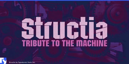
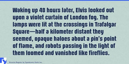
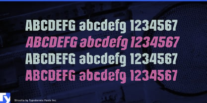
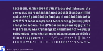
Industrial display fonts often make a strong first impression and then run out of range. An octagonal all-caps face may handle a machine name or event title, but the same project can also need mixed-case headings, product families, technical graphics, cleaner supporting material, and occasional wear or damage. Structia was built for that broader job. Its narrow proportions, open counters, angular construction, and functional lowercase create a mechanical display system rather than a single industrial effect.
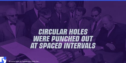
Structia Regular and Italic establish the core. They suit heavy equipment, industrial automation, autonomous machinery, defense technology, motorsports, professional tools, and performance equipment while remaining open enough to handle more than a handful of capitals. Use them for product-series names, machine badges, model markings, specification-book covers, dealer graphics, equipment decals, training titles, exhibition walls, and campaign headings.
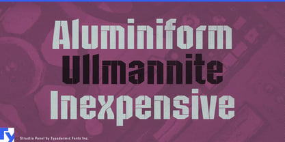
Structia Panel adds fine internal divisions that suggest access panels, folded sheet metal, welded seams, protective housings, and technical component drawings. It can distinguish an advanced product line, prototype system, engineering presentation, or special edition without switching to an unrelated futuristic face. Defense robotics, unmanned aircraft, field communications, surveillance hardware, industrial control systems, and near-future vehicle technology are natural territory.
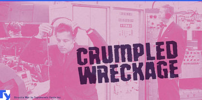
Structia War pushes the same structure toward physical wear. It fits rally-raid graphics, motocross, off-road equipment, combat-sports promotions, rugged tools, demolition equipment, fight-night campaigns, and vehicle-combat games where abrasion belongs to the subject rather than serving as generic dystopian decoration.
The three treatments can work as a progression: clean machine, engineered panel, battered machine. A manufacturer can use Regular for everyday product identification, Panel for a technically advanced line or launch campaign, and War for dramatic event graphics or limited promotional material while keeping the family resemblance intact.
Structia grew from brutalist architectural forms and the angular logic of machine-age display lettering, but it was drawn narrower and more openly than many fonts in that tradition. Larger counters, generous apertures, and a functional lowercase give it enough breathing room for headings and subheads as well as short names. That makes Structia especially useful when a project needs toughness and mechanical structure across more than one level of intensity.