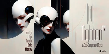
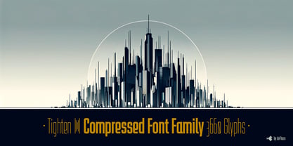
Tighten: The Ultimate Compressed Sans Serif Typeface
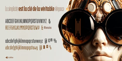
Tighten is a compressed sans serif typeface family, notable for its elegance derived from an exaggerated vertical proportion. Its style is a fusion of Art Deco and Futurism, giving it a distinctive and highly readable presence in any medium. Designed specifically for those seeking to stand out in graphic design, brand creation, publishing, videos, and editorial design, Tighten emphasizes consistency, functionality, and distinction.
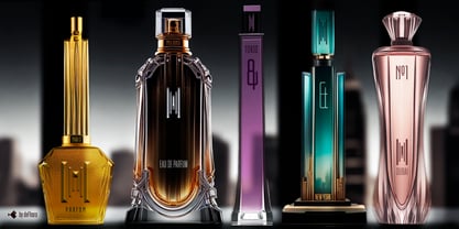
• Tighten's versatility makes it perfect for a variety of applications, including: Composing Publications, Designing Brochures, Creating Logos, Product Packaging, Signage, Corporate Image, Cinematic Texts, etc.
Its ability to economize horizontal space without losing presence makes it an ideal choice for projects requiring clear and effective graphic differentiation.
• Unique Features of Tighten
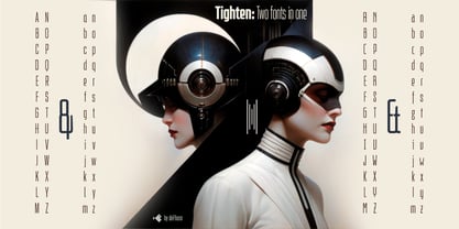
- Five Weights: Extra Light, Light, Regular, Bold, and Heavy, each carefully calibrated for maximum versatility and adaptability.
- Complete Sets of Characters: Two complete sets of uppercase and lowercase letters, alternative characters, ligatures, and various sets of numbers.
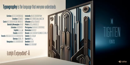
- Multilingual Compatibility: Compatible with Latin Extended-A, making it perfect for multilingual applications.
- Compressed Proportion: Ideal for spaces where horizontal saving is essential without sacrificing visual impact.
- Advanced OpenType Features: Dynamic fractions, mathematical symbols, Bitcoin symbol, and other currency signs.
• Precision and Technical Excellence
Tighten's precision is not only visual but also technical. Its proportions, metrics, and kerning are meticulously defined through golden ratio sequences, ensuring maximum readability and optimal usage in any size or application.