Direkt zum Inhalt
Zum Hauptinhalt springen

Transport New

von K-Type
Einzelschnitte ab $20.00 USD
Komplette Familie mit 6 Fonts: $20.00 USD
Die Schriftfamilie Transport New wurde von Keith Bates entworfen und von K-Type veröffentlicht. Transport New enthält 6 Stile und Familienpaketoptionen. Mehr über diese Familie

Über die Familie


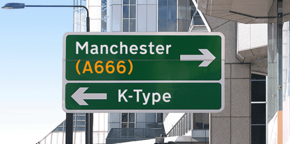
Transport New is a redrawing of the UK Transport font originally designed for British road signs by Jock Kinneir and Margaret Calvert beginning in 1957 and first published on the Preston bypass in 1958.

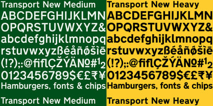
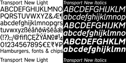
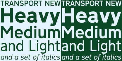
In addition to the familiar Heavy weight (intended for dark text on a light background) and Medium weight (for white text which appears bolder against a dark background), the original K-Type family includes the previously unreleased Light weight proposed for back-lit signage but never actually applied. The Heavy font is actually more of a Bold, and the Light is pretty much a regular weight, but the original nomenclature has been retained for old times’ sake.

ORIGINAL FAMILY – 6 fonts:

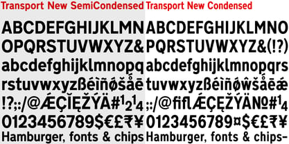
The version 3 fonts feature numerous outline and spacing refinements, and to align with Motorway, the other typeface used for UK road signage, italics for all three weights have been added. The family includes a full complement of Latin Extended-A characters. The Transport New and Motorway fonts are spaced and kerned for normal text usage, so increase the tracking to simulate the generous spacing often employed on road signs.

CONDENSED PACKAGE – 3 fonts:

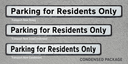
The new Condensed Package contains Condensed and SemiCondensed versions of the Heavy font, and a complimentary Heavyweight original is also included.

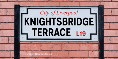
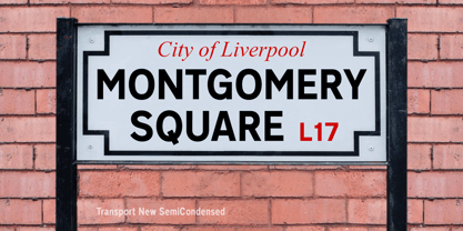
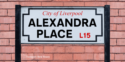
The Condensed and SemiCondensed fonts have been prompted by the use of the typeface for general signage and highway-related publicity. All-caps usage for street nameplates is common, so longer names will benefit from the condensed versions. For uses where space saving is important, these narrower fonts offer a perfectly consistent solution.

Designer: Keith Bates

Foundry: K-Type

MyFonts Debüt: Feb 18, 2009

Transport New

Über K-Type

K-Type is a small, independent type foundry based in Manchester England, offering a unique range of high quality fonts which are modestly and simply priced for designers, small businesses and large organisations.In addition to creating new typefaces resulting from formal experimentation, many K-Type fonts show the influence of inspirational artists and designers, many exploring the mix of insular and eclectic that has forged the typographical landscape of Britain and America.K-Type is also keen to make affordable fonts from styles which possess cultural currency or an existing social presence, generally redrawn to include comprehensive character sets containing a full complement of Latin Extended-A glyphs. New, previously unavailable weights and italics are often designed and added.

Mehr lesen

Weniger lesen