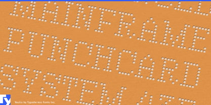
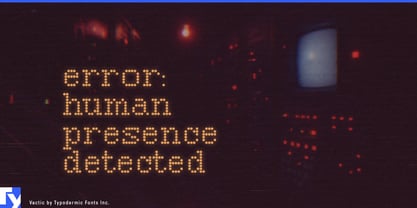
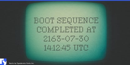
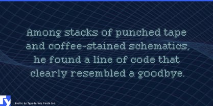
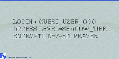
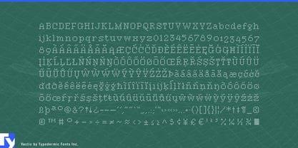
Vactic turns words into fields of points. Its letters are built from dense arrays of tiny circular marks, creating a texture that changes with scale: close up, the construction is obvious; from farther away, the points gather into compact serif forms. It works best for very short text at very large sizes, where the dotted structure becomes part of the image.
Point-cloud visualization is an especially natural setting. Lidar companies, industrial 3D-scanning systems, geospatial platforms, architectural scanning, and digital-twin services already work with imagery assembled from sampled points. Vactic can carry product names, exhibition titles, report covers, launch graphics, and conference installations while sharing the same visual material as the data around it.
The dots can also read as holes. Architectural acoustic panels, perforated metal systems, speaker grilles, ventilation products, filters, and façade materials all rely on repeated openings across a surface. Vactic can translate that physical language into oversized trade-show titles, catalogue covers, showroom graphics, material-sample displays, and campaign imagery.
At another scale, the points become light emitters. Architectural LED installations, arena presentation systems, immersive exhibitions, and large event graphics can use Vactic for words that glow, pulse, fragment, or gradually resolve into legible forms. Professional audio offers similar territory through speaker grilles, acoustic treatment, meters, and luminous display systems.
Particle-based imagery opens another route. Additive manufacturing, metal powders, microscopy, advanced materials, and semiconductor research often visualize matter as grains, particles, or sampled data; Vactic can carry short campaign titles and major section headings within those visual systems.
Vactic is deliberately specialized. At ordinary sizes, its tiny dots and tight spacing resist casual reading. Enlarged across a wall, screen, façade, enclosure, or exhibition structure, those same limitations become the reason to use it.