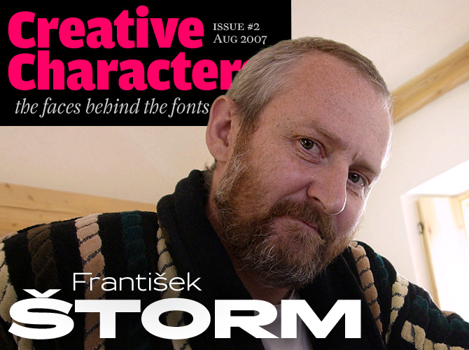
All type designers are individualists, but František Štorm from Prague is a special case. His historically inspired fonts are virtually unparallelled. He has arguably made the most interesting revivals of classic text faces by Jannon, Baskerville and Walbaum. But he also designed a large number of fonts that are less straightforward and pretty hard to pigeonhole: very personal and rather eccentric interpretations of classic and modernist traits and mannerisms. Fonts that serious typographers might think too fancy… if they weren’t so well made and legible.
Meet František Štorm, artist, graphic designer, photographer, musician, teacher, and perhaps a future ex-type designer. He also makes great tea.
Your biography states that you graduated from the Academy of Applied Arts in Prague, at the School of Book and Type Design under Professor Jan Solpera. What were the most important things you learned from Jan Solpera?
He was a guru to my generation of typographers. He taught us to be personal rather than useful, with an emphasis on an original, unmistakable attitude. When assigning semestral tasks, he always followed the individual nature of each student. That’s very similar to what I’m doing with my students now.
Jan lives 7 km from my house in South Bohemia and we work together on his projects. He also helps out sometimes with consultations about my students, and comes to our parties, of course. When it’s cold and rainy -- we call it “typographic weather” – he comes to visit me and we drink tea, sitting at the computer screen and doing some béziers.
When I first saw your early typefaces almost ten years ago in a brochure on Czech design, I was amazed by their originality and unusual shapes. Did you actually set out to design type that was ‘different’, or were these just forms that came natural to you?
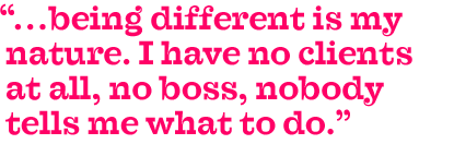
Both. Because being different is actually my nature. I have no clients at all, no boss, nobody tells me what to do. This can be very difficult at times, though. When I try to think of what to do and no idea comes, I know I’d better go chop some wood or cut grass to clean my mind. Then if still nothing comes, I go to a local pub to drink a few beers and consult the farmers. When I once tried to explain to them what typography is, they laughed: “are you stupid?”… "I am," I answered.
I suppose originality comes with freedom.
Besides digital type design and graphic design, you are proficient in woodcut, etching and photography. To what extent do these activities influence your typographic work?
Well, I have many more different activities. For instance, I do some music as well. It changes from time to time. I quit etchings, for example. For the moment, I also quit type design because everyone asks me about type design.
What is it that you like most about designing type?
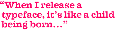
I love all aspects, including research, exhausting computer work, printout samples, first public appearance, and… the money, because business is part and parcel of our occupation. I like to contemplate my sketches, compare them to existing typefaces, and select one of several possible forms. When I release a typeface, it's like a child being born, with lots of bugs to be improved. I love the silence in my studio, my tea on my desk, my music during endless hours of work at night.
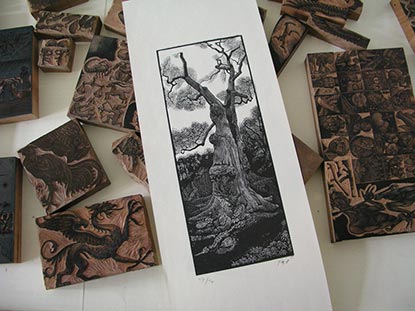
woodcuts made by František Štorm
Many of your fonts are inspired by history. Some are serious and very thorough revivals, such as your excellent trio of Jannon, Baskerville, and Walbaum. Others seem more like playful or exaggerated variations of type from past centuries – I’m thinking of Serapion, Biblon, Farao and others. Is there an aspect of fun or irony to these designs? Do you think of them as parodies or pastiches?
That’s right, I do. My life is full of grotesque experiences. You forgot Cobra, it’s a pure joke.
For your catalogues and website, you have written numerous texts in which you re-write the history of type design in a way that is irreverent, witty and philosophical at the same time. Are you very critical of the ‘traditional’ way in which the history and techniques of type are usually described?
I don’t try to re-write anything, I want to explain a different point of view (mine) on historical material. I hope nobody regards me as a historian, and people reading my explanations should know the historical facts first. But there have been some stupid distortions, whose authors were led by the modern era’s sickly penchant for simplification. For example, I hate the term “transitional” type, because it was invented in the past century, not in the age of Caslon and Baskerville. Also, some fonts which are named “Garamond” have nothing to do with Garamond, it is rubbish. I like to call things by their proper names.
Talking of Baskerville, what were your motives behind the revival you designed?
In the case of Baskerville, I wasn't satisfied with the existing digital versions. I never knew what to answer when colleagues asked me what version they should use for computer typesetting. I realized that many of the other renderings were poor – some downright awful! So I took several original books printed by John Baskerville as a direct inspiration and ignored all later re-cuts, so that nothing stood between John and me. From that moment (with kind help of Otakar Karlas) my re-designing work ran very quickly. Now many books are printed with my Baskerville Ten Pro (incl. Cyrillics), which makes me very happy.
When you were in Romania to give workshops, you photographed stenciled street lettering and then gave these letterforms back to your hosts in the form of a free font. Are you always looking for possible sources of inspiration, everywhere?
Sure. Patzcuaro comes from Mexico, Teuton from the Sudetenland. I need local diversity, with specific design attributes. These should be preserved and developed in an original way, not mixed with incompatible folkloristic elements from other cultures. That’s what today's world music does – but who needs Bavarian G’stanzl yodelling in Tamil-Nadu?
Romania is a wonderful country, and Manele music rules! Especially Nicolae Guta and Adrian Minune (search Manele on YouTube...)! And stencils too, each piece has its own story, often very personal and serious.
They also took us to visit the Academy in Bucharest – which was kind of shocking. The students are regarded as complete idiots by their aging professors, just like in Prague some 50 years ago. But we also met open-minded young people, who resist all that BS, doing great graphic design and making public lettering with stencils, in defiance of the school.
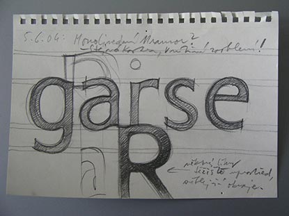
a page of typeface sketches from Štorm's noebooks
Many type designers will say that making type is like providing practical solutions – making little machines for reading. But what about fantasy? Decoration? Seduction?
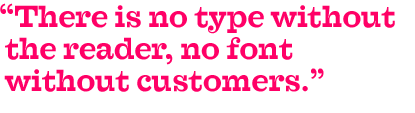
Whatever it is, it must be legible. There is no type without the reader, no font without customers. That’s what I keep saying to my students. Then comes art, but it always comes second.
In the past ten years, your type library has been growing at amazing speed. You’ve also managed to improve and extend existing families. Among your own typefaces, which are you favorites at the moment?
Always the one I’m working on, my last type system (Sans&Serif). It shall be out very soon. It will have Latin, Slavic, Cyrillic and Greek; something huge and ambitious. Of course, I’m not sure yet whether the result will match my expectations...
What other plans do you have for, say, the coming two years – professionally speaking?
First, I’ll quit teaching at the Academy of Art Architecture and Design in Prague. The state scholar system only parasitizes on my enthusiasm, giving me no reason to stay. After that – I don't make fixed plans, because they could go wrong.
Thanks František! We'll look forward to seeing more fonts from you in the future!
John Baskerville
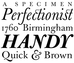
Dissatisfied with other Baskervilles, Mr Štorm went back to the original source. In 1999 he studied rare volumes from Baskerville's printing office, c. 1760, at Nové Hrady Castle, in the Czech National Museum Library.
Having selected the typeface which Baskerville used, among other things, for his 1763 folio Bible, Štorm designed what he calls a transcription: “the aim was not so much to be reverently faithful to the original, as to preserve the spirit of the type face and to breathe new life into it.”
The result is one of the most readable Baskerville revivals ever made; a workhorse in the service of literature. Check out Storm’s John Sans for an interesting sans-serif companion.
Farao
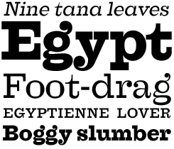
Egyptiennes are cheerful typefaces. In the early 19th century, when they were first developed, a lot of experimenting with new letterforms was going on. Therefore, many Egyptiennes (also known as slab-serifs) had design flaws – uneven spacing, letters falling backwards and bizarre details – for which they were avoided by ‘serious’ typographers. In the course of time, however, it was realized that such oddities could be quite pleasant and inspiring.
Based on 19th-century sources, Štorm’s Farao is soundly imperfect, which makes it stand out from other, colder slab-serifs.
Etelka
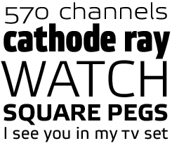
In today’s digital office environment, products such as software no longer come with printed manuals. Installation CDs carry huge documentation, mostly in PDF format. To read these comfortably on the screen, we need extremely legible screen typefaces which are readable even in long lines.
Etelka is for on-screen reading as well as print. Its design idea is a wide, open rounded square – like the shape of an old CRT monitor. It is suitable for all kinds of visual communication, especially corporate identity and orientation systems in architecture. The Pro version comes with useful ideograms and signs.
Zeppelin
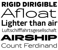
Originally designed in 1998 as an all-caps font, Zeppelin was inspired by the shapes of the famous airships of that name. More recently a lower case was added, as well as a narrower version. Zeppelin’s design is simple and consciously impersonal; as the designer notes: “...its consistent monolienar drawing is nearly naive, with no trace of expression.”
Zeppelin is ideal for a wide range of contemporary applications: from magazines and advertising to information and signage systems.
Splendid Quartett
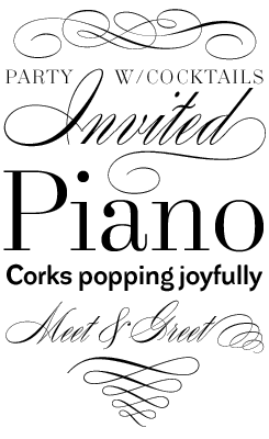
The division of a typeface family into four designs is common in most text faces. However, display typography calls for a richer tonal scale. Its purpose is to decorate, to represent and to please.
Splendid Quartett is an example of a combination of heterogeneous sources of inspiration into a single harmonious group. An American-style script is accompanied by a subtle English-type 'Didone' typeface. The whole is reinforced with a Germanic Grotesk. A very idiosyncratic concept – but it works beautifully.
Pivo
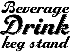
Pivo is Czech for ‘beer’. Freely inspired by a traditional brewery label from southern Bohemia, Pivo is typical of fonts that contain between 4.5 and 6 percent alcohol. Its contours are reminiscent of typical effects of regular beer consumption on the body form. Soft and massive appearance of each word set with Pivo makes it a suitable for logos.
Thank you for your Thank-yous!
“Very impressive!” “Inspirational!” “Absolutely wonderful!” “Congratulations!” … Your reactions to last month’s Creative Characters exceeded our wildest expectations. We received an avalanche of e-mails telling us how much you appreciate our idea to dedicate a monthly newsletter to designer interviews. The work of our interviewee, Swedish type designer Hans Samuelson, was very well received too: many readers told us they were adding Hans’ fonts to their MyFonts albums.
We received dozens of suggestions for future interviews. Some of them were already on our list, but there were quite a lot of mails that made us mumble: “Hey... why didn’t we think of them?” Here are just a few of your suggestions: Christian Schwartz (“a genius and a good guy”), Nick Curtis (“I’m a fan!”), Cyrus Highsmith (“my favorite”), Dino dos Santos (“makes beautiful fonts”) David Carson (“ask him anything!!!”), Timothy Donaldson (“tell him he owes me a pint!”).
Creative Characters has a future – that’s for sure. We’ll get to work. Meanwhile – keep those e-mails coming!
This issue’s credits
featured fonts
supporting fonts
The Creative Characters newsetter is produced by Jan Middendorp (editor) and Nick Sherman (designer), with input from the MyFonts team and readers like you!
Comments?
Please send any thoughts you'd like to share with us about this newsletter to: [email protected]