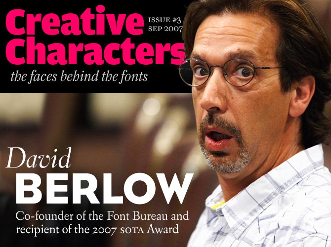
photo of David Berlow by Eben Sorkin / Eyebytes, © The Society of Typographic Aficionados (SOTA)
Although David Berlow is obviously too young to be counted among the grand old men of American typography, he is certainly one of its most influential figures. As a designer with Linotype and Bitstream, he witnessed and influenced the early developments of digital typography. As co-founder and principal of Boston’s Font Bureau he has conceived and directed an impressive number of quality type designs. His status as one of today’s type gurus was underlined when, last summer, he received the SoTA Award of the Society of Typographic Aficionados. We spoke with David recently from his hideaway on Martha’s Vineyard…
When and why did you decide to become a type designer?
Well, I didn’t grow up or go through my education knowing it was possible to be a type designer, because I never really thought it was until I toured Linotype’s New York Letter Design Office in 1977. There was however, this moment of unmistakable joy I still remember quite vividly carving block prints at the age of 7 – that if I positioned the palm trees just so, and the monkey swung just so, I could repeat the same block as many times as I wanted for a longer picture! I found this again when I opened a drawer of type in the first year of university but still didn’t think to pick up punch cutting. I found it again at Linotype with a lot of fine art, commercial art and art historical education in between.
Who taught you how to do it? What were the most important things you learned from them?
It’s not over ’til it’s over. Going backwards, I’m still learning a lot from the people I’m supposed to be teaching. Each person has a lot to give and the first time one learns something is not always right, or complete. I think this is especially true in a field as wide as ours historically, stylistically and culturally. So in big way, all the designers whose work is published through Font Bureau are my latest teachers. From them I learn how to look at things related to type today from a variety of stylistic and entrepreneurial perspectives.
Before that, there was a core of designers who lived through Linotype and Bitstream during the formative years of the digital era, some of my “graduate experience” including Matthew Carter, Mike Parker, Cherie Cone, Larry Oppenberg, Alex Kaczun, Richard Stetler, Walter Petty and George Ryan. I was together with these designers, and many others, roughly from 1978 until 1989. At the beginning of that, I learned a lot about the qualities of any design and the lines themselves from John Quaranta, the master designer at Linotype when I arrived, who, past 65 at the time, did not make the leap to Bitstream, but who was patient and tolerant enough to make the leap to Ikarus.
During the 11-year period mentioned above, I was also fortunate enough to be exposed to the design and technology ideas of Karow, Knuth, Bigelow, Holmes, Stone, Zapf, Frutiger, Jim von Ehr and many more.
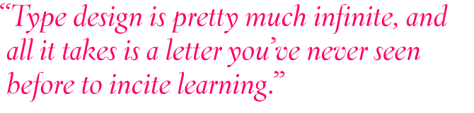
That’s the living. Type designers who lived hundreds and occasionally thousands of years ago are still teaching me, because type design is pretty much infinite, and all it takes is a letter you’ve never seen before to incite learning, I think.
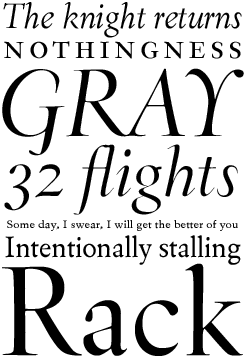
Agency FB
This family was designed on the basis of a single titling font designed by Morris Fuller Benton in 1932. Berlow liked the squared, monotone forms of the narrow capitals and made Benton’s concept his own, creating 5 different weights – all with lowercase – to produce Agency FB, an immediately popular hit.
Belucian
In 1990, Smart magazine commisioned Font Bureau to revise Lucian Bernhard’s alphabet from 1925. The result was Belucian, a family which offers an unusual and expressive text font in combination with a distinctive display style.
When you and Roger Black founded the Font Bureau in 1989 – what were your objectives? What was it like, back then, starting an independent font foundry?
We’re talking about all this happening midway between the introductions of PostScript and the web, so there was no web, just email. I’d been told that magazines were being composed and output using PostScript, but had never seen it. The type used in the graphics of newspapers was also being composed in PostScript, but I’d also not seen this. I had personally never sold any fonts or written or read a contract or licensing agreement, I’d only made two or three fonts in Fontographer. Adobe controlled the PostScript Type1 format, Apple had no competition and the basic hardware for a letter designer cost $7,000. So it was a little scary.
But Roger and I had the simple objective of making fonts that were useful to customers, and there was just enough cooperation going around to get things done repeatedly enough to bolster the confidence of lots of composers (a.k.a. customers), to move to PostScript.
Initially, customers were newspapers and magazines, Roger’s clients, and I’d brought a few clients with me too, including Apple and Hewlett-Packard. So, our simple objective became tied early on to the changes in technology, which is perhaps a good thing for founders already somewhat knowledgeable about type.
Many typefaces in the Font Bureau catalogue, and your own fonts in particular, are revivals or interpretations of typefaces from previous centuries. What is so fascinating about the past?
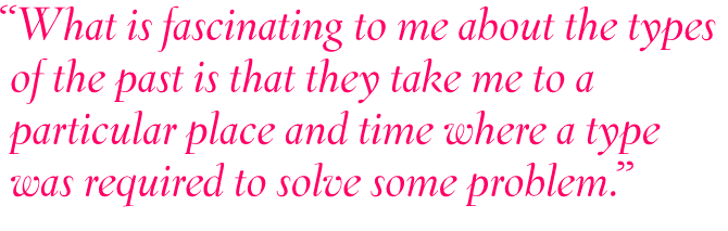
What is fascinating to me about the types of the past is that they take me to a particular place and time where a type was required to solve some problem. The solution, quite often, then became visually associated with the person, publication or place where the solution was needed. Then, if the design was still cool several decades or centuries later, the design was revived for new technologies. Having the first one happen over 400 or so years ago, and then the second one 150 years ago to 50 years ago, we now have several layers of technologically and culturally motivated inventions and revivals to peer through for inspiration. And of course, with the physically vacant nature of type’s modern form, all of the pieces of the past that were used to make and use type, even the rottenest old job case, are fascinating to me as well.
Eldorado
W. A. Dwiggins, the most idiosyncratic type designer of mid-20th century America, cooperated with Mergenthaler Linotype on a long series of experimental typefaces. Many of his experiments never went into production, but Eldorado – which he worked on during World War II – was released in 1953. Based on a classic Spanish face, its atmosphere is distinctly different from Dwiggins’ more radical families such as Metro and Electra.
With Tobias Frere-Jones and Tom Rickner, Berlow revived Eldorado in 1993-94 for Premiere magazine, developing versions not only for text and display, but also a sturdy “Micro” weight for type sizes of six-point and smaller.
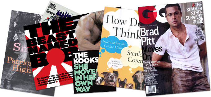
Samples of how Berlow’s fonts have been used in various publications
More specifically, several of your own designs are inspired by nineteenth-century typefaces – I’m thinking of designs like Bureau Grotesque, Rhode, Giza. So... what’s so fascinating about the 19th century?
To continue what I was saying, I think viewers in many cultures have reactions to types from different times and places that infuse some of the cultural soul from those places, to the new places in which the type is used. In your example, the slightly decorative uses of type in the world that preceded Helvetica, had roots in the 19th century, and I, being inclined towards Anglo-American tastes quite a bit, made Grotesques, Egyptians and Industrial sans in response, because lots of people between me and the viewer wanted to take the viewer to a slightly more soulful place, perhaps.
Font Bureau specializes in the design of custom type for newspapers, magazines and corporate clients. Is designing fonts for clients very different from working without an assignment – from being your own client, so to speak?
I’ve not worked without an assignment since Font Bureau was formed, really. When I’ve gone off on some big new font family, it’s always been for a group of clients who wanted enough parts of it at once to make it worth risking.
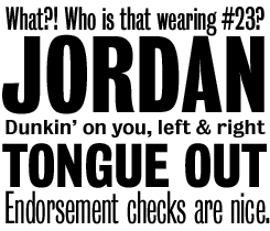
Eagle
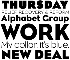
In 1933 Morris Fuller Benton drew his famous titling alphabet, Eagle Bold, for the National Recovery Administration. In 1989, David Berlow took Benton’s ideas as a starting point for a full typeface. He designed a lowercase, completed the character set, and added a Book weight for setting text. In 1994, Jonathan Corum followed up with the Light and Black weights.
When you begin working on a new typeface, do you have a specific method, a fixed sequence of characters that you draw first? A ritual, maybe?
Absolutely. Unless there is a logo involved, and assuming a whole typeface family is required with all the characters, I have a specific method. Logos and projects with limited styles to draw can require a different method. But usually, I start with H-O-D and then n-o-p, and then all the lowercase of the lightest and blackest styles of roman and italic from a to z.
At this stage I’m thinking of the possible typologies of each glyph, the detail of each of the unique features of each character, the weight spectrum and of course the roman-italic relationship, as much as possible in the context of its main use, whatever that has been determined to be. This is when I usually spend a lot of time looking at other solutions and historical references, and once a full set of lowercases are done, I do interpolations if I need to look at a middle weight right off, and a lot of proofing, and tinkering. I sometimes finish only the unique forms in each style, and sometimes I draw, space and build tables for everything, this decision depends on the design itself, how much detailed attention is required by the form of the type, and what kind of client relationship there is.
But the first several hundred characters are the most fun – getting the “monkey to swing right” repeatedly, so to speak, through the first styles and then through all the rest of the common glyphs in a family, and watching a style or family of styles behave on the screen or from the printer is the most fun, and I think, the very most fun when done methodically. By that, I mean not n-o-p then a to z, which is just an order of convenience for me. But methodically as in knowing what to compare to what and what to use as a starting point to draw a new character and how to differentiate between making changes and chasing your tail.
Beside the computer – what’s your main tool in designing type?
The rest of the world, I guess. I spend time doing things that allow me to think better about letter, typeface and font design. I generally do not, for example, sit down at the computer and think, “draw some letters”, I go there when I can “draw these letters!” With this and the world’s steady stream of typographic stimulation from old and new media and the revival of old media in new, I can’t even think of another tool.
As the Font Bureau’s principal, one of your tasks is to criticize other people’s design. What are the things you pay most attention to? What are the common mistakes made by beginners? And... do people think you’re harsh?
Just to be clear, we receive one submission every day, there are a dozen or so projects going on at once, and hundreds of fonts are involved. These go through a screening process that gets a lot of things done that I never see. In reviewing submissions, for example, all the types that “don’t fit” in our library, that are too close to what is already in our library, and other kinds, never get my criticism. What gets criticized is what I’m asked to look at, and my own work.
When I do look critically at type, I pay attention to suitability for the the purpose it was intended, both technically and stylistically, and to see if the monkey swings, i.e. does the type work to form letters, words, lines or whatever, of the kind required? “Do people think I’m harsh?” is a question only “people” can answer. I am certainly direct when it comes to critiquing a font, but I try not mix harshness for a font with harshness for a person.
Bureau Grotesque
Bureau Grotesque was first developed by David Berlow in 1989. In his quest to capture “the essence of tooth and character in an English nineteenth-century sans”, Berlow worked from original specimens of the grotesques released by Stephenson Blake in Sheffield during the 1800s. Bureau Grotesque met with immediate success at the Tribune Companies and Newsweek. Between 1994 and 2006, the family was further expanded under Berlow’s supervision by Jill Pichotta, Christian Schwartz and Richard Lipton.
Giza
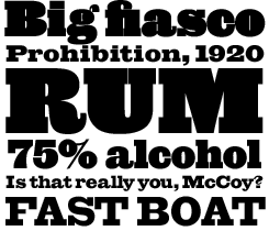
In the early 19th century, archeological discoveries triggered a genuine Egyptomania. Type founders capitalized on that craze by using the name “Egyptian” for several fashionable new display fonts. Over time, the word “Egyptian” has become synonymous with slab serif.
Named after the Cairo suburb where the great pyramids stand, Font Bureau’s Giza is a slab serif of monumental proportions. Its sixteen styles bring back the colorful power and variety of the original “Egyptian” typefaces. Berlow based the family on showings in Vincent Figgins’ specimen of 1845. Check out the truly thunderous bolder weights, designed for maximum effect in the largest of sizes.
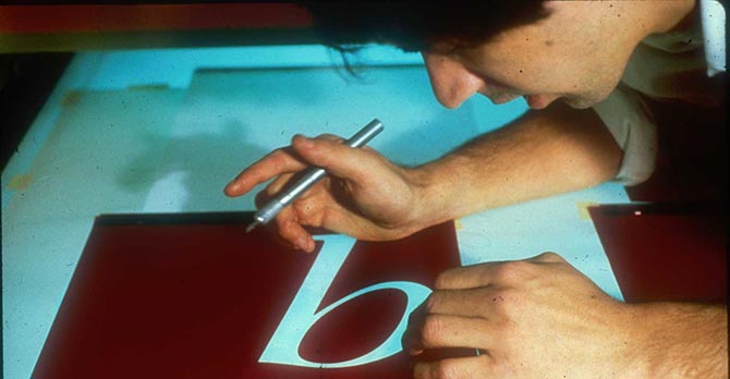
A younger Berlow cutting Rubylith during his days at Linotype
Among your older colleagues – who do you admire the most? And which type designers of the younger generation do you think are particularly talented?
Aldus to Zapf? Does older include passed? I can’t choose there, it’d be like one of ’dem old Greek stadia filled with ’em, and I’d have to point at the whole thing or they’d stone me. Younger is also difficult because there are creators, there are craftspeople, there are technology people and I know five or ten of each that would be hard to separate. Other people, I think, are far more objective than I’d be.
You’ve witnessed something of a revolution in the type world since you started at Mergenthaler Linotype in the late 70s. What are the most dramatic changes? Do you like what’s happening?
Well, perhaps not surprisingly, the web is the most dramatic change. The only thing I don’t like about the web is that is makes it much easier for bad information and bad practices to spread very quickly and it is very difficult to correct. This is not unlike information and practices in many other fields, but in type, it is so easy for amateurs.
Among your typefaces, which are your favorites?
My fonts that are done.
What has the collaboration with MyFonts meant for Font Bureau?
MyFonts? It’s a great place to shop for fonts! It’s fun, it’s informative and it’s a safe and secure site to get fonts that are of approved quality, performance and, with the wide variety of styles available, truly broad functionality of types. Our Font Bureau fonts, which offer quite a bit of quality, performance and functionality themselves, seem to fit well in the MyFonts world. In addition we admire sites like MyFonts which provide plenty of service and support, if needed, including referrals all the way back to us, here at the Font Bureau.
Finally: you live on Martha’s Vineyard, an island off the coast of Massachusetts. It is a beautiful spot, I’m told. Apart from that – does the place and its relative isolation help you in your work?
I’d grown up in small towns and rural environments until age 24 and then I moved to Manhattan. I lived in cities for 16 years and kept an apartment in Boston until four years ago. Urban living always supplies some amount of inspiration, but as the work itself (for me), requires a lot of concentration and an isolated if not isolationistic environment, I find the quiet default more conductive to a 24/7/365 requirement to work, than anything else I’ve tried. P.S. I utterly hate working in headphones.
Thanks so much David. We can’t wait to see more from you and the Font Bureau team in the not-too-distant future!
Rhode
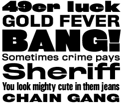
Not only did the trend-setting Vincent Figgins introduce the first recorded slab serifs, he also pioneered a style of elephantine grotesques or sans-serifs, which found their parallel across the Atlantic in the American Railroad Gothic. Both styles stand out by their striking combination of straight verticals and generous curves above and below.
Working from these forms, Berlow shrunk center strokes (as in A, E and e) and minimized counterspace to emphasize the massive forms. The result is Rhode, a complete family of sans serifs which Font Bureau proudly describes as “a manly series of great dignity and presence”.
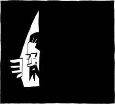
Berlow’s isolationist tendencies, as depicted in an illustration by Font Bureau senior designer (and Berlow’s protégé), Cyrus Highsmith

Who would you interview?
Creative Characters is the new MyFonts newsletter dedicated to people behind the fonts. Each month, we will be interviewing a notable personality from the type world. And we would like you, the reader, to have your say.
Which creative character would you interview if you had the chance? And what would you ask them? Let us know, and your choice may end up in a future edition of this newsletter! Just send an email with your ideas to [email protected].
If you’re curious to know which type designers we’ve already interviewed as part of past Rising Stars newsletters, have a look at the Rising Stars archive.
This issue’s font credits
Comments?
Please send any thoughts you’d like to share with us about this newsletter to: [email protected]
This e-mail was sent to [email].
Not interested in receiving this newsletter anymore? To unsubscribe, go here: http://www.myfonts.com/MailingList