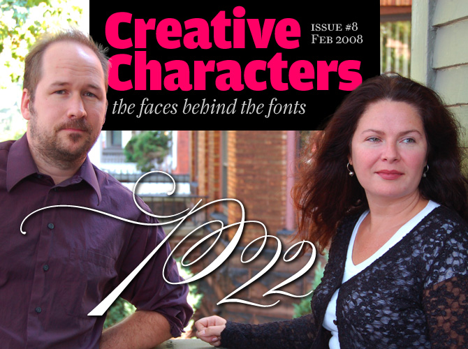
In the American typographic landscape P22 takes a special place. Having started out as a maverick art project, they morphed into a foundry specializing in typefaces related to art and history. They became known for their spectacular, award-winning packaging. Then a series of unrelated font projects crossed their path, which they decided to accommodate in separate labels: IHOF (International House of Fonts), Lanston Type, Rimmer Type Foundry, and Sherwood Type. They also publish books and music CDs, and are co-organizers of this year’s TypeCon. All of this is accomplished by a surprisingly small staff, led by Richard Kegler and Carima El-Behairy, husband and wife. Meet one of the type world’s hardest working couples…
P22 was originally a somewhat mysterious group of artists. Could you tell us something about those early days, and about that weird and wonderful art form called mail art?
Richard: It was as much a mysterious group as it was my own nom de plume for any number of projects that involved not getting a real job. The mail art project started as a way to correspond with a fellow artist who had moved across state. We would send objects through the mail and try to outdo one another. Often objects were sent back and forth with each round adding or subtracting until one of us decided it was “finished” or until the post office lost or destroyed it.
Carima: Our local post office would often display the collaborative pieces that came through. But the mail bombs of the “Unabomber” put an end to irregular mail. A visit from the postal inspector with one of the pieces, extracting a promise never to send objects with electronic components any more, combined with the rise of P22, put an end to the project in the mid-90s.
Richard, you were also a book artist and a bookbinder. Did that help spark your interest in type?
Richard: 99.9% of the books I made were blank or just sculptural. The truth is I avoided typography in art/design school because the type instructor was notorious for being tough. My general art degree didn’t require it, so I did other things.
When you made that first font, did you realize right away: “This is it!” – After all, correcting curves on a computer screen is a far cry from making objects with paper and wire, brushes and cutters…
Richard: The first font was intended only for a minor part of my thesis project installation. It was a mechanical exercise that took Marcel Duchamp’s handwriting and randomly selected one of each letter from his notebooks and without adjustment or judgment, assembled the font. It was a specific homage to Duchamp’s “ready-made” or found object ethos. It had no intended use other than this one project.
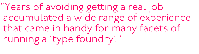
So at the start, it really wasn’t about type. The transition from the physical object happened in my graduate studies in Media Study. I was interested in video but quickly fell for the allure of the Amiga, a highly underrated computer system with awful fonts. There was no “Eureka” moment, but years of avoiding getting a real job accumulated a wide range of experience that came in handy for many facets of running a “type foundry.” Then, after a couple years of having the P22 type foundry, I was finally able to do a couple of hand made book projects that incorporated our type.
Californian
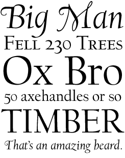
Frederic Goudy was associated with Lanston Monotype for 27 years as art director and art counselor. So it’s only fair that revivals of that great communicator’s typefaces take center stage in P22’s Lanston Type Company.
Californian is considered by many to be Goudy’s most restrained, most balanced typeface. It was designed in 1938 for the University of California Press. Twenty years later, it was commercially released by Lanston Monotype.
The LTC version is a beauty. True to the original, it does not have a bold weight – but it has great typographic sophistication, thanks to its separate cut of Display fonts, its small caps and swashes. The OpenType version has a huge range of numerals – including small caps and tabular oldstyle – and lots of extra ligatures.
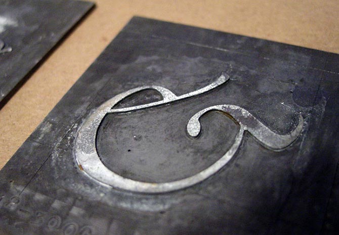
The original Lanston-Monotype patterns were used as source material for Californian. Shown here is the ampersand (&) for the Italic.
In the mid-1990s, when you started out, most designers preferred to submit fonts to existing foundries. Why did you choose to start your own foundry?
Richard: Up to that point the “foundry,” like all P22 projects, was a put-on. Using the term foundry was a tongue-in-cheek way to suggest an anachronistic business name. The first font was made available months after the project had been completed. It was offered for sale in packaging (which, at the time, was still undesigned) at the trade show where my blank books were sold to museum gallery gift shops. The P22 distribution system for the first year was solely through museum gift shops via the distribution system that was already in place for my books.
Carima: This distribution allowed P22 national and international exposure without the advertising dollars and within a relatively short span of time. P22 was introduced in August of 1994 and by January of 1995 P22 could count the Guggenheim, The Los Angeles MOCA, San Francisco MOMA, the Art Institute of Chicago, the British Museum, and MoMA as customers.
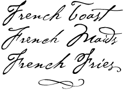
Many of the early P22 fonts were based on artists’ handwriting, and many recent fonts are still inspired by hand-lettering and handwriting. In the originals, every single letter is different. How do you go about transforming them into a font, where there is only one version of each letter, plus maybe a couple of alternates?
Richard: In handwriting every letter is different, but there is always an exemplar or average of most letters. The trick is to digitize letters that work together without jumping out too much. The distinctive swash t in Cezanne was an experiment that stuck but we knew it was too much so we included an alternate in the original PostScript version. The advent of OpenType made us re-examine the “must choose one” approach, and thus Cezanne Pro was a logical choice for us.
P22 Declaration
On the 4th of July 1776, the Declaration of Independence of the USA was adopted by Congress, and the handwritten draft was sent to a printer, who made 150 to 200 copies. It wasn’t until a few weeks later that a fair copy was calligraphed on parchment for the delegates to sign.
It is that calligraphic document that P22 Declaration is based on: a script with the look of 18th-century penmanship, the tip of a quill scratching the parchment. The accompanying Blackletter font was used for emphasis in the original document. Also included are the signatures of each of the delegates. Patriotic stuff!
P22 has grown into a multi-foundry conglomerate: besides the P22 mothership, it includes IHOF, Lanston Type, the Sherwood Collection, and the Rimmer Type Foundry. Why so many different labels? And how do they relate to each other?
Richard: The growth of the P22 empire was somewhat organic and definitely not part of a five-year plan. International House of Fonts (IHOF) was created because P22 was at the time strictly defined by packaged discs (first floppies, then CDs) that had specific art themes. We had no way to deal with submissions from freelancers, or our odd designs that didn’t fit the P22 model. So IHOF was made to be what P22 was not: online only, a wide scope of styles, freelance submissions. Without a large investment in packaging and disc duplication costs, we could take more risks with unusual releases.
Carima: All of these labels have one thing in common: they are all historically based or have historical references. At the time, hardly anyone was releasing historical faces. Each one of the foundries evolved to meet a need expressed by our customers or a need that came out of the foundries themselves. For example: Sherwood evolved out of Ted Staunton’s vision and expertise in historical typefaces. He came to us with one face and then when that went well, he asked if we would be interested in a couple of others he had. Well, there were more than a couple, it was more like 25. And Sherwood was born.
Each label has its own personality, and it wouldn’t be fair to lump them all together and expect them to act, or look like the other labels or foundries. Much like family members, they look similar but each are individuals.
There has been an incredible boom in script fonts lately. Did that have an impact at P22 as well? Why do you think these fonts have become so popular?
Carima: We probably could have ridden the Script wave a bit better, but in some ways we already had our script fonts released and we had moved onto other things. Cezanne, Zaner and Corinthia are very different types of scripts, but they continue to do well for us. Meanwhile, we have spent the last couple years focusing on the Lanston and Rimmer Collections. We do have a couple of new scripts in the works, though. Even with everything out there, we still see voids that we would like to fill.
Richard: Why are scripts so popular? I still think part of it is the backlash against technology. The ability to be geometric and perfect is still dehumanizing to many. The natural or flawed script fonts evoke a real human element. Very few people can actually write like these fonts, so to some it is also an aspiration to have such writing oneself.
As for the stuff that people create with our handwriting fonts – we have seen just about everything. Cezanne in particular went through a coffee phase where at least five major coffee purveyors were using it. Recently there has been a chocolate glut using Cezanne. Food packaging seems like a constant, while invitations are another perennial favorite.
The Lanston Type Company is a continuation of the legendary Lanston-Monotype company [a short history of which can be found here]. How did you come to acquire Lanston, and why was it so interesting to you?
Richard: Gerald Giampa approached us because we had digitized a Goudy face and linked to his web site for reference. He also liked our font collection. My first reaction when he posed the question was to laugh and say we were flattered but we were in no position to acquire a company. I was always confused and intrigued by the distinction between Lanston and Lanston Monotype and Monotype so I decided to at least hear him out. We talked to our bank and the numbers made sense. As the library was very complementary to the P22 collection, with no real overlap in styles, it became a separate label.
P22 Zaner
While there’s a spontaneous and irregular edge to handwriting fonts like Cezanne and Roanoke, P22 Zaner is clean, smooth, flawless elegance. The font’s shapes are based on ornamental penmanship as taught by Charles Paxton Zaner at the turn of the 20th century.
The font family’s possibilities are almost endless, thanks to the availability of four complementing fonts. The best package of all is the Super Pro set that contains a staggering 3,000+ characters! It uses the OpenType Stylistic Sets feature to great effect. If you want your script to look impressive, posh and/or classy but are bored by the usual roundhands, try Zaner.
P22 Bifur
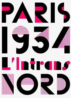
Designed as metal type by poster artist A.M. Cassandre in 1929, Bifur was originally available as a single font or as a two-part font in which each letter has been split into two components, to be printed with two colors.
In the P22 / IHOF version, Cassandre’s original all-caps font has been expanded with an inventive lower case. The six-font set offers each alphabet in two grades of hatching. The complementing “half character” fonts can be layered to form multi-tone lettering, offering a wide range of decorative options.
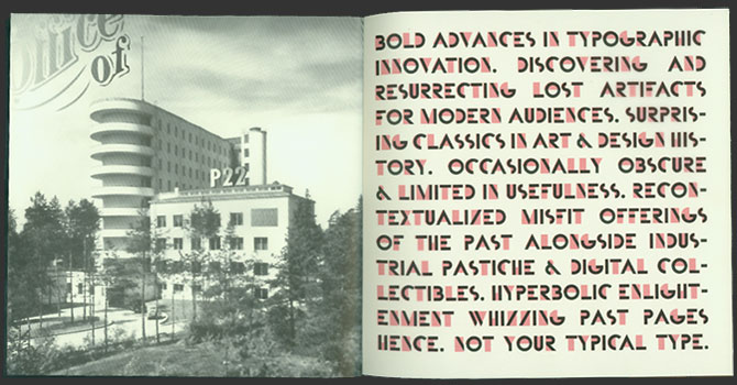
A spread from one of P22’s printed catalogs, showing Bifur in use.
You do a lot more than just publish typefaces. You’ve co-edited and published the wonderful Indie Fonts books, you’re active members of the Society of Typographic Aficionados and this year you’ll be hosting their annual TypeCon conference… so you seem to be hell-bent on keeping typographic culture alive!
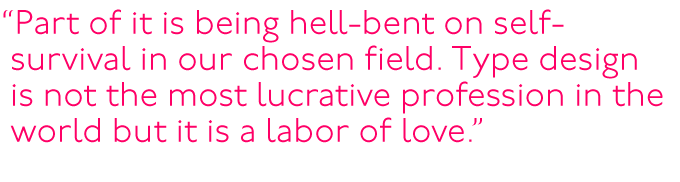
Richard: Part of it is being hell bent on self-survival in our chosen field. Type design is not the most lucrative profession in the world but it is a labor of love. Indie Fonts came about as a promotional vehicle more than anything else and with the non-competitive nature of most indie foundries, making the books a co-operative venture was actually quite easy. The camaraderie of attending a type conference makes them memorable events on so many levels, so when we were asked to host TypeCon for 2008, we looked at each other and said… sure. This is not a 9-to-5 job. As much as many people want to leave their job behind and look forward to Fridays, I actually look forward to going to work. There aren’t enough hours in the day to do what we want, so we do as much as we can.
P22 is also a music label. Could you say something about your relationship to music and, perhaps, about the link between type and music?
We tried, on and off, to make the record label a true companion of the foundry. Emigre did it for a while, and the recent TYPO Berlin conference with music as the theme shows there is more than a passing synergy between type and music. It seems many type designers are also musicians. We have four releases that have a font along with audio on a CD, but this usually just confuses people looking for just music or fonts. I guess I just still regret selling my Rickenbacker guitar years ago, and releasing other people’s music is my vicarious way to stay involved with music without having to actually practice or perform.
P22 Cezanne
Cezanne is one of P22’s classic handwriting fonts. Based on the handwriting of the French artist Paul Cézanne, it was originally created in 1996 for the Philadelphia Museum of Art. However, it didn’t reveal its full potential until the recent Pro version, one of the most complete fonts of its kind.
When using programs that support full OpenType functionality, type a text in Cezanne Pro and watch how the characters adapt to the context, forming ligatures and words in a lively rendition of Cézanne’s handwriting. The font comes with some fine skulls, but for a full set of drawings by the great artist, try Cezanne Sketches.
Apart from being the heart and soul of P22, you’re also a married couple. Do you somehow manage to separate business from private life?
We try. It is difficult. Our offices are on opposite sides of the building. We don’t recommend couples sharing businesses together. It is a true test of a relationship.
As we are speaking, you are preparing for a long stay at Jim Rimmer’s workshop to film him cutting matrices for a new font commission. What’s your collaboration with Jim Rimmer like?
Richard: Jim is a really exceptional guy. We came to an agreement to acquire his digital faces in order to sort out some confusion on work he had done for Lanston and to help him finance his restoration of a Colts armory press. Our newest project with Jim is a new face that will be simultaneously released in metal and OpenType. On a previous visit to his Vancouver workshop, we made a promotional piece with him for the Buffalo TypeCon announcement. I figure this opportunity to work with him again on this new project should be filmed, and filmed well. I am hoping that my master’s degree in media study will now pay off.
We look forward to seeing the results. Thanks so much for your time… and good luck with TypeCon!
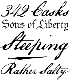
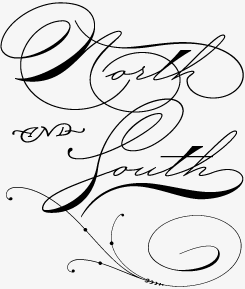
Roanoke Script
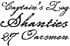
Ted Staunton’s Roanoke Script, released as part of the Sherwood Type collection, is an authentic-looking script inspired by 18th-century handwriting. Its quivering outlines convincingly simulate the scratching of a steel nib pen on uncalendered paper. Pirate movies and gothic novels come to mind, as well as mail order catalogues for something organic.

Who would you interview?
Creative Characters is the MyFonts newsletter dedicated to people behind the fonts. Each month, we will be interviewing a notable personality from the type world. And we would like you, the reader, to have your say.
Which creative character would you interview if you had the chance? And what would you ask them? Let us know, and your choice may end up in a future edition of this newsletter! Just send an email with your ideas to [email protected].
If you’re curious to know which type designers we’ve already interviewed as part of past Creative Characters newsletters, have a look at the archive.
Credits
This month’s interview was conducted and edited by Jan Middendorp and designed by Nick Sherman.
Supporting fonts
The Creative Characters masthead is set in Amplitude and Farnham; the intro image features P22 Zaner; the pull-quotes are set in P22 Underground Pro; the large question mark is set in Farnham, and the small URL at the top is set in Unibody 8.
Unsubscribe info
This message was sent to:
[email].
It is never our intention to send unwanted e-mail. If you no longer wish to receive this newsletter, you may change your subscription settings at: www.myfonts.com/MailingList
Comments?
We’d love to hear from you! Please send any questions or comments about this newsletter to [email protected]