|
|
|
|
Throughout our series of type designer interviews — over 90 so far! — we have taken you to Japan and Thailand, visited Europe from Portugal to Siberia, and traveled the South American continent. But never before have we been to India. We are there now, in its westernmost state Gujarat, where Satya Rajpurohit runs the Indian Type Foundry (ITF) in Ahmedabad. He’s a native of Rajasthan to the north, so his mother tongue is written with a script (or writing system) called Devanagari, the most commonly used in the country. Yet in Gujarat they use Gujarati, another one of nine so-called Indic scripts. ITF has set out to make fonts for all of them. Confused? We hope you’re less so after reading our interview.
|
|
|
You studied graphic design at the National Institute of Design (NID) in Ahmedabad. What got you into type design?
During my early days at NID I was most inclined towards pursuing a career in broadcast and motion graphics. So for the internship that each NID student is required to do, I applied to several motion graphics agencies outside India where I absolutely wanted to go. It did not happen. As I had to do an internship anyway, I switched to my second interest, which was typography. I managed to land an internship at Linotype (now Monotype) in Bad Homburg, Germany. I spent three months there, and I got to work on the Devanagari companion to the Frutiger type family. That was very exciting. At the time type design was hardly considered a real profession in India, so I had never considered that a serious option. But the internship at Linotype first brought out my profound interest and passion about type. Since then, I have never looked back.
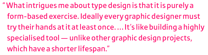
What intrigued me about type design is that it is purely a form-based exercise. Ideally every graphic designer must try his or her hand at it, at least once. What I like most about it is that whatever I’m doing is going to last for a long time. It’s like building a highly specialised tool — unlike other graphic design projects, which have a shorter lifespan.
Were you pretty much a novice when you arrived in Europe?
More or less. I had sent Linotype a portfolio of type sketches, and a number of outline files made in Illustrator, but no fully functioning fonts. So in those three months I got to learn a lot. My main teachers were Monotype’s type director Akira Kobayashi, and type designers Jochen Schuss and Dan Reynolds.
After finishing my internship my next target was to finish my graduation project. As I had decided to do a type project, I began looking for a design studio that worked on multi-script fonts — and I learned about the Dalton Maag company in London. At the time Bruno Maag was directing a multi-lingual project for a large telecoms client, and I happened to get in touch with him at the right time. I was already comfortable with three Indic scripts, but I wanted to work on something I wasn’t familiar with, so I chose to work on Bengali and Tamil. As this was my university project, I could take some time off to actually learn them.
I know there are many languages in India that use a variety of scripts (or writing systems). Do you have some figures?
According to a recent survey, people in India currently speak about 780 languages written in 11 different scripts: Devanagari, Gujarati, Gurmukhi, Bengali, Kannada, Telugu, Tamil, Malayalam, Odia or Oriya, Arabic and Latin. The Sanskrit language stands as the classical language of our country. Hindi has been declared official language of our Federal Government, accompanied by English as the associate language; about 35% of Indians speak Hindi.
What was advantageous for me was that I was familiar with five of these scripts at the start of my career. That made it especially interesting to work on these letterforms. It was a golden opportunity for me to apply my understanding to all these scripts together, in something as streamlined as type design.
This is where my idea for the Kohinoor family came from: to design a superfamily that supports all the languages of India while keeping the visual aesthetic of all scripts similar across the entire suite of typefaces. This would allow for all the languages in India to be typeset in a coherent and consistent visual system. It was and still is a very unusual idea in India: it is rare to find fonts that offer various scripts within the same family. There are fonts from companies like Nokia, but these are proprietary typefaces, not fonts for normal licensing. When I started working on Kohinoor, I don’t think there was any retail font available that supported all Indian languages. Kohinoor was the first family that offered all those scripts, and some of the world’s biggest tech companies, including Apple, have started using it. It makes much more sense to them to use a family that has a unified visual language and includes fonts for various scripts.
|
|
|
|
|
|
|
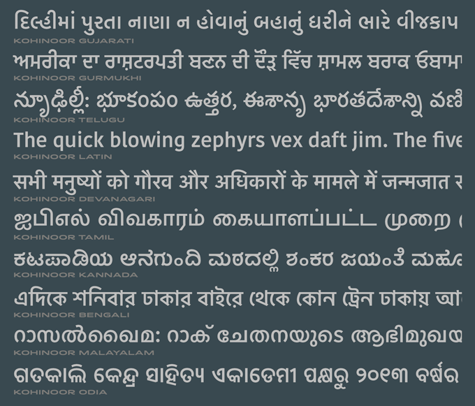
A complete overview of Satya Rajpurohit’s multi-script Kohinoor superfamily. So far, only the Latin and Davanagari fonts are distributed by MyFonts; the less common scripts are licensed directly by the Indian Type Foundry.
|
|
|
|
In 2009 you started up the Indian Type Foundry. Originally you worked together with Peter Biľak of Typotheque, who is based in the Netherlands. How did that collaboration come about?
While I was in Europe for my internship, I visited Peter in The Hague, where he proposed that I work on the Devanagari version of his Fedra typeface — which became my first ever professional typeface. This was just before I went to London to work at Dalton Maag. When Peter and I finished Fedra Devanagari in 2009 we looked for foundries in India who could potentially distribute our fonts. Unfortunately, at the time there existed no foundry that could release a Unicode-compliant font like Fedra. So Peter suggested I set up a foundry that primarily focused on Indian scripts. It was an ideal proposal for me then, since it gave me a great opportunity to continue working with Peter (whom I consider one of my heroes during the college days) while staying in India.
Of course, there were companies making Indian fonts before we came in, but they were primarily software developers who used to sell fonts as supporting products. So if you wished to buy their font, you would also need to buy their software, and vice-versa. Those circumstances made the idea of starting our own foundry look more attractive. We were the first local foundry to distribute high quality Unicode-compliant fonts in India, which helped get us established relatively fast.
Apparently, new type design and typesetting technologies have resulted in big changes in Indian type and typography. Are there many things that are feasible today that weren’t possible as recently as fifteen years ago?
I think that for the Latin script, the OpenType features are more of a luxury — but for the Indian languages it’s necessity. OpenType has finally made it possible to translate all the details and nuances of the Indian scripts to the digital medium. All the scripts heavily depend on complex conjuncts and ligature systems. Thanks to these features it is possible to typeset Devanagari or other scripts the way they should be written. I don’t think it would be possible to do this correctly otherwise. These letters work with a lot of accents that can come on top of the character, below it, or next to it. It’s very complicated. Besides, the number of basic characters is huge — a decent Devanagari typeface will have 600+ glyphs. It’s not possible to access that many glyphs simply via one keyboard, so you need to program it. That’s where OpenType comes in. I do some basic programming, but we have an in-house font technician who does most of this work.
So how big is your company?
Right now we have thirteen people on staff, most of whom are type designers. I have hired quite a few new people. Recently we’ve started expanding our library. During the past five years we could only handle five to ten families. As the first proper type foundry offering Unicode fonts, it was our first responsibility to offer a wide variety of usable types before embarking on more conceptual projects. Now, more and more clients come to us asking for more options; so we should be able to offer more fonts. As there are many writing systems, and the character sets are massive, I could never work on so many fonts on my own. Also, we happened to get a lot of custom work recently from clients like Apple and Google, and that also required team work. There’s always a deadline and when you’re working alone you’ll never be able to finish jobs like these on time.
|
|
|
|
|
|
|
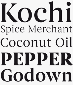
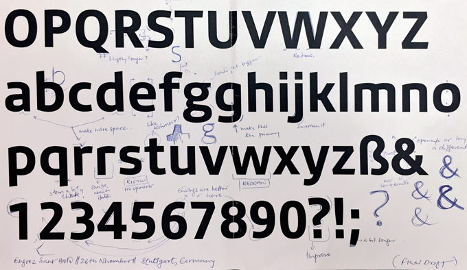
Corrected proofs for the Engrez typeface.
|
|
|
|
How important are the Latin fonts within your library?
Many clients only come to us to buy Indian fonts. But I thought it would be good to design Latin fonts as well; also because English is the second official language in India. Almost every graphic design project in India has English in it, so there’s a good reason to design a Latin companion with each Indic family. Offering Latin typefaces is also a way to open up to an international market. On MyFonts, we’ve only offered Latin fonts until very recently. This has worked quite well — MyFonts is a perfect platform for distributing our Latin fonts.
You’ve recently brought out display families like Pancho and Quantum Latin — typefaces that have more striking and unusual shapes than your earlier faces. When you design Indic companions for these families, do these faces have similarly fanciful shapes?
When I started out, the fonts we released were rather neutral, text-friendly typefaces such as Kohinoor and ITF Devanagari. We did not start looking at display fonts until much later — we’re slowly starting to build a collection of them now. Display faces usually have very limited uses, but then there are always clients looking for those kinds of fonts. Once a novel visual style like Pancho is created, we do like to develop a companion Devanagari with a similar informal style; but in its details it will inevitably look very different from the Latin. The Latin isn’t always the first component to be designed, we sometimes design Latin companions after designing the Indics first; this depends on the project and the client.
In illustrated books and magazines devoted to typography, we often see pictures of the colourful hand-lettering you find all over India — on shop fronts, vehicles and the like. Are there many case in which such styles become models for digital display fonts?
The vernacular style is a well known craft unique to India and some parts of Pakistan. There has certainly been an interest in reviving this style in digital form: several graphic designers have been adapting this lettering style for branding exercises. As lettering for specific needs, it makes sense; but as a functional typeface, I don’t know. In India, many young designers are keen to move away from using this vernacular truck art typography — they find it overdone, I guess. Design in India is in continuous development, and a unique Indian identity is slowly being crafted thanks to an overall improvement of design education and an increase of independent studios.
|
|
|
|
|
|
|
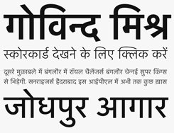
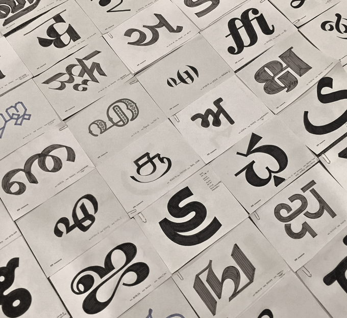
“Each day,” says Satya Rajpurohit, “we have this small half-hour exercise in the office called ‘Typomarathon’, where we decide on a script and every type designer draws at least one letter by hand. This not only improves the designers’ drawing skills; it has also resulted in hundreds of fresh ideas for our next fonts. Here is an image showing the collection so far.”
|
|
|
|
What is it you enjoy most about running a type foundry?
I started my own foundry because I love type, but now I am also enjoying the business part of it. I never thought that it would become so big. Working with so many people, and managing all these projects — I think it’s very fascinating. I never expected anything of this scale when I started out. The way it has been going these past five years, it is quite exciting. Luckily I still find time to do design work myself.
Do you often get questions that are specifically related to Indian type?
Well… a lot of people ask why Indian fonts are so expensive. I don’t find them expensive considering the work… The most challenging thing about type design for Indian languages is the complexity of the fonts. A lot of time goes into designing and programming them. Also, type design is related to deep cultural contexts; in a multilingual country it makes the process of designing letter forms extremely challenging, as each script has its own contextual uses, and all the regional cultures have their specific demands.
Let’s discuss a concrete example. When your studio develops a family with multiple Indic writing systems, how many people work on it for how much time?
We are doing a project for Google right now — a family that supports all the Indic scripts, all the languages in India. We have ten people working on it simultaneously. We have deadlines to respect! One script takes one designer at least four months, so to do ten scripts, you need ten people to work for four months each. It’s the only way to finish these big projects in time. By way of comparison: I did the Kohinoor family all by myself, and I have been working on it for five years. I still have not completed all the fonts for all the Indian scripts!
Where do you think the Indian Type Foundry will be going in the near future?
I’m pretty happy with the current developments — we’re doing pretty well. We were the first young digital foundry, and we now see that a lot of people are inspired by this and take up type design as a profession. Before, we had so many scripts but so few quality fonts. Young people now go abroad to take type design Masters, then come back to contribute to Indian type design. There are yearly, countrywide conferences devoted to type and typography. Students are very eager to learn type design and we get a lot of requests for internships.
|
|
|
|
|
What kind of city is Ahmedabad? Do you intend to stay there?
It is in the state of Gujarat, in the north-west of the country; it is where the National Institute of Design (NID) is located, where I studied. I started up my foundry here, because Ahmedabad is a relatively small, peaceful city; big cities such as Delhi and Mumbai are very noisy and crowded. I did not want to go to a city where life was so fast. For the business, it doesn’t make much difference from where we operate, as long as we have a nice workspace.
It is also a very good thing to be in the same city as the National Institute of Design. That was another reason to start up the foundry here. Every year we take two or three students and teach them type design. Most of them stay with us — which is perfect, because it is very difficult to find people who are trained. It’s a young team — yes. I think about ninety percent of them are under 25!
Satya, it was fascinating talking to you. We wish you lots of success in further establishing your company and helping India develop a thriving typographic scene.
|
|
|
|
 |
|
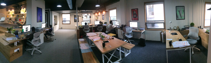
A panorama image of the Indian Type Foundry’s office space. |
|
|
MyFonts on Facebook, Tumblr, Twitter & Pinterest
Your opinions matter to us! Join the MyFonts community on Facebook, Tumblr, Twitter and Pinterest — feel free to share your thoughts and read other people’s comments. Plus, get tips, news, interesting links, personal favorites and more from the MyFonts staff.
|
|
|

|
Who would you interview?
Creative Characters is the MyFonts newsletter dedicated to people behind the fonts. Each month, we interview a notable personality from the type world. And we would like you, the reader, to have your say.
Which creative character would you interview if you had the chance? And what would you ask them? Let us know, and your choice may end up in a future edition of this newsletter! Just send an email with your ideas to [email protected].
In the past, we’ve interviewed the likes of Maximiliano Sproviero, Sumner Stone, Typejockeys, Charles Borges de Oliveira, Natalia Vasilyeva, Ulrike Wilhelm, and Laura Worthington. If you’re curious to know which other type designers we’ve already interviewed as part of past Creative Characters newsletters, have a look at the archive.
|
|
Colophon
This newsletter was edited by Jan Middendorp and designed by Anthony Noel.
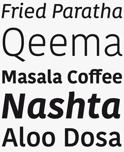
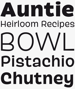
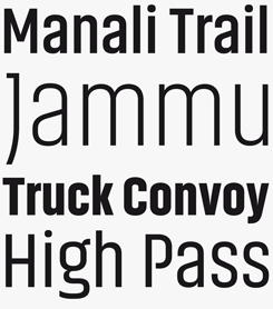
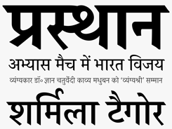
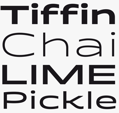
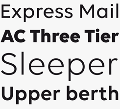
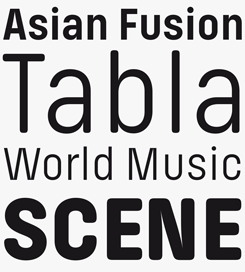
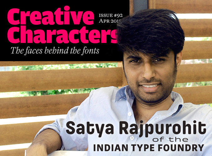
The Creative Characters nameplate is set in Amplitude and Farnham; the intro image features Pilcrow, Quantum Latin, and Engrez; the quote image is set in Engrez; and the large question mark is in Farnham. Body text, for users of supported email clients, is set in the webfont version of Rooney Sans.
|
Comments?
We’d love to hear from you! Please send any questions or comments about this newsletter to [email protected]
|
Subscription info
Had enough? Unsubscribe immediately via this link:
www.myfonts.com/MailingList
Want to get future MyFonts newsletters sent to your inbox? Subscribe at:
MyFonts News Mailing List
|
Newsletter archives
Know someone who would be interested in this? Want to see past issues? All MyFonts newsletters (including this one) are available to view online here.
|
|
|
|
MyFonts Inc, 600 Unicorn Park Drive, Woburn MA 01801, USA
MyFonts and MyFonts.com are trademarks of MyFonts Inc. registered in the U.S. Patent and Trademark Office and may be registered in certain other jurisdictions. Mister K is a trademark of Monotype GmbH and may be registered in certain jurisdictions. FF is a trademark of Monotype GmbH registered in the U.S. Patent and Trademark Office and may be registered in certain other jurisdictions. Other technologies, font names, and brand names are used for information only and remain trademarks or registered trademarks of their respective companies.
© 2015 MyFonts Inc
|
|
|