
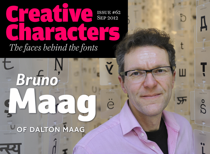
He is the co-founder and owner of Dalton Maag, possibly the largest independent studio in Europe specializing in custom type design. Educated in Basel in his native Switzerland, he has worked and lived in London for two decades. His company recently developed a huge plurilingual font system for Nokia and has presented their bespoke font for the 2016 Rio Olympics. Following many requests from our customers, Dalton Maag’s superior typefaces have recently become available for retail on MyFonts. Meet Bruno Maag, at your service.
Bruno, how does a Swiss designer with a degree in Visual Communications from the Basel School of Design end up in London running a type design company?
My background has always been in typography, starting with a typesetting apprenticeship and followed by a typographic design degree at the Basel School of Design. It was during this first bit of further education at Basel that I was introduced to type design. Doing Visual Communication was simply an extension of my desire to continue my design education and deepen my understanding of type design.
As my education came to an end, I knew I wanted to be a type designer for the rest of my life. During some work experience at Stempel (yes, I am that old), I met Rene Kerfante who eventually moved to Monotype in the UK. He invited me to join Monotype to start up a Custom Type department. The day I started was also when I first met Just van Rossum, who spent a couple of months at Monotype for work experience. We were both huddled around the only Mac in the company doing fun stuff, whilst the Monotype staff were merely shaking their heads.
After my work at Monotype, both in the UK and the US, I started Dalton Maag with Liz Dalton, my wife. I simply couldn’t find the right job in the type design industry, and really, I wanted to be my own boss. The company has grown steadily and organically over the last twenty years, and today Dalton Maag employs over forty people, most of us based in London but also in Boston, Brazil, Vienna and most recently in Hong Kong.
Contrary to most type design companies, your studio mainly develops custom typefaces for a broad range of clients. Compared to making fonts for the retail market, did you find that the more interesting option?
I think this is more of a historical development. When I first started out I needed money, so I took on commissions. I enjoyed the work I did, and considered working on our own font library only when I had time. The truth is that only a small percentage of library fonts ever give you a return on your investment. Occasionally, you produce a hit that will pay for itself more than adequately, but I enjoyed the relatively secure income that custom work provided.
I also find the challenges of creating custom fonts really interesting, particularly now that we are involved in creating global fonts for mobile devices. It requires huge amounts of research, both in regards to design and technology. And when you see a Bengali font, for example, that respects typographic traditions and works technically, it makes you feel great.
You’ve grown fast, and probably employ more people than any other independent type design studio today. That’s quite an achievement considering that you provide such a specialist service. What’s the secret of your success?
We’re still continuing to grow and as I mentioned above, we’re now just over forty people. To be honest, I don’t think there is a secret to it. It is the result of creating quality work year after year, nurturing relationships and eventually being in the right place at the right time. Of course, being based in London also helps, considering that many corporate clients have their creative work done by London-based agencies.
It is also important to understand who you are in the chain of creative work. Type is a vital ingredient in any corporate identity or branding exercise, but it is still only a small part. As a type designer we are a supplier to agencies and clients, and we have relatively little input in the overall creative direction within a project. Often briefs are very specific and we work within a narrow set of parameters. Maybe the secret of our success is that I think of myself not as being a ‘creative’, but a craftsman; a designer who can make things work and look good.
Also, the company has grown organically. I invited people to join Dalton Maag when we were ready for it. Of course, events in the last two years went a touch faster than anticipated, but it is still growth that is borne out of demand. We keep a wary eye on the financial side of the business and question everything we do on an almost daily basis. We continuously fine tune every aspect of the business, in the hope that this will lead to long term, sustainable growth and success.
The people working here are also a key ingredient of Dalton Maag. Without the talent that we have managed to employ, our success would not be what it is. The management team works hard at creating a comfortable and exciting working environment where people can learn and grow personally and professionally. And whilst I am the owner and boss, I don’t believe that I am always right. I believe in listening to the opinions of those around me and if their ideas are better than mine, I am happy to implement them.
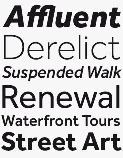
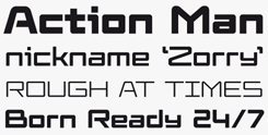
InterFace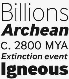
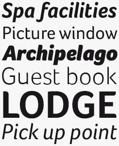
The design of InterFace is influenced by the sans serif fonts of the late 19th Century. While many of the features are Grotesque, a softer look is achieved by blending in some humanist features, for instance in the way the curved strokes meet the straight stems. The x-height is subtly larger than usual, which allowed for a slightly narrower design to increase the letter count where economy is crucial. The highly individual features on some of InterFace’s characters support a unique look, which helps a brand or identity stand out from the crowd.
LEXIA
One of the latest font families Dalton Maag added to their MyFonts offering is Lexia, a robust slab serif that is surprisingly elegant in its detailing. Whether as body copy or display text, the Lexia font family’s extended range of weights makes it remarkably versatile. Details such as the subtly curved serifs and open character shapes give Lexia a warm, friendly feel. Each of the weights was carefully crafted for its purpose; a testament to this functionality-led approach is the generous x-height, which allows for very small text sizes without compromising Lexia’s supreme legibility.
lexia typo advertising
If Lexia Black represents the loudest sound on the normal scale of a display typeface, then Lexia Typographic Advertising is the proverbial one that goes to eleven. It has straight serifs instead of the curved ones on the rest of the family and, with its tight fit and heavy monster weight, gives you that extra push for maximum attention.
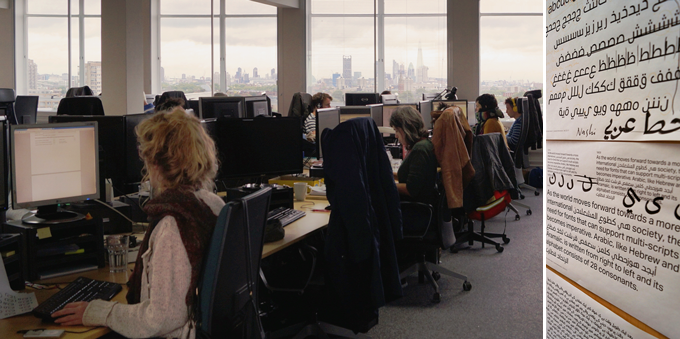
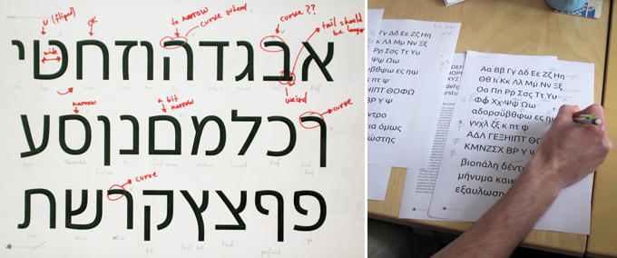
Left: a glimpse of Dalton Maag’s London office. Right: the studio walls are lined with corrected printout of fonts in many scripts — these are for Arabic.
Dalton Maag is a very international company; currently you employ designers, font engineers and managers from the US, France, Italy, Brazil, Spain, Germany and South Africa. Did that more or less happen by chance, or did you plan it that way? Is it a good thing?
None of the above was ever planned — it just happened that way. We responded to demand in our business, and chose the best people to work with that we could find. I am glad that we have such an international team as it brings different facets to the business, different cultural experiences that enrich what we do. It is also a great advantage to have so many languages spoken in the office as it often enables us to respond to a client’s query in their native language. This is a positive experience for the client and puts them more at ease.
We also regularly host interns and some of our team, past and present, have become part of Dalton Maag after being an intern. Lukas Paltram, one of our senior designers, and more recently Alex Blattmann are examples of this.
Many designers who have gradually grown into running medium-sized companies have more or less stopped being designers and are full-time managers. How has that been with you personally — are there things you miss about being small-scale?
I think this is the trade-off of growing a company. It is, of course, possible to make the decision not to grow beyond a certain number of people, which would have allowed me to keep designing and manage less. However, even when we were only five or six people, the vast majority of my time was spent managing and in sales, just to feed the machine. Growing the company for me has always been the ambition, but I didn’t reckon on the impact it would have on my job description.
Today I am only involved in top level design decisions, quite often at the start of a project where I give creative guidance. Once basic concepts are agreed upon I leave it to my highly qualified team to make the right decisions, but I am always available to give my opinions, and I go around the office regularly to see what people are doing. This helps me to stay involved, and it’s also necessary to have an overview of what we’re working on at Dalton Maag so I can represent my company correctly to my clients and at conferences.
How does one develop a font for a client, and how do you decide the design direction? Do clients have a lot of input on details concerning the look of the typeface?
Before we even think about a design, we discuss all the requirements with the client. And from the start we try to assess what their time scales are so we can manage their expectations straight away. The design direction is influenced by the branding needs of the client, and how they are dealing with all the other design collateral. But the design is also dictated by how the font is used. Display or text? Print, screen or both? Those are just a couple of the many questions we ask, as well as trying to get a feel for the extent of the number of font styles to be created.
Once we have an idea of the parameters, we will start developing a number of design concepts which we submit to the client, all interpreting our understanding of their needs. For this we usually create only a very limited character set containing key glyphs. Enough to set some dummy copy and to make an informed decision in regards to what the final font will look like. We usually provide these in font format to allow the client to actually put the designs into their other design collateral.
Once the basic decisions are made, we progress swiftly to refining the design concept and expanding it to a larger glyph set, as well as creating a first draft of the range of font styles. Up to this point we collaborate closely with the client, since conceptual decisions have to be made in consultation. With all the information in place we can then start working more independently and simply submit our work at key stages for comment and approval.
Co and co corp
The Co family, created in collaboration with North Design, is a soft and round — yet utterly modern — text and display typeface. Its underlying geometry gives the design structure and an even rhythm. The Headline version, with it harmonic combination of organic and geometric shapes, is an appealing display font, while the more fluid, less geometric Co Text offers high legibility and functionality in smaller sizes. For full Latin, Greek and Cyrillic coverage, choose Co Corporate; for a unique take on Arabic, there’s Co Arabic.
Effra
The Effra family has its roots in Caslon’s seminal sans-serif type from 1816. The design was expanded and updated for contemporary use. While not strictly intended for body copy, the resulting family does function well at text sizes. Characterized by clean lines and geometric proportions, Effra also has soft and humanist design details where traditional Grotesque features might be expected, creating an even texture and superb readability.
Type designers or potential clients who do not have much experience with custom fonts may be curious to know what kind of licensing you think is preferable. Do customers often buy the exclusive perennial rights to a font? If there’s a limited period of exclusivity, how long will that period be before you can market the font as a normal retail font?
Whether or not we transfer the rights to a client or simply give them a period of exclusivity depends on the nature of the project. For Nokia Pure, for example, we agreed to transfer the rights to the client, simply because of the client’s complex needs. It is administratively and logistically much easier to transfer the rights. If the design is for a specific product brand, or possibly for a campaign with a relatively short life span, we tend to keep the rights and provide the client with exclusive usage. Of course, which route we take also depends on the client’s budget for the project.
As a standard we offer exclusive usage rights for a period of five years. In our experience this is sufficient for many projects. Of course, this is negotiable, and again depends on the type of project and client. If brand implementation alone takes two years due to the complexity of the client’s organisation, five years is simply not enough. I believe that all parties need to openly discuss their needs, and be honest with each other.
What kind of changes do you make before you put a custom-made font on the retail market?
We deliberate the suitability of the font design as part of our font library and make appropriate amendments. This may involve a few characters only, or a respace. Quite often, however, it also means extending the range of font styles, and possibly language support. What we do not want to change, however, is the visual expression of the font overall, since we want to take advantage of the exposure that the font has had when it was an exclusive design.
Contrary to many other studios, you usually credit typefaces to their individual designers. That’s quite generous, because your peers at other agencies may argue that just crediting the studio reinforces the company brand and it’s a team effort anyway. Please explain the thinking behind this.
In general publicity Dalton Maag is always credited first for our fonts, library or custom. But it’s the talented people in our team that create the good work and by crediting their efforts and input, I believe the brand is strengthened because our customers can see who is behind the service or product they buy. Crediting the individuals also instills a sense of ownership in the fonts which again motivates everyone to do only their best work.
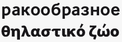
You recently developed Ubuntu, a meticulously designed multi-lingual font family that is offered for free to accompany Canonical’s open-source operating system Ubuntu. In spite of your collaboration in this and other free-font projects, you’ve been a very outspoken critic of Google’s free web font program.
Yes, Google with its free fonts, or libre fonts as they like to call them, is a particular bugbear of mine. Now, if someone wants to make their fonts available for free that is up to them; I have no problems with that. However, it is very different if a giant corporate entity which has a market valuation of a gazillion dollars is asking young and budding designers to submit their fonts for a measly few thousand dollars under the condition of an open source licence. I call this exploitation as well as a complete disregard for design. The result, unfortunately, is that in many cases the fonts are of not very good quality since they have been designed by inexperienced designers.
The contributors’ argument is that it’s a way to have their work publicised and get some money for it. But I’m convinced it would be far more beneficial for everyone if Google invested the money in scholarships for designers so they can do an internship somewhere, or study type design, and in return get the fonts to be added to their website. And spending so little money in type is an insult considering that it provides a great value to Google’s web services.
We designed the Ubuntu font family, and it is available for everyone to use under an open source licence. But we got paid a fair fee to create the fonts, a fee that acknowledges the skill that goes into creating quality fonts, both design-wise and technically. Google should take a leaf from that.
Tondo and Tondo corp
Tondo is a small but very usable family — a rounded sans serif that stands out from the crowd thanks to its even and harmonious texture. The rounded stroke ends are slightly flattened, which helps the font appear more stable and less fuzzy, particularly when set at smaller sizes. When used as part of a corporate design, Tondo won’t compete with other design elements but supports the brand with a subtle voice. While not primarily designed for body text, it functions very well at smaller sizes too. Tondo Corp, the corporate edition, comes with complete Greek and Cyrillic character sets.
Foco and foco corp
The playfulness of the Foco family’s design details belie its serious quality. While enabling colorful visual statements in display settings, Foco works equally well in the toughest of corporate identities, or in editorial projects. Foco is best applied where high visibility and recognition are demanded, yet with careful use it can support quiet communication with a subtle and sympathetic voice. The affordable Standard edition includes the Latin Extended A character set. Foco Corp comes with Greek and Cyrillic character sets as well.
Although released under an open source license, the multi-lingual Ubuntu family was meticulously designed and painstakingly corrected.
There’s a prominent current debate about the clean functionalism of the new Windows OS versus Apple’s more human skeuomorphism: since you work for Nokia (whose latest handsets use Windows 8), maybe your opinion might be obvious but we’d be interested to hear your view about typography’s role in that debate.
As screen resolutions improve we have an opportunity to introduce a broader range of type styles but in the end I think that within user interface environments typography’s role has to be even more functional than in its traditional applications.
As far as the Apple/Windows debate is concerned, all I can say is that I switched to Windows when OSX was first released. I like the simplicity of the Windows UI, and what I have seen so far in the new Win 8 OS, I like its clean, graphic style.
Most of Dalton Maag’s retail collection is within one bracket or niche — serious, functional fonts for corporate and editorial design. Do you ever get asked by clients for more ornate or characterful solutions? Or do you have a personal preference for type that is first and foremost functional? Does your Swiss heritage make functionalism inevitable, or have your travels and living abroad had an influence?
Dalton Maag started off as a foundry producing custom fonts only, with library fonts being added only in around 1999. We have also primarily worked in the corporate world and this has very much influenced the look and feel of our work. Corporations are not very expressive, their main ambition is to have functionality paired with a subtle expression that is appropriate to their brand. We have done some custom fonts that are more expressive, the Puma fonts, for example, or the font suite we created for the Land Registry in England and Wales.
I believe that typography is about functionality, namely to convey a message via the means of the written word. Type design has to facilitate this functionality; I don’t really want to distract the reader from the message with a singing and dancing font. Of course, in the display world, expression is desirable, when a font should also attract the attention of the potential reader.
Personally, I don’t find designing for display that exciting, and I am not overly into expressive. I am more at home with finding a design that performs functionally to its best and has small features that make it unique. The features may not even be noticeable to the untrained eye but they do register as they change the feel of the typeface, and the texture. That’s what turns me on.
Thank you very much for your insights! We’re looking forward to whatever Dalton Maag will come up with next.
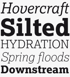
King’s Caslon
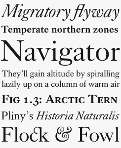
King’s Caslon is a contemporary interpretation of a classic, based on samples found in old specimen books. The display version is dramatically different from the text font. King’s Caslon Display has an extrovert authority that is signified by high contrast between the strokes. King’s Caslon Text is the quiet cousin that will perform when you need to read page after page. The typographic edition, King’s Caslon Typo, offers extra benefits like more ligatures, small caps and non-lining numerals.
ELEVON AND ELEVON CORP
Elevon, the latest addition to the Dalton Maag library, is described by the foundry as “a taste of the future.” Inspired by science fiction, Elevon has a grid-based square construction that gives a futuristic feel to the letterforms. With its rounded corners, the font combines the soft and hard to create a typeface with real character. Elevon Corp is equipped with Greek and Cyrillic.
MyFonts is on Twitter and Facebook!
Join the MyFonts community on Twitter and Facebook. Tips, news, interesting links, personal favorites and more from MyFonts’ staff.

Who would you interview?
Creative Characters is the MyFonts newsletter dedicated to people behind the fonts. Each month, we interview a notable personality from the type world. And we would like you, the reader, to have your say.
Which creative character would you interview if you had the chance? And what would you ask them? Let us know, and your choice may end up in a future edition of this newsletter! Just send an email with your ideas to [email protected].
In the past, we’ve interviewed the likes of Crystal Kluge, Laura Worthington, Jonathan Barnbrook, Dieter Hofrichter, David Berlow, Gerard Unger and Chank Diesel. If you’re curious to know which other type designers we’ve already interviewed as part of past Creative Characters newsletters, have a look at the archive.
Colophon
This newsletter was edited by Jan Middendorp and designed using Nick Sherman’s original template, with specimens and type descriptions by Anthony Noel.
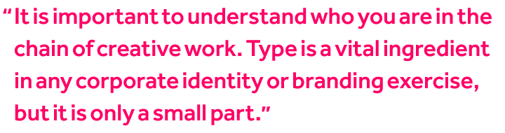
The Creative Characters nameplate is set in Amplitude and Farnham; the intro image features Foco and Effra while the pull-quote is set in Effra Medium; the large question mark is in Farnham.
Comments?
We’d love to hear from you! Please send any questions or comments about this newsletter to [email protected]
Subscription info
Want to get future MyFonts newsletters sent to your inbox? Subscribe at myfonts.com/MailingList
Newsletter archives
Know someone who would be interested in this? Want to see past issues? All MyFonts newsletters (including this one) are available to view online here.